First I will explain that I am a Capture One fan. I have used Lightroom extensively but over the past year and a half have mostly abandoned it due to the controls and flexibility of Capture One especially when it came to processing Phase One P45+ files.
Recently, a dear friend gave me an XRite Color Checker Passport. Besides th nifty cased set of white balance card, color swatches and a standard color checker, it comes with software, both stand-alone and a Lightroom plug-in to create custom dng profiles.
last night, I set up the color checker and studio flash and with a P45+ took two images. One was flash exposed and the other was illuminated with the modeling lamps to give me a tungsten illuminant. With these two images, I used Lightroom and the passport plug-in to create a dual illuminant dng profile for the P45+.
To compare them, and to see how they looked compared to the same image procesin in Capture one, I layered them in Photoshop and added layr masks to expos a portion of each image in each Color Checker square. in addition, I added an octagon, filled with nominal Color Checker values that i obtained from Bruce Lindbloom's web site .
The result was interesting to say the least:
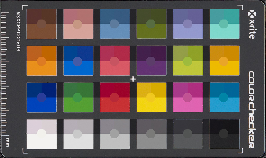
The lower portion of each square is the file as processed by Capture One 5.0.1. The upper left corner is the Lightroom processed file using the "Adobe Standard" profile. The upper right corner is the Lightroom processed file using the custom dng profile created by the passport plug-in. In all cases adjustments were zeroed out and default "film curves" or "medium contrast curves" were used.
the first observation is that the Lightroom files all appear significantly darker than the files processed by Capture One.
In order to investigate this a bit, I added a curve adjustment layers clipped to each of the stacked images. The gray scale was used for reference and then the curve for each layer was adjusted to get the gray scale to match the reference values represented by the central octagons. This produced a more "standardized" result

Well, now we can see some differences in a more comparable way. Even though all of the images had been white balanced to the third gray square, the Lightroom highlights have a slight pink cast. in addition, the Lightroom profiles produced more saturated results arguably more accurate with these adjustment curves applied.
So, what adjustments were necessary?
Here are the curves that i used:

Very interesting. The Lightroom curves were more linear than the Capture One curves. Both the Lightroom "custom dng" and "Adobe standard" profile compensation curves essentially matched. The curves on the right are the two overlayed with the "Adobe Standard" in black and the "custom dng profile" in red. The profile did not affect the contrast curve in a significant way.
The curves added about a stop more brightness to the files processed in Lightroom as can be seen by the uniform displacement of the adjustment curves above the 45 degree line.
the Capture One curve on the other hand was interesting in that it clearly adds contrast and brightens the image from black all the way through the upper quarter tone, then rolls off to emulate a long film-like shoulder (please don't flame me for this). In other words, by comparison, Capture One compresses the highlights while providing more mid-tone and shadow contrast.
As for color accuracy, I will let others judge for themselves. To be fair, the brighter squares where C1 seems grayer in the "normalized" comparison are those most affected by the compensating curve, but one thing is clear. Lightroom requires that its exposure slider be moved up a bit over a stop in order to produce files of equivalent brightness to the same file when processed in Capture One. The difference in midtone gamma explains to a large degree, the different appearance of P45+ files processed in Capture One compared to those same files processed in Lightroom.
Since much of the apparent detail we perceive is derived from this portion of the total tonal range, I might surmise that at least some of the enhanced detail we see in Capture One processed files might be due to this difference in mid-tone gamma.
-bob
Recently, a dear friend gave me an XRite Color Checker Passport. Besides th nifty cased set of white balance card, color swatches and a standard color checker, it comes with software, both stand-alone and a Lightroom plug-in to create custom dng profiles.
last night, I set up the color checker and studio flash and with a P45+ took two images. One was flash exposed and the other was illuminated with the modeling lamps to give me a tungsten illuminant. With these two images, I used Lightroom and the passport plug-in to create a dual illuminant dng profile for the P45+.
To compare them, and to see how they looked compared to the same image procesin in Capture one, I layered them in Photoshop and added layr masks to expos a portion of each image in each Color Checker square. in addition, I added an octagon, filled with nominal Color Checker values that i obtained from Bruce Lindbloom's web site .
The result was interesting to say the least:
The lower portion of each square is the file as processed by Capture One 5.0.1. The upper left corner is the Lightroom processed file using the "Adobe Standard" profile. The upper right corner is the Lightroom processed file using the custom dng profile created by the passport plug-in. In all cases adjustments were zeroed out and default "film curves" or "medium contrast curves" were used.
the first observation is that the Lightroom files all appear significantly darker than the files processed by Capture One.
In order to investigate this a bit, I added a curve adjustment layers clipped to each of the stacked images. The gray scale was used for reference and then the curve for each layer was adjusted to get the gray scale to match the reference values represented by the central octagons. This produced a more "standardized" result
Well, now we can see some differences in a more comparable way. Even though all of the images had been white balanced to the third gray square, the Lightroom highlights have a slight pink cast. in addition, the Lightroom profiles produced more saturated results arguably more accurate with these adjustment curves applied.
So, what adjustments were necessary?
Here are the curves that i used:
Very interesting. The Lightroom curves were more linear than the Capture One curves. Both the Lightroom "custom dng" and "Adobe standard" profile compensation curves essentially matched. The curves on the right are the two overlayed with the "Adobe Standard" in black and the "custom dng profile" in red. The profile did not affect the contrast curve in a significant way.
The curves added about a stop more brightness to the files processed in Lightroom as can be seen by the uniform displacement of the adjustment curves above the 45 degree line.
the Capture One curve on the other hand was interesting in that it clearly adds contrast and brightens the image from black all the way through the upper quarter tone, then rolls off to emulate a long film-like shoulder (please don't flame me for this). In other words, by comparison, Capture One compresses the highlights while providing more mid-tone and shadow contrast.
As for color accuracy, I will let others judge for themselves. To be fair, the brighter squares where C1 seems grayer in the "normalized" comparison are those most affected by the compensating curve, but one thing is clear. Lightroom requires that its exposure slider be moved up a bit over a stop in order to produce files of equivalent brightness to the same file when processed in Capture One. The difference in midtone gamma explains to a large degree, the different appearance of P45+ files processed in Capture One compared to those same files processed in Lightroom.
Since much of the apparent detail we perceive is derived from this portion of the total tonal range, I might surmise that at least some of the enhanced detail we see in Capture One processed files might be due to this difference in mid-tone gamma.
-bob
Last edited:
") D). You might want to reprocess the file under the linear curve setting and compare.
D). You might want to reprocess the file under the linear curve setting and compare.