(...)
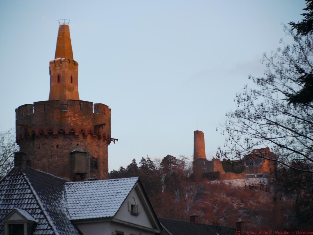
The snow is as white as can be on my screen and the clay pot has that earthy brownish orange red a clay pot has to have (at least here) after it has been burnt at 1000 degrees. And before you mention the color of teh tower and castle in pic #6 - that was evening sunlight just before sunset.
Sorry, but I can't follow you on that ...
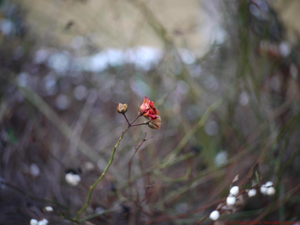
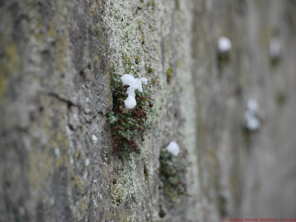
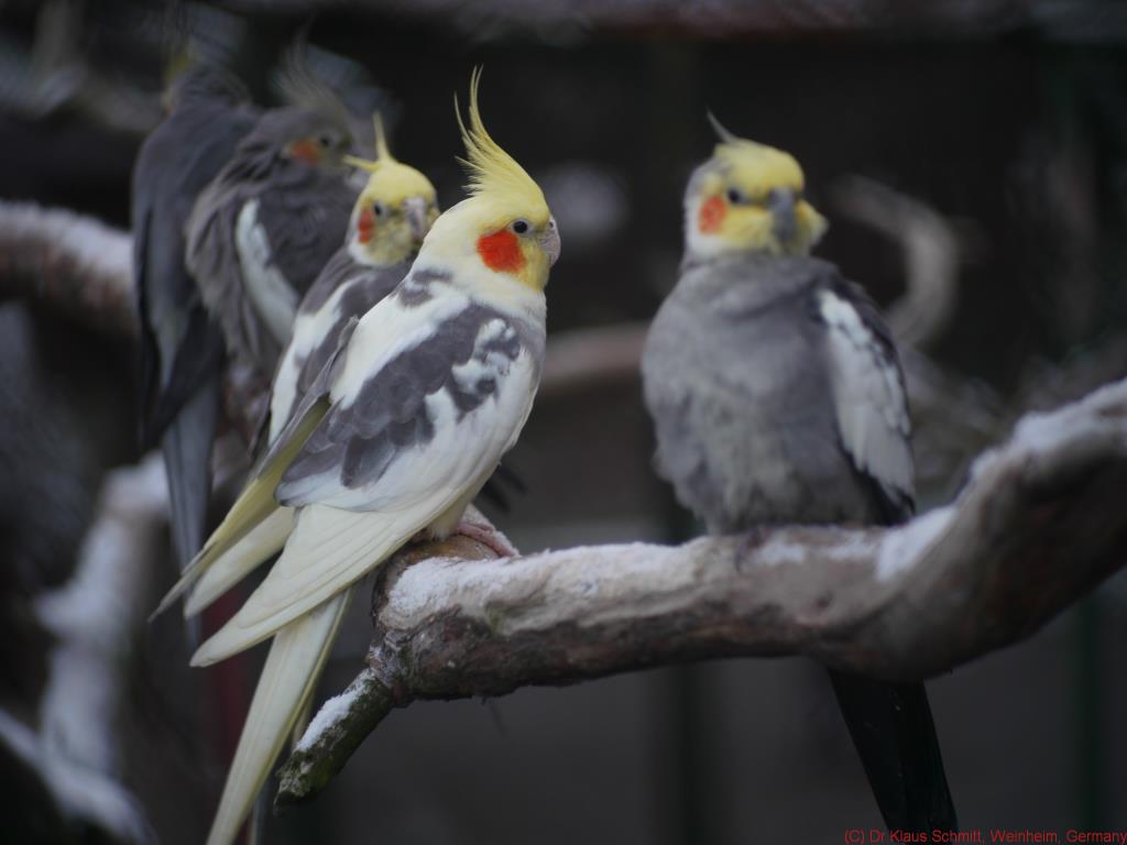
Well Jonas, my idea behind that was to show the performance of the lens with some real shots. If the colors are off a bit (at least for me) does not really matter, as it is more about sharpness, contrast, flare resistance, distortion, bokeh etc. All these are straight from the cam (GH1) just resized. Had I wanted to show a picture for its content or message, I would certainly have polished it up - but that is not what test shots are for.
Hi Klaus,
I'm noticing the difference and I'm happy that it's not only me seeing the colors as being off a bit. I shouldn't have written "way off" in my first reply and I apologize for that. Little off, or a bit off, it should have been.
With that out of the way there is this other discussion you bring up. Whenever anyone takes images with a certain lens with the intention to present the lens to the public people will either have or get opinions on the lens and/or the images. Does the task come with a responsibility? In my opinion it does.
There are two types of "test" images, technically ones, and samples. Most people like to see samples while the "technical" images like resolution charts and such, are boring but also bringing a lot of information.
In both cases they images should be properly exposed and the samples should also be processed for the web if that is where they are presented. Any lens can easily be made to look bad, and sometimes better than it is, either by the in-camera processing or by the photographer.
I appreciate your images being taken with different situations in mind and showing several features of the lens. What I didn't like was the color (and if I dare to say also some underexposure) of some images.
Back to those gourds. To my eyes there is a blue cast and too little light in general. This make the lens look worse than it is.
When I worked as a cinema technician I always checked the xenon bulb current current and made sure there was enough light projected to make the images look decent (measured with a spot meter). Dark, or even slightly dark, images doesn't look sharp to the human eye. In the same way I checked the lenses and the screen for aging and yellow tint. I'm not sure how that works with our monitors but in my experience it is the same thing.
If your intention was
to show the performance of the lens with some real shots I think they should have been adjusted before posting, or the goal isn't reached.
This is just some thoughts in general on this topic. There is more to say of course but I'm on my way out and this is already a quite long post as it is. I hope you don't take all this as negative critique.
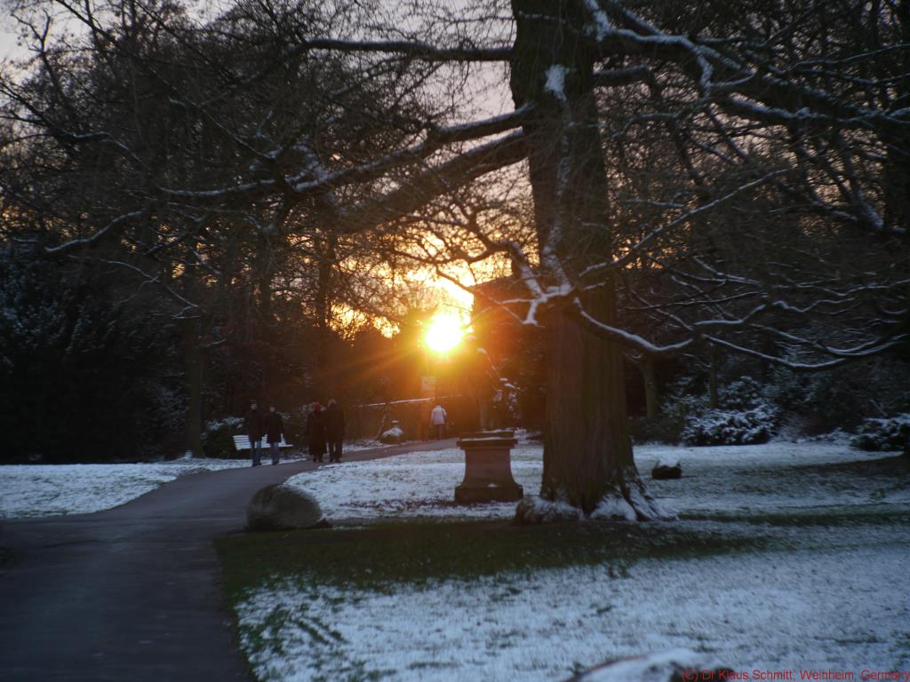
I don't post a lot of images here, so who am I to speak at all? My last image posted on-line can be found in the 50mm thread, but is probably better viewed
here. Four posts down there are a couple more. I hope you don't see the snow as orange and yellow...
")
regards,
/Jonas