The GetDPI Photography Forum
Great to see you here. Join our insightful photographic forum today and start tapping into a huge wealth of photographic knowledge. Completing our simple registration process will allow you to gain access to exclusive content, add your own topics and posts, share your work and connect with other members through your own private inbox! And don’t forget to say hi!
The All New More and More Fun With Digital M Images
- Thread starter Guy Mancuso
- Start date

Lloyd
Active member
Re: The All New More and More Fun w/M8 Images
I'm with Cindy here, Osman. Great series and subject, but this first one... wow.I was lucky to be around with 28 cron The Day Aurora Came to Town. Overpowering and elegant, she brought a Felliniesque ambiance to the hectic Galata waterfront. Hope you enjoy watching them as much as I did while shooting.
Best,
Osman

Daniel
New member
Re: The All New More and More Fun w/M8 Images
M8, ISO1250, Voigtänder 15mm Super Wide Heliar f4.5. A bit of touch up with Viveza
View attachment 23185
View attachment 23183
View attachment 23184
View attachment 23181
View attachment 23182
M8, ISO1250, Voigtänder 15mm Super Wide Heliar f4.5. A bit of touch up with Viveza
View attachment 23185
View attachment 23183
View attachment 23184
View attachment 23181
View attachment 23182
Lloyd
Active member
Re: The All New More and More Fun w/M8 Images
Very nice!! I like the touches of color in the clouds in that first one, and the next to last is a winner!M8, ISO1250, Voigtänder 15mm Super Wide Heliar f4.5. A bit of touch up with Viveza
View attachment 23185
View attachment 23183
View attachment 23184
View attachment 23181
View attachment 23182
Re: The All New More and More Fun w/M8 Images
precisely! i got the isolation, but sharpness was gone. proof, alas, that my 35 needs to go in the shop again... so i softened it even more with some of Jeff Ascough's actions.But that isn't sharp, Cam.Exactly why it looks great.
Stuart Richardson
Active member
Re: The All New More and More Fun w/M8 Images
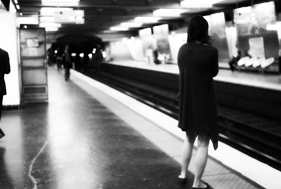
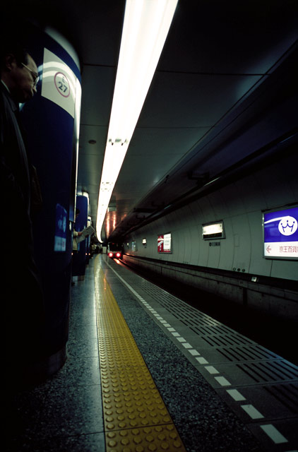
Lovely shot cam -- there is something about metro and train stations that is so beautiful in photographs. Probably because it gathers people in a large, open space, and more or less enforces them to wait. The kinds of things people do and express when they are waiting are quite interesting. As much as I love it here in Iceland, there are certainly times when I miss the subway theater that I had in NYC and Sapporo.
Lovely shot cam -- there is something about metro and train stations that is so beautiful in photographs. Probably because it gathers people in a large, open space, and more or less enforces them to wait. The kinds of things people do and express when they are waiting are quite interesting. As much as I love it here in Iceland, there are certainly times when I miss the subway theater that I had in NYC and Sapporo.
Re: The All New More and More Fun w/M8 Images
i know, Stuart! i am always faced with a quandary -- do i walk somewhere or take the metro...? i should walk, street shots and the like, but i admit to having a weakness for the metro. i also prefer quieter stations, as fishbowl photography gets tedious (not am i really interested in shooting tourists).
i get into such an intense mode of shooting that i often almost miss my stops -- LOL! as for the stations, there too i can become entranced. i remember being utterly fascinated with an old guy who i thought was looking off the end of the tracks, contemplating jumping. when i looked at the pics later, i saw he was just peeing... i think i was lucky not to get sprayed!
i've never been to Sapporo, but the shots i've seen have been stunning. and i absolutely adore NYC!!! i may be going back there in december and am seriously contemplating picking up the GRDIII for that. i'm a bit of a wuss, i admit, but feel more comfortable with a smaller camera there. New York has gotten kind of weird about photographers there.
Stuart Richardson
Active member
Re: The All New More and More Fun w/M8 Images
Yes, I think I prefer the stations to the trains themselves, but I like them too. Elevated lines in particular are amazing for photographs, as they get such beautiful light -- again, it is forcing people into a glass box and making them wait. Here are a few of my subway/train photos, though I must admit none are with the M8...
I think Sapporo was particularly beautiful. My favorite photo ever was taken there in an elevated station. It was just an afternoon of exploring, I came to the station, just saw a shot, raised the camera and took a single frame. I remember it as being the 35/1.4 ASPH at f/4 on Tri-x in rodinal 1:100.
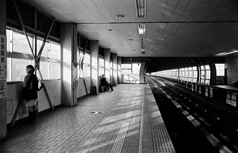
Here are some other ones with various cameras and in various places....
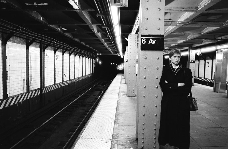
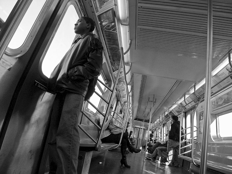
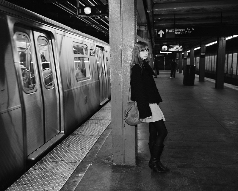
That last one was posed...
Yes, I think I prefer the stations to the trains themselves, but I like them too. Elevated lines in particular are amazing for photographs, as they get such beautiful light -- again, it is forcing people into a glass box and making them wait. Here are a few of my subway/train photos, though I must admit none are with the M8...
I think Sapporo was particularly beautiful. My favorite photo ever was taken there in an elevated station. It was just an afternoon of exploring, I came to the station, just saw a shot, raised the camera and took a single frame. I remember it as being the 35/1.4 ASPH at f/4 on Tri-x in rodinal 1:100.
Here are some other ones with various cameras and in various places....
That last one was posed...
glenerrolrd
Workshop Member
Re: The All New More and More Fun w/M9 Images
Mike
I shot a Hands On Atlanta event with my daughter and the company tee shirts are all bright RED . I will post a few when I have my files on line. I find if the red gets over saturated that going to the camera calibration sliders ......shift the hue between 4-8 toward yellow and desaturate the red by the same 4-8 range works . This keeps the blues and other colors like K25 without roasting the skin tones.
This is also true with the M8 ..I shot with both the M8 and the M9 and every image has the same RED shirts ...good test .
The smoothness of the images is what amazes me ..it reminds me of a fine grain slide film...has a depth of color thats outstanding.
Most people missed this in E Puts blog about the rendering being smoother and more film like than the Nikon.
Want to see a good example ...look at Steve McCurry s new website . He has mixed his Kodachromes with mostly Nikon digital files and each image is dated. You can see the difference immediately ..yet the Leica files look like the chromes.
Thanks guys.
For these particular shots, I pumped up saturation in LR on purpose for effect (bright clear skies tend to look better with saturation pumped).
When the shot includes skin, then I keep saturation more constrained.
Here's an example of one of the architecture shots above.
First the more neutral (contrained) version (Vibrance -1; Saturation -10):
And then the "pumped up" version (Vibrance +8; Saturation +2):
Here's an example of skin tones (Vibrance 0; Saturation -7):

I agree with Roger that I am generally getting higher saturation in my M9 files than I had in my M8 files. Especially in the Reds. And I'm using the ChromaSoft color profile for the M9, which was carefully calibrated on a MacBeth chart.
Notice how deep the pink car is in the last shot, even with Saturation dialed down to minus 7. The skin tones are accurate.
Lloyd - I'm doing my B&W conversions in LR. I outlined the procedure in this post #118 of this thread:
http://forum.getdpi.com/forum/showpost.php?p=138889&postcount=118
ElvisKennedy
New member
Re: The All New More and More Fun w/M9 Images
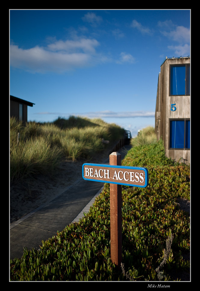
Mike:
What lens (lenses) on those Pajaro Dunes shots?
Thanks.
Mike:
What lens (lenses) on those Pajaro Dunes shots?
Thanks.
jonoslack
Active member
Re: The All New More and More Fun w/M9 Images
I'm doing the same in Aperture (actually, generally all that's needed is an 8% boost in hue towards yellow).
I'm hoping that when they get the colour calibration tables in that this won't be necessary (C1 is much closer to correct).
As you say, it was the same with the M8, the difference being that in high ISO in the M8 it really wasn't 'fixable' whereas it is in the M9.
HI RogerMike
I shot a Hands On Atlanta event with my daughter and the company tee shirts are all bright RED . I will post a few when I have my files on line. I find if the red gets over saturated that going to the camera calibration sliders ......shift the hue between 4-8 toward yellow and desaturate the red by the same 4-8 range works . This keeps the blues and other colors like K25 without roasting the skin tones.
I'm doing the same in Aperture (actually, generally all that's needed is an 8% boost in hue towards yellow).
I'm hoping that when they get the colour calibration tables in that this won't be necessary (C1 is much closer to correct).
As you say, it was the same with the M8, the difference being that in high ISO in the M8 it really wasn't 'fixable' whereas it is in the M9.
Guy Mancuso
Administrator, Instructor
Re: The All New More and More Fun w/M9 Images
hey folks if you want these raws from when I ran my test let me know i can post the raws so you can compare if you want. These jpegs come out of C1
hey folks if you want these raws from when I ran my test let me know i can post the raws so you can compare if you want. These jpegs come out of C1
Mike Hatam
Senior Subscriber Member
Re: The All New More and More Fun w/M9 Images
If you want to know the specifics on a particular image, just let me know which image.
Mike
ZM 21 f2.8 and 28 Cron. Shot mainly at f5.6Mike:
What lens (lenses) on those Pajaro Dunes shots?
Thanks.
If you want to know the specifics on a particular image, just let me know which image.
Mike