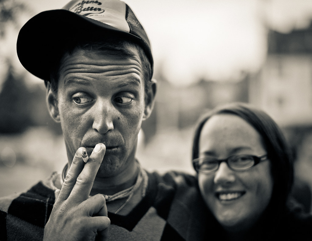
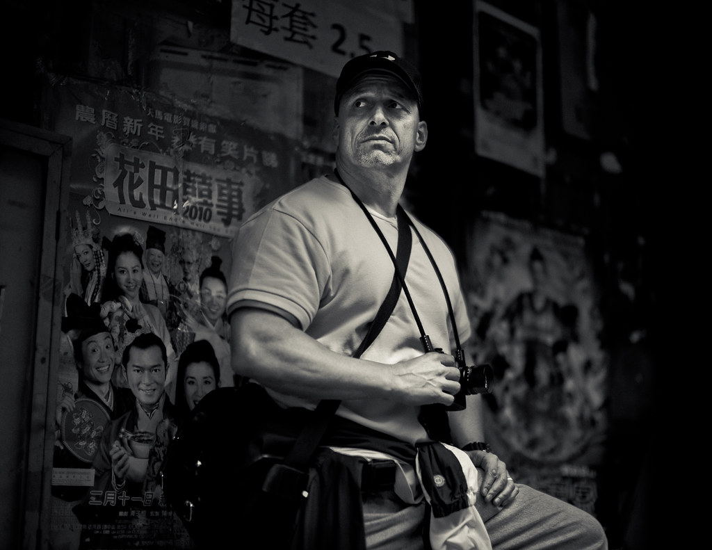
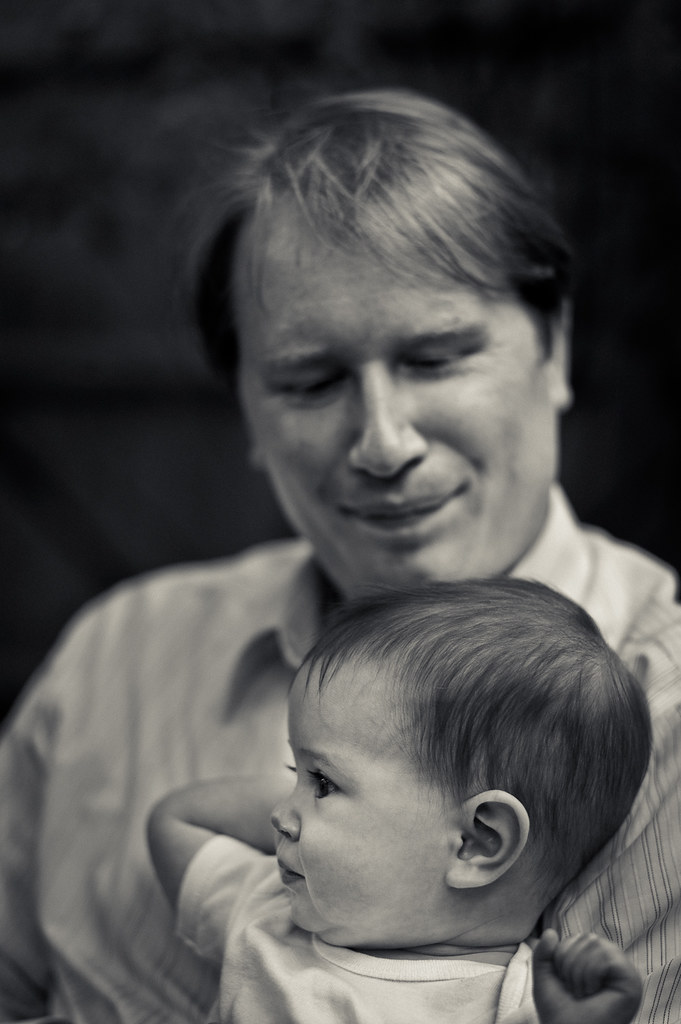
Thanks so much, Lloyd. I am happy to share. I have switched over the past few days to a LR3 only processing scheme. LR3 is outstanding. I will still use Nik, but haven't needed to. Here's what I do for the BW's.
1. import M9 CR2, and use The B&W "Look 3" or "Look 4" setting. Typically, if an image is well exposed, I use "Look 3", and if underexposed a bit, "Look 4". I play around with brightness and exposure a bit to get a reasonable histogram, usually slightly left shifted.
2. Next, I do a bit of dodging and burning to bring out a more 3D look. I jokingly call this painting with light (I come from a background of oil painting). Particularly, I try to slightly emplasize the highlights a bit, and it gives my portraits more pop. Usually use a dodge setting of 0.4 or so to do this.
3. Next, I switch to the clarity option in the brush, and do a once over the sharp parts of the image, in this case the guy's face, to bring more subjective clarity. Sometimes I do this a couple of times , using new clarity brushes
4. Next I use a split toning setting. I pick a yellow color for highlights, and a bluish color for shdow, but drop saturations of each split tone down to 10-15%, until I get the slightly colored look that I want.
5. Then, I add a bit of highlight-priority vignetting, in this case -20% with a smidge of feathering, to center the image more
6. Finally, I add grain using the new grain tone, usually grain set to 40 for amount, 10 for size, and 30 for roughness. This gives a nice structure to the grain, but prevents it from being too distracting.
That's the nitty gritty.
Best,
Ashwin