Probably depends on the printer. I have some profiles for low gamut Epson papers for 3880 here and when I compare them with AdobeRGB, none of them fit inside. There are usually blues and yellows that stick out, but with same papers also greens and reds. I posted an example earlier in this thread.... in a print it will hardly make a difference as most printer's color spaces are much smaller anyway. So both ProphotoRGB and AdobeRGB would get scaled down to match that particular printer's color space.
The GetDPI Photography Forum
Great to see you here. Join our insightful photographic forum today and start tapping into a huge wealth of photographic knowledge. Completing our simple registration process will allow you to gain access to exclusive content, add your own topics and posts, share your work and connect with other members through your own private inbox! And don’t forget to say hi!
Compressed VS Uncompressed DNGs - A quick test
- Thread starter MaxKißler
- Start date
I think the differences are very small, but they all contribute. If I use lossy compression and clip colors and use cheap paper for printing and skimp on display and do not calibrate and use cheap filters...My rule of thumb is: Use the largest possible color space and use the right rendering intent when scaling down to the output color space. That's why it's important to me to know whether shooting compressed raw yields the same quality as uncompressed raw. If the (color) information isn't there in the first placce, using a large color space such as ProphotoRGB won't make much sense.
So, ProPhoto RGB is the way to go for greater accuracy. For mere mortals which monitors are you guys using that support ProPhoto RGB? It seems to me that if the monitor doesn't support it (you can see the difference) you would just end up printing random colours you knew nothing about at the post processing stage. Even if the full gamut of Adobe RGB isn't shown by many monitor's/screens (even though they operate in it) it surely can't help to go even bigger and further into the unknown with ProPhoto? I'm sure it won't be a cheap solution.
Steve
Steve
Not sure about the greater accuracy. In my view, it is a way to avoid premature clipping of colors.So, ProPhoto RGB is the way to go for greater accuracy. For mere mortals which monitors are you guys using that support ProPhoto RGB? It seems to me that if the monitor doesn't support it (you can see the difference) you would just end up printing random colours you knew nothing about at the post processing stage. Even if the full gamut of Adobe RGB isn't shown by many monitor's/screens (even though they operate in it) it surely can't help to go even bigger and further into the unknown with ProPhoto? I'm sure it won't be a cheap solution.
Steve
CRT monitors had approximately gamut of sRGB and it did not prevent prepress studios from working in AdobeRGB even though their printing mistakes would have been very expensive, compared to reprinting an inkjet print.
The colors are not printing "random", the greens from my diagram won't turn purple or orange. They will just display slightly differently. Having inaccurate preview is quite normal for "mere mortals" anyways, for many other reasons than using ProPhotoRGB as a working space.
There are, to my knowledge, three ways to learn something about the out of gamut colors.
- Soft proof with gamut clipping preview will show the areas that are impacted
- Photoshop has an option to desaturate all colors, allowing the whole scale to show up, albeit in lower saturation
- Test print
I use an Eizo CG276.So, ProPhoto RGB is the way to go for greater accuracy. For mere mortals which monitors are you guys using that support ProPhoto RGB? It seems to me that if the monitor doesn't support it (you can see the difference) you would just end up printing random colours you knew nothing about at the post processing stage. Even if the full gamut of Adobe RGB isn't shown by many monitor's/screens (even though they operate in it) it surely can't help to go even bigger and further into the unknown with ProPhoto? I'm sure it won't be a cheap solution.
Steve
Shooting in raw, converting to 16 bit tiffs with a ProPhoto colorspace before working in PS.
Of course my monitor is calibrated as are my printer/paper combinations and I edit with proofing set to the selected destination profile.
A very good book on the subject is "Color management, Understanding and using icc profiles" Wiley2010 ISBN: 978-0-470-05825-1
-bob
Shashin
Well-known member
Why? Don't you like higher bit depths? All the tones are in the same place in the visual gamut with an 8-bit or 16-bit image, you just don't have as many with 8-bit. This is what effectively happens with different gamut sizes with a given image gamut--ProPhotoRGB can results in fewer discrete colors. That could be important if you process your images. That is just how color is encoded in gamuts."ProPhotoRGB will use fewer coordinates. A smaller gamut will use more." This should not affect anything. ProphotoRGB is a larger color space but that doesn't change the location of particular tones in the entire color space.
Max, if you have a system that works for you and you are pleased with it, that is great. It is all you need. Which is just showing your point in this thread about the insignificance of things like compression and the chase for the "best" image quality is rather pointless, at least if it is done by specs. I was just pointing out that folks use specs because they think they are getting more when they can actually be getting less, ProPhotoRGB is just an example of that.
Do you have any tips on types of images or situations where this could be a problem? I hear about this often, but I was never able to reproduce any banding/posterization issues coming from the fact that ProPhoto has large gamut. If there are, I would like to be able to demo it the same way I demoed the color clipping.I was just pointing out that folks use specs because they think they are getting more when they can actually be getting less, ProPhotoRGB is just an example of that.
I try to keep open minded about this, but it is hard. Example: ProPhoto gamut volume is only about twice as big as AdobeRGB. If AdobeRGB is just fine for 8 bit processing, why 16-bit (256x larger) precision is not enough for ProPhoto?
Yes we all know about calibrated monitors etc. but if you can't see what a colour space does for you, why use it? It is adding additional information at the printing stage that you can't see on your monitor, so it's a crap shoot, you glory in it when it goes well, you go back to stage one (something closer to what you see on the monitor) when it does things you don't expect. ProPhoto is a great idea but if it isn't seen on a monitor how can it convey what you want in post processing?I use an Eizo CG276.
Shooting in raw, converting to 16 bit tiffs with a ProPhoto colorspace before working in PS.
Of course my monitor is calibrated as are my printer/paper combinations and I edit with proofing set to the selected destination profile.
A very good book on the subject is "Color management, Understanding and using icc profiles" Wiley2010 ISBN: 978-0-470-05825-1
-bob
Steve
Shashin
Well-known member
Well, I know a few folks here at GetDPI that have had banding with 8-bit ProPhotoRGB. Since I don't use PhotoPhotoRGB that much and they are very experienced photographers, I had no doubt they had experienced this. I know of one fine art photographer who I help with printing her exhibition work have some difficulty with bring some detail out in some dark saturated areas of an image and it seemed that the ProPhotoRGB gamut was contributing to it.Do you have any tips on types of images or situations where this could be a problem? I hear about this often, but I was never able to reproduce any banding/posterization issues coming from the fact that ProPhoto has large gamut. If there are, I would like to be able to demo it the same way I demoed the color clipping.
I try to keep open minded about this, but it is hard. Example: ProPhoto gamut volume is only about twice as big as AdobeRGB. If AdobeRGB is just fine for 8 bit processing, why 16-bit (256x larger) precision is not enough for ProPhoto?
But I am not talking about posterization. I am talking about optimizing the color gamut to the image. You can also make very nice images from underexposed files, but I prefer to optimize my exposures as well. If you have the perfect 8-bit image, a 16-bit image will look no different. My arguments, and I think that you keep missing this, is not that ProPhotoRGB will not give good results, it will, but that if you are really trying to optimize your data, then the choice of color space will be part of that.
I will say this again: if you have a workflow that gives you good results, great, go with that. I have a workflow that works for me and I am just sharing a thought with that.
Yes, I think I am missing this. Would you mind giving an example?But I am not talking about posterization. I am talking about optimizing the color gamut to the image. You can also make very nice images from underexposed files, but I prefer to optimize my exposures as well. If you have the perfect 8-bit image, a 16-bit image will look no different. My arguments, and I think that you keep missing this, is not that ProPhotoRGB will not give good results, it will, but that if you are really trying to optimize your data, then the choice of color space will be part of that.
MaxKißler
Member
I'm sorry I couldn't follow you. Could you please explain this further. What did this have to do with bit depth? Were you referencing the compressed raw files which, I guess (looking at file sizes), are being downscaled to 8 bits per channel?Why? Don't you like higher bit depths? All the tones are in the same place in the visual gamut with an 8-bit or 16-bit image, you just don't have as many with 8-bit. This is what effectively happens with different gamut sizes with a given image gamut--ProPhotoRGB can results in fewer discrete colors. That could be important if you process your images. That is just how color is encoded in gamuts.
...
Thanks
Shashin
Well-known member
Lets use 8-bit because the numbers are smaller. 8-bit has 256 from 0 to 255 for each channel. Those RGB values represent all the possible coordinates in a color space. Regardless of the size of the gamut, there cannot be any more colors in a color space than 256 X 256 X 256.Yes, I think I am missing this. Would you mind giving an example?
Since the number of coordinate in a space is fixed, for it to cover a larger gamut, there must be a larger distance between coordinates. Colors that exist between those coordinates have to be binned up or down.
Now, if I have an image with a small gamut, the number discrete colors that can be created depend on how many coordinates in the color space fit. The larger the color space, the fewer the coordinates. If you have an image of a brick wall, ProPhotoRGB will bin those colors in the wall into fewer bins than AdobeRGB.
Now, you can actually see the effect on a histogram. Open an image in Photoshop in AdobeRGB and then covert the profile to ProPhotoRGB. Undo and redo while watching the histogram. You will see a change in the histogram area and a shift to the left for ProPhotoRGB. And as you know, when things shift to the left in a histogram, it is not ideal as there is a compression in the information, even though the appearance may not change. Now, the significance will depend on the image and the processing of the image. But the difference is there.
Not really that at all.Yes we all know about calibrated monitors etc. but if you can't see what a colour space does for you, why use it? It is adding additional information at the printing stage that you can't see on your monitor, so it's a crap shoot, you glory in it when it goes well, you go back to stage one (something closer to what you see on the monitor) when it does things you don't expect. ProPhoto is a great idea but if it isn't seen on a monitor how can it convey what you want in post processing?
Steve
Digital sensors have the potential for recording images quite outside of any "usual" gamut such a proPhoto. When those images are rendered into something like a 16 bit tiff, they are converted to the user selected colorspace according to the rendering intent. Depending on your raw converter, sometimes the intent is followed, sometimes not quite as well, but in any case, I now have an image that has a fairly small amount of compression in the color domain.
While I am editing, I usually soft proof and show areas that are outside the destination gamut and use my judgement about how I would like to manage this.
I sometimes assign (not convert) other profiles, such as one of those offered by Joseph Holmes Joseph Holmes - RGB Working Space Profiles.
During editing the image may be manipulated in a number of ways that move color and saturation around until I get what I want.
Usually I end up with something that falls within the colorspace of my output device, sometimes I don't, but the gamut warning is useful in localizing those areas. I might select my rendering intent for output depending on the device and the image to produce the results I want.
Is it a crap shoot, well every time you push the shutter button it is to some degree, but I want as much control as possible.
Premature conversion of tristimulus values during the tiff generation to a small color space simply reduces the information that the file contains. I prefer to remove as little as possible until the end.
-bob
To illustrate the point I am trying to make, I took one raw file and generated two 16 bit tiffs, one in sRGB, and one ProPhoto.
I used a tool to compare the two images and to mark each pixel where there is a difference. Black means a difference, clear means no difference.
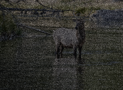
As you can see, although the differences appear subtle when viewed on-screen, there are enough differences between the 16 bit tiffs to cause concern.
-bob
I used a tool to compare the two images and to mark each pixel where there is a difference. Black means a difference, clear means no difference.
As you can see, although the differences appear subtle when viewed on-screen, there are enough differences between the 16 bit tiffs to cause concern.
-bob
MaxKißler
Member
That's a good point you're making and is defintely worth considering in one's color management workflow.Lets use 8-bit because the numbers are smaller. 8-bit has 256 from 0 to 255 for each channel. Those RGB values represent all the possible coordinates in a color space. Regardless of the size of the gamut, there cannot be any more colors in a color space than 256 X 256 X 256.
Since the number of coordinate in a space is fixed, for it to cover a larger gamut, there must be a larger distance between coordinates. Colors that exist between those coordinates have to be binned up or down.
Now, if I have an image with a small gamut, the number discrete colors that can be created depend on how many coordinates in the color space fit. The larger the color space, the fewer the coordinates. If you have an image of a brick wall, ProPhotoRGB will bin those colors in the wall into fewer bins than AdobeRGB. ...
However I'm always doing as much processing as possible at raw stage, export 16bit tiffs in ProphotoRGB and only do minor adjustments, retouching if necessary and color management in PS. So far I've never had any problems with ProPhotoRGB- works for me.
Regarding your example with the brick wall: Doesn't it also depend on the subject (in this case the brick wall)? If the bricks are rather desaturated it makes sense but as soon as the sun is shining for example and the bricks are well lit and saturated, in AdobeRGB there will/might be colors that are out of gamut.
Regards
Last edited:
Thank you. Yes, I get that. That's why I was talking about the posterization. Less values in extreme gradients could cause visible steps and it apparently does happen in 8 bit. ProPhoto is more than 2x larger than AdobeRGB, so the chances are higher.Lets use 8-bit because the numbers are smaller. 8-bit has 256 from 0 to 255 for each channel. Those RGB values represent all the possible coordinates in a color space. Regardless of the size of the gamut, there cannot be any more colors in a color space than 256 X 256 X 256.
Since the number of coordinate in a space is fixed, for it to cover a larger gamut, there must be a larger distance between coordinates. Colors that exist between those coordinates have to be binned up or down.
Now, if I have an image with a small gamut, the number discrete colors that can be created depend on how many coordinates in the color space fit. The larger the color space, the fewer the coordinates. If you have an image of a brick wall, ProPhotoRGB will bin those colors in the wall into fewer bins than AdobeRGB.
Now, you can actually see the effect on a histogram. Open an image in Photoshop in AdobeRGB and then covert the profile to ProPhotoRGB. Undo and redo while watching the histogram. You will see a change in the histogram area and a shift to the left for ProPhotoRGB. And as you know, when things shift to the left in a histogram, it is not ideal as there is a compression in the information, even though the appearance may not change. Now, the significance will depend on the image and the processing of the image. But the difference is there.
With the M8 and M9 I tested for the difference in image content between compressed and uncompressed, and could never detect a difference.
As these cameras are rather slow in clearing their buffers and take about twice as long to do so shooting uncompressed, I decided to shoot compressed for everything except static scenes. Even when shooting uncompressed and in single shot mode I still often have to wait for the cameras. That's one of the main reasons I got the M.
With the M there is of course no point in shooting uncompressed, and the Monochrom will not allow in camera compression, so these are not part of the discussion.
Henning