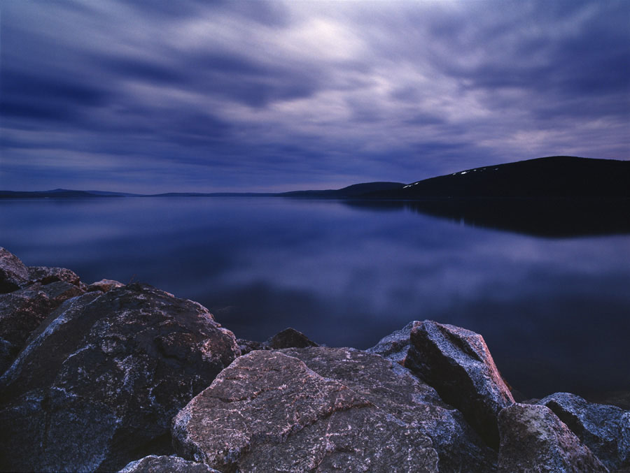
Lovely photos everyone! Keith -- I have long remembered that image of yours...I have seen it before through photo.net, and it has always impressed me a great deal. There are such wonderful contrasts in texture and color, but a lovely overall symmetry in the composition. It is no surprise that Hasselblad has used it for their promotional material, because it really shows off the possibilities of the square format.
I am going to choose this one for medium format, perhaps not because it is my favorite or best photograph of the last decade (which is actually longer than I have been taking pictures...I started in 2002), but because I think it demonstrates the kind of images I most like to take:
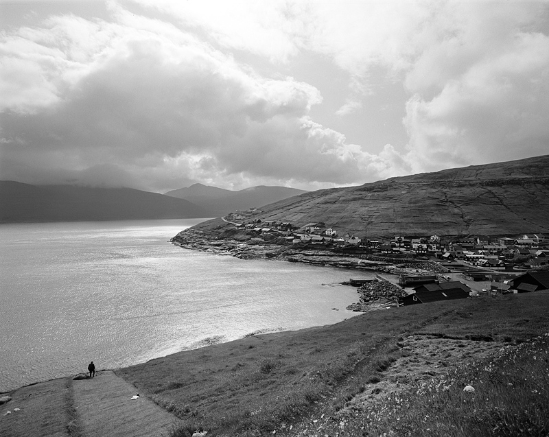
I took this image on a visit to the Faeroe Islands in 2007. It was taken with a Mamiya 7II and the 43mm lens. The reason I like it so much is that it captures not only the beautiful countryside in the Faeroe Islands, but also shows how people interact with the land. I love landscapes, but I usually prefer to have some human element within them -- I find the ways people inhabit the land just as interesting as the land itself. So for this photo, I see the sea, the sky, the cliffs, and the people trying to make a life on a tiny, windswept chain of islands in the north atlantic. I think the small figure working in the fields and small houses in the much broader vista of the sea, clouds and hills help give expression to that feeling.
Beyond that, it represents what I like to do -- I knew very little about the Faeroe Islands, but it seemed interesting, so I decided to go -- I rented a car and drove around the islands for a week. I used photography as a means of engaging the place...as I saw the land for the first time, my camera saw the land for the first time. While I definitely like to continuously revisit certain places I love, I think it is very difficult to relive that first moment of wonder when you see a new place -- often the purest photographs come from visiting a place for the first time. I love that feeling of discovery, and I think that is another reason why I liked this photo -- it was that sort of picture...I was seeing it for the first time as the viewer is.
P.S. I hate that image for at least one reason, however -- it is a monster to print. It looks best in a real silver print, but that requires flashing, extensive and fussy burning in the sky, dodging in the town, split grade printing....you name it. It requires the whole bag of tricks. I was lucky enough to work on this print with Brian Young of ICP (he prints for Nachtwey, Bruce Davidson, Eugene Richards, ICP, Magnum and any number of other great photographs and institutions), and he really helped me improve on it. The analog print looks much better than the jpeg I have posted here.
")