The GetDPI Photography Forum
Great to see you here. Join our insightful photographic forum today and start tapping into a huge wealth of photographic knowledge. Completing our simple registration process will allow you to gain access to exclusive content, add your own topics and posts, share your work and connect with other members through your own private inbox! And don’t forget to say hi!
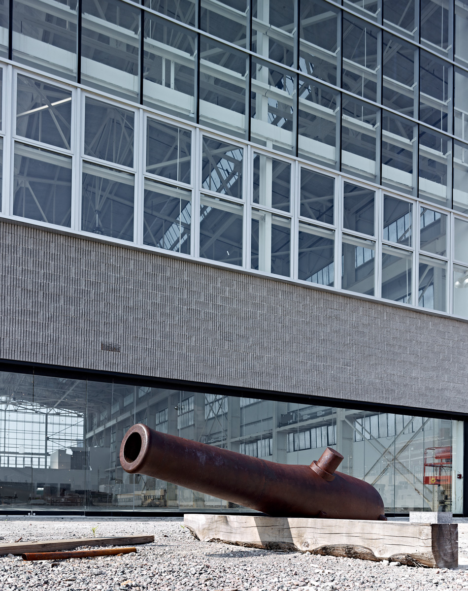
Technical Camera Images
- Thread starter danlindberg
- Start date
I know I "liked" this, but I keep coming back to it time and again. I do think that this is possibly my favourite photo that I've seen posted in this thread. Truly remarkable work."Fitzgerald Bench"
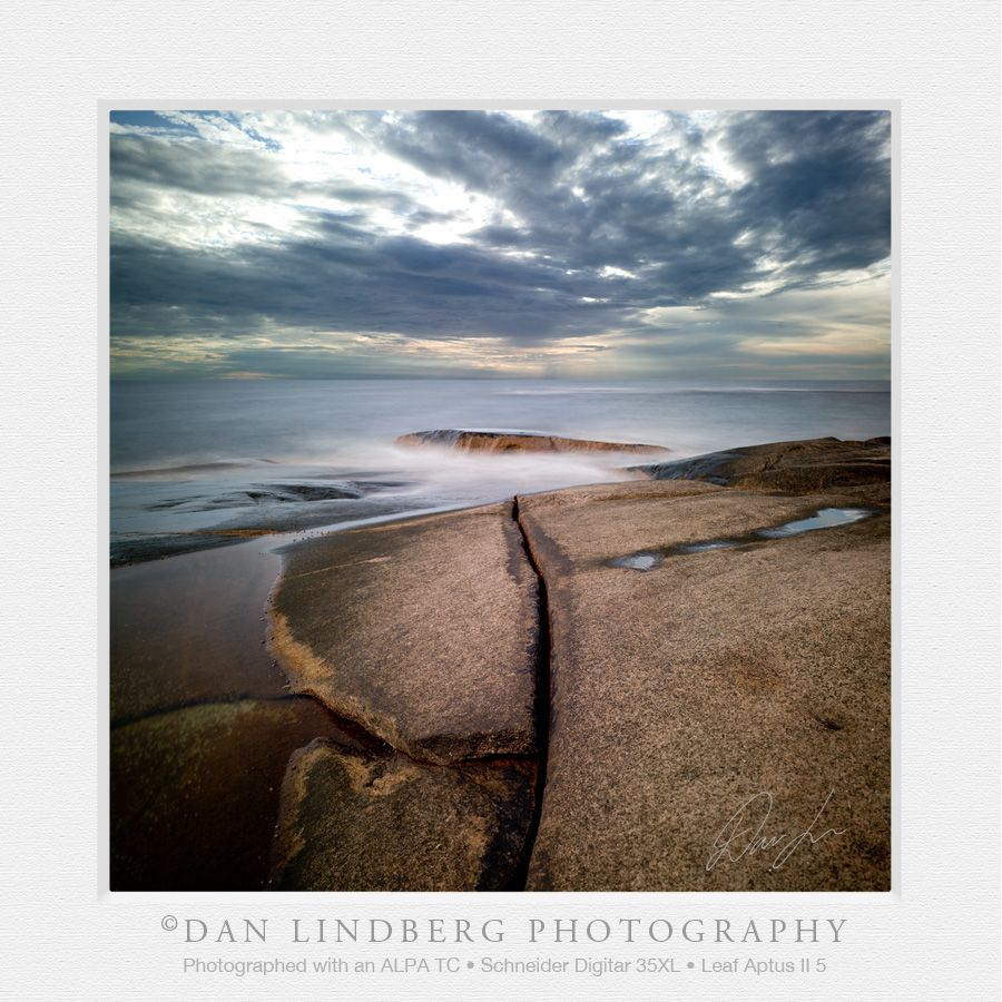
Fitzgerald Marine Preserve, Half Moon Bay, California
Alpa MAX, SK150mm APO-Digitar SB, P65+ (portrait orientation), f/16@1/2sec, full left and right shift (cropped), ISO 50

Thanks very much Gerald; I am truly flattered!!
I went back the next day to retake the image. To be perfectly honest, I missed the focus on the bench. My guess is that the laser point of my distometer must have moved when I pressed the measure button. At 100% the softness in the bench is apparent.
So at any rate, the light was a bit warmer the next day and I took the image again and got the bench in focus. I would like to hear which you (or anyone) prefers and why.
Thanks again!
Bob
Original Image:
Second Image:
Thanks Matt. Perhaps the bark is over sharpened in the first? Or perhaps because the bark beyond the bench was more in focus in the first than the second it is sharper?The tree bark looks silky in the first image, yet the archway is more highlighted in the second. They each have wonderful elements.
--Matt
So really no preference? If forced to pick one, which would it be?
etrump
Well-known member
Second with some edits in the forest to add depth similar to the first. Just my point of view.Thanks Matt. Perhaps the bark is over sharpened in the first? Or perhaps because the bark beyond the bench was more in focus in the first than the second it is sharper?
So really no preference? If forced to pick one, which would it be?
Interesting. Thanks Ed.
If anyone is interested, a couple of other images from this haunted forest are here:
Fitzgerald Marine Preserve
And here:
Fitzgerald Marine Preserve
Bob
If anyone is interested, a couple of other images from this haunted forest are here:
Fitzgerald Marine Preserve
And here:
Fitzgerald Marine Preserve
Bob
Landscapelover
Senior Subscriber Member
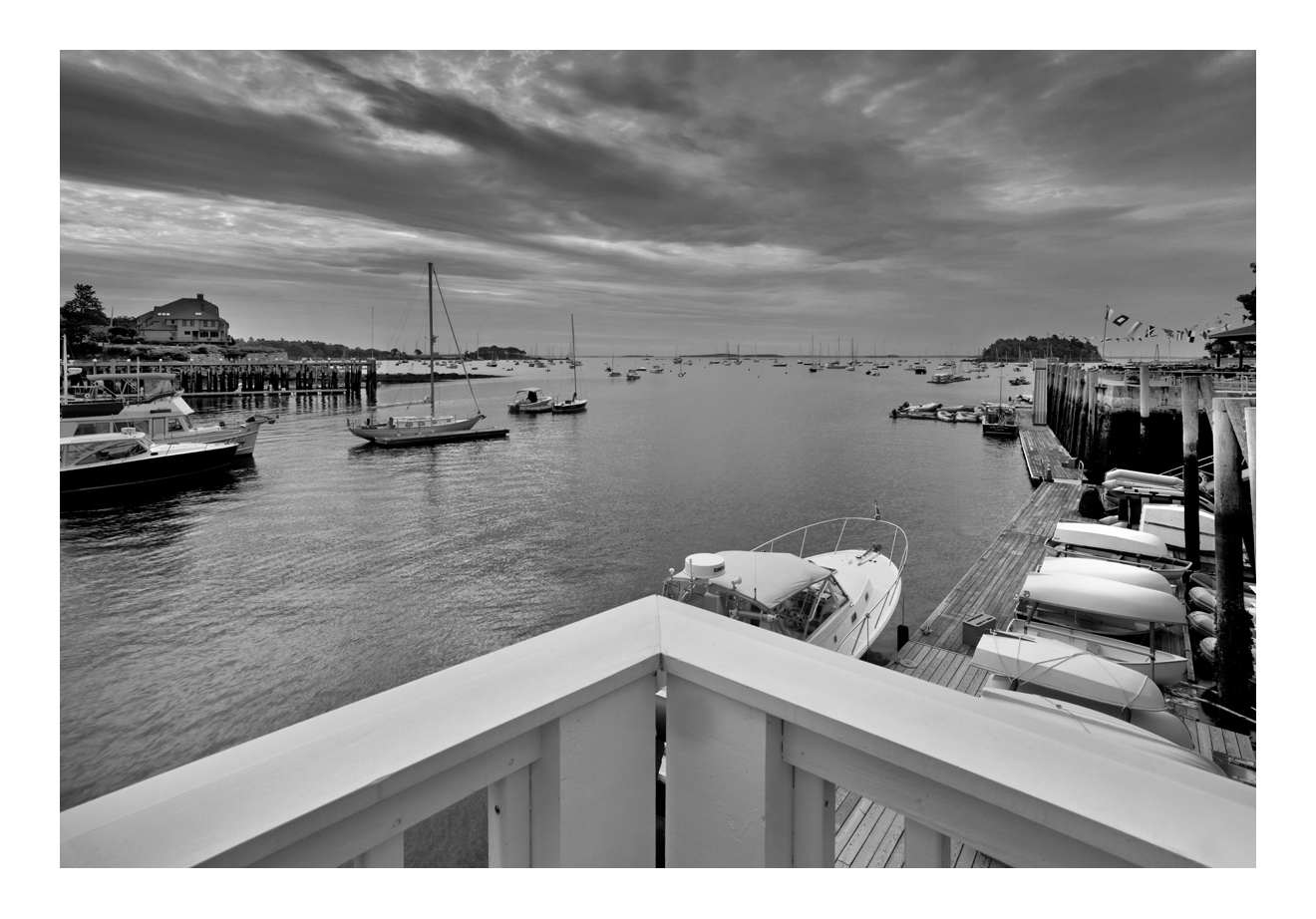
Camden, Maine
Cambo WRS AE; IQ 180; Rodenstock 28mm HR
Thank you,
Pramote
danlindberg
Well-known member
Dan,
As always I admire your work, both in terms of composition and color contrast. Can I ask what your process is for finding appropriate subjects and paring them down to such basic composition while still maintaining such effectiveness in presentation?
I don't know if that's clear actually... I guess what I'm asking is, do you just sort of organically "see" in terms of elegantly simple compositions with strong form and line, or do you look at a scene and then think/plan on how to distill the greater picture down to very basic, very strong elements?
Just back after a few days offline. THANK YOU for these kind words. Always inspiring to read and well appreciatedI think it boils down to "Some people have it, and some don't." There are those who can paint, draw, or otherwise create beauty. Others, like me, have to struggle and sometimes get lucky to create a beautiful image. Dan Lindberg and Don Libby create images that speak to me and are wonderful works of art. And, I am sure they work hard to create their amazing images. Others define it as having an "eye". I am inspired by their work and always strive to create images that just come close to those wonderful images shown on this site.
Greg
")
I am afraid I do not have a magical process to find and execute photographs. Maybe a key factor is that I am seldom in a hurry. If I see something that 'could' be good, then I rarely shoot at once. I take my time (especially if the light is constant) and try to maximize that particular scene, considering 'all' options that I can see in my mind. I work hard to make every image I shoot to be a keeper. I almost never set up my camera when I see a nice scene but the light is wrong or there is an unwanted object somewhere etc - meaning that if I see that it will never make a publication, then why bother!
To see the compositions, I suppose you must have some sort of talent or 'eye'. In my case I have been doing photography since childhood and been a working professional for the past 20 years, so experience is on my side today.
It is incredibly interesting to look back at photographs (especially landscapes) that I did 10, 20 and even 30 years ago (I'm 45 this year). I have gone through all the phases of experimentation and complex ideas to where I am today - simplifying everything to its bare bone. Minimalistic photography where exclusion of objects are far more important than any intention of creating images with double messages or technically complex setups. Done that, been there, got the T-shirt....
If the light is good, if there are plenty of scenes around a hike, then I average around one, sometimes two images per hour. A full day out I usually come home with a dozen 'possibilities'. After going through them all I am happy if I process three, where one of them is worthy of publication.
But, this is not always. Yesterday afternoon, I was in an incredible place. Amazing scenes high and low, left and right. But, in the end, I did not get a single photograph that I am happy with. I must go back, because it was really really great, but it simply wasn't my day yesterday. Boring, uninteresting captures that did not at all show the incredible scenes that I saw with my eyes. No magic anywhere.
Bottomline is that you need both 'the eye', technical knowledge and luck to create good photography. Sometimes all three coincide and that's when we enjoy the art.
danlindberg
Well-known member
MGrayson
Subscriber and Workshop Member
I'm with Ed. I like the second, but I think some of the magic in the trees from the first version could be added back in. In the first version, the forest between the bench and the arch seems "aware". I don't know how you did it.Thanks Matt. Perhaps the bark is over sharpened in the first? Or perhaps because the bark beyond the bench was more in focus in the first than the second it is sharper?
So really no preference? If forced to pick one, which would it be?
Best,
Matt
Thanks Matt. I'll work on it and repost. Both your and Ed's input is really appreciated,I'm with Ed. I like the second, but I think some of the magic in the trees from the first version could be added back in. In the first version, the forest between the bench and the arch seems "aware". I don't know how you did it.
Best,
Matt
Bob
I rally prefer the first image. It is lovely and has more visual depth.Thanks very much Gerald; I am truly flattered!!
I went back the next day to retake the image. To be perfectly honest, I missed the focus on the bench. My guess is that the laser point of my distometer must have moved when I pressed the measure button. At 100% the softness in the bench is apparent.
So at any rate, the light was a bit warmer the next day and I took the image again and got the bench in focus. I would like to hear which you (or anyone) prefers and why.
Thanks again!
Bob
--snip--
-bob
OK. I'll impose on all of your patience just one last time if you would all be so kind:I rally prefer the first image. It is lovely and has more visual depth.
-bob
First Image:
Second Image, redone:

Better feeling of depth in redone #2? Better than first?
Thanks,
Bob
danlindberg
Well-known member
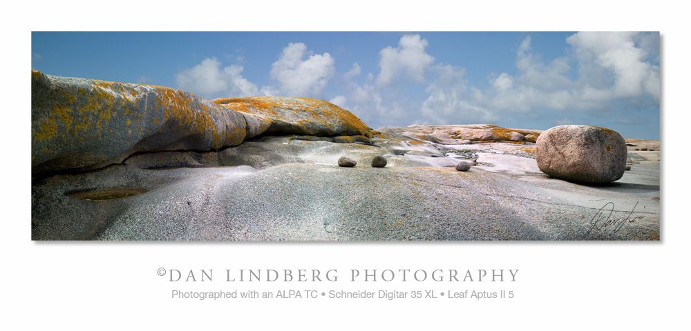
A three image panned stitch. The sweet Alpa TC and a Schneider 35 XL. Fantastic hiking setup
danlindberg
Well-known member
I still prefer the first one. But it is difficult to choose, both are really nice and either is a stunner!
OK. I'll impose on all of your patience just one last time if you would all be so kind:
First Image:
Second Image, redone:
Better feeling of depth in redone #2? Better than first?
Thanks,
Bob
darr
Well-known member
The colors in this shot are wonderful!!A three image panned stitch. The sweet Alpa TC and a Schneider 35 XL. Fantastic hiking setup
jotloob
Subscriber Member
What a stunning pano .A three image panned stitch. The sweet Alpa TC and a Schneider 35 XL. Fantastic hiking setup
Is there a little magenta cast in rocks in the foreground or is that color correct ? ? ?
danlindberg
Well-known member
Thank you DarrThe colors in this shot are wonderful!!
Thanks Jurgen, yes couple of patches of magenta and I did think of removing it, but it actually looked like this. The colours are very truthful so I kept it. I think the Leaf 5 is producing good colours right out of the box.What a stunning pano .
Is there a little magenta cast in rocks in the foreground or is that color correct ? ? ?