GrahamWelland
Subscriber & Workshop Member
Chrome 16 is color managed on the Mac btw.Are you looking at it in Google Chrome on a mac. If so, Chrome isn't color managed. Safari is, and Firefox can be (if you turn it on). Could just be your browser.
Great to see you here. Join our insightful photographic forum today and start tapping into a huge wealth of photographic knowledge. Completing our simple registration process will allow you to gain access to exclusive content, add your own topics and posts, share your work and connect with other members through your own private inbox! And don’t forget to say hi!
Chrome 16 is color managed on the Mac btw.Are you looking at it in Google Chrome on a mac. If so, Chrome isn't color managed. Safari is, and Firefox can be (if you turn it on). Could just be your browser.
I'm running 16.0.9.... and it does not appear to be. Is there some secret menu I need to check ala Firefox, because it's not reading the profiles in my photos as of right now.Chrome 16 is color managed on the Mac btw.
At least for most purposes I try not to make skin too perfect. I used to and did spend hours of freq. separation style cloning and d&b but I thought that the ladies just looked well shall we say "unrealistically" good. I admit to cleaning up a large pore here or there, but my rule is usually something like (mostly) if it looks dry or red, then clean it up. If brown leave it be.Dialing down clarity also makes it blurry IMO.
The only way to make skin "good" and real is hours and hours of
cloning, healing and D&B.
On my screen it also was a little too green to my taste.
Hi Curtis, this criticism/comment is based only on what I see on your post, and I concentrate on the last picture. BTW, congrats on getting a child relaxed; not always easy!
1. Colour balance
Too yellow-green to my eyes on my monitor, in Safari. Look at neutrals if possible to get white balance; the girl’s shirt and the woman’s jumper look grey to me. I did some Levels adjustments in PS via an adjustment layer.
2. Contrast
Seems too harsh to me, though ironically I find the fill a bit too heavy. Used Shadows/highlights in PS to open shadows, and lightened overall.
3. Focus
Spot on, but I find the sharp background distracting (and I feel pic is over-sharpened at the displayed size). I used a layer mask with lens blur to separate the background. A good and bad thing about MF is the relatively shallow depth-of-field; I am far more likely these days to use f2.8 or f4 to blur BGs (M645/Aptus 22) than I did in 35mm. What aperture did you use here?
I also blurred a duped layer 3–4 pixels, using Lighten transfer mode at 25% to give a teensy bit of highlight glow.
HTH!
Here's the difference (screen grab) between safari (on left) and chrome (on right) for me... latest macbook pro is my system... these don't look the same to my eyes. Notice how the color has changed, compared to the origina, once this screen grab was saved out of photoshop with the srgb color space:The colors look the same on both mine and others pictures on
Safari, Firefox and Chrome.

I metered the background in your screen grab Shelby, and they look awful close to me.Here's the difference (screen grab) between safari (on left) and chrome (on right) for me... latest macbook pro is my system... these don't look the same to my eyes. Notice how the color has changed, compared to the origina, once this screen grab was saved out of photoshop with the srgb color space:
(which makes me wonder if Chrome is indeed reading the profile... but still rendering it differently than safari/firefox)
") .
.I think the reflections encourage the impression.ditto!
Seriously, is it just me or does it look like she has a lazy eye.
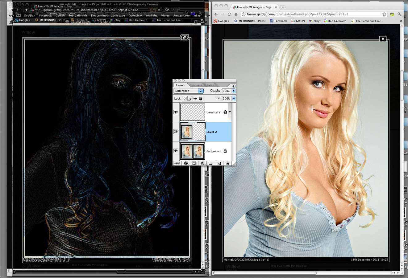


I guess we're getting off topic, so I'll end my replies here... and take any comments off-forum... but to me the difference is pretty noticeable. The left-most image has, informally, less red to my eye... and looks more yellow/green. I know it's not enough to break the bank being that it's just web display, but it still bothers me. Apparently it's better now with version 16 of chrome (which I didn't realize)... it used to be a horrible difference. I'm glad to see them so close. My browser updated to 16 automatically and I didn't notice the better handling of color. :thumbup:I noted sone variation in d-min readings varying up to 4 units of R and G, with 1 or 2 units of B (from a base of 0-0-0), when looking at the dark area top left (using the PS Eyedropper). This is easily explained by the low resolution, different images sizes and JPEG artifacts, but seems pretty marginal to me for those reasons.
I did exactly this last night on the exact same single-pixel location within the image (a medium highlight in the eye that was easy to discern) and the differences in rgb numbers were, to me, significant enough to corroborate a noticeable/viewable color shift.I metered the background in your screen grab Shelby, and they look awful close to me.
Check out the digitalcolormeter in the utilities folder in your mac to see at least what the files measures in the buffer. What is actually on your screen depends on your monitor.
There is a color temperature shift left to right on each image so that the most right part looks a bit different than the most left part
Another from yesterday in -8C weather. 55 LS. Snow squalls on the horizon!
Bill

This is one shot in Kansas on the way to a workshop in Colorado a few years ago with a P30+. There were tornado warnings on the radio but I didn't know what county I was in, so I kept shooting.