The GetDPI Photography Forum
Great to see you here. Join our insightful photographic forum today and start tapping into a huge wealth of photographic knowledge. Completing our simple registration process will allow you to gain access to exclusive content, add your own topics and posts, share your work and connect with other members through your own private inbox! And don’t forget to say hi!
Fun with Nikon Images
- Thread starter Lloyd
- Start date
- Status
- Not open for further replies.

stngoldberg
Well-known member
Blue Heron portrait with gray background
Stanley
Stanley
Not that you asked, but I personally prefer the color version, but only because of the perfectly swirling surf!Nikon 810, 14-24 lens. Corona Del Mar Beach, CA
Both are great captures regardless, congrats!
:thumbs:
Swissblad
Well-known member
DittoNot that you asked, but I personally prefer the color version, but only because of the perfectly swirling surf!
:thumbs:
Dogs857
New member
I think what you have discovered here Dave is a classic case of correct framing.Looking for advice/opinions here. I shot this in 35mm format (3:2) with a D800E and 24~70 f2.8 Tamron VC lens. I blew it up to 20"x30", and matted and framed it. After framing it and hanging it, the top started to bother me a bit. The mats I use are 1/4" smaller all around so the lighthouse top is closer to the top edge than shown here. I also use a Pentax 645D with it's 4:3 proportions, and it got me thinking. I enlarged the "canvas" size to 4:3 proportions, and used the rubber stamp tool and content aware tool to clone all the edges to fill up the 4:3 canvas. I allows breathing room at the top after matting, and also a little bit bigger "base" for the lighthouse to stand on It also allowe me to clone the path for a leading line. I have not blown up the 4:3 yet. What are your thoughts? The 3:2 version is D700, the 4:3 version is D699.
Thanks in advance for your valuable input.
Dave in NJ
You could get the same effect by stepping back and taking the same shot (no idea if the path is there or not as it was cloned in). It's all about taking your time and examining the scene as you are taking photos. What is working, what isn't?? Mind you there have been plenty of times I have gotten home and wished I had of spent more time getting something right. Just moving to the left a bit, moving back or trying a different lens. The trick is to not get so focused on the subject you forget to take in the scene as a whole and really pay attention to what is in the viewfinder.
Many people prefer the 3:4 ratio over the 2:3 but that comes down to personal preference really. The 2:3 is like a short pano format and can work quite well in a lot of scenarios. I must admit however I prefer the shorter 3:4 or 4:5 for most things though. The D800 should have lines to help with 4:5 framing and can even grey out the cropped area.
The best thing about this is that you are critically evaluating your images, which will lead to better photos in the future as you pay more attention to these little details.
For me the 3:4 image is certainly stronger. You just need to fix up that fence line.
My 0.02c
Keep living the dream mate.
Thanks for taking the time Jeff. I agree with everything you said. I tend to compose tightly in the viewfinder. Usually the finished images look the way I saw the images in the finder, and usually look OK on screen. But because I basically have the goal of every image being made into a matted print, I have begun to leave a little space top and/or bottom to allow for the 1/4" mat intrusion. I started making 16"x20" C prints in my home darkroom in 1960. I am a died in the wool print maker. Thank you again for your help and kind words.I think what you have discovered here Dave is a classic case of correct framing.
You could get the same effect by stepping back and taking the same shot (no idea if the path is there or not as it was cloned in). It's all about taking your time and examining the scene as you are taking photos. What is working, what isn't?? Mind you there have been plenty of times I have gotten home and wished I had of spent more time getting something right. Just moving to the left a bit, moving back or trying a different lens. The trick is to not get so focused on the subject you forget to take in the scene as a whole and really pay attention to what is in the viewfinder.
Many people prefer the 3:4 ratio over the 2:3 but that comes down to personal preference really. The 2:3 is like a short pano format and can work quite well in a lot of scenarios. I must admit however I prefer the shorter 3:4 or 4:5 for most things though. The D800 should have lines to help with 4:5 framing and can even grey out the cropped area.
The best thing about this is that you are critically evaluating your images, which will lead to better photos in the future as you pay more attention to these little details.
For me the 3:4 image is certainly stronger. You just need to fix up that fence line.
My 0.02c
Keep living the dream mate.
Dave Gurtcheff, Beach Haven, NJ USA
www.modernpictorials.com
stngoldberg
Well-known member
EGYPTIAN DUCK
Stanley
Stanley
Thanks Jack. I would tend to agree.Not that you asked, but I personally prefer the color version, but only because of the perfectly swirling surf!
Both are great captures regardless, congrats!
:thumbs:
stngoldberg
Well-known member
How about the texture on these birds!
Stanley
Stanley
chrism
Well-known member
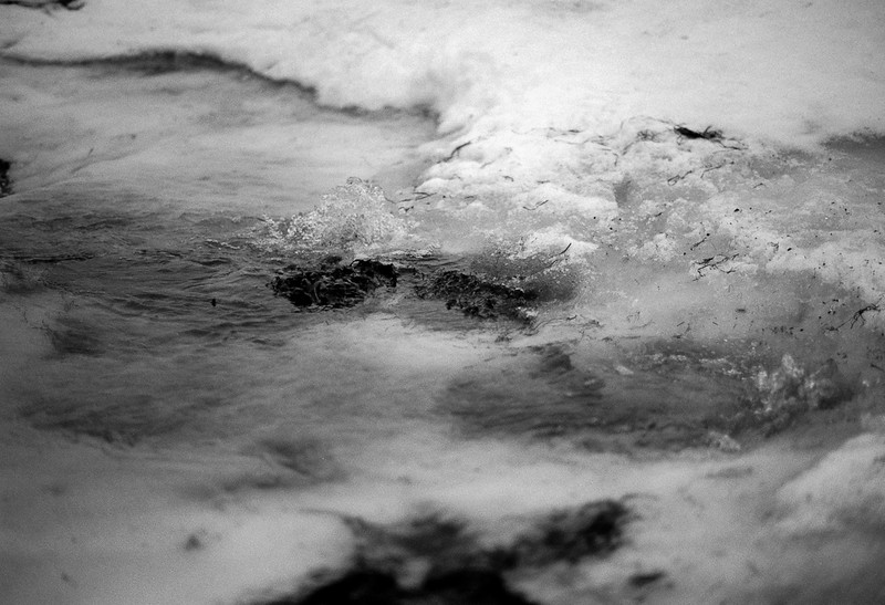
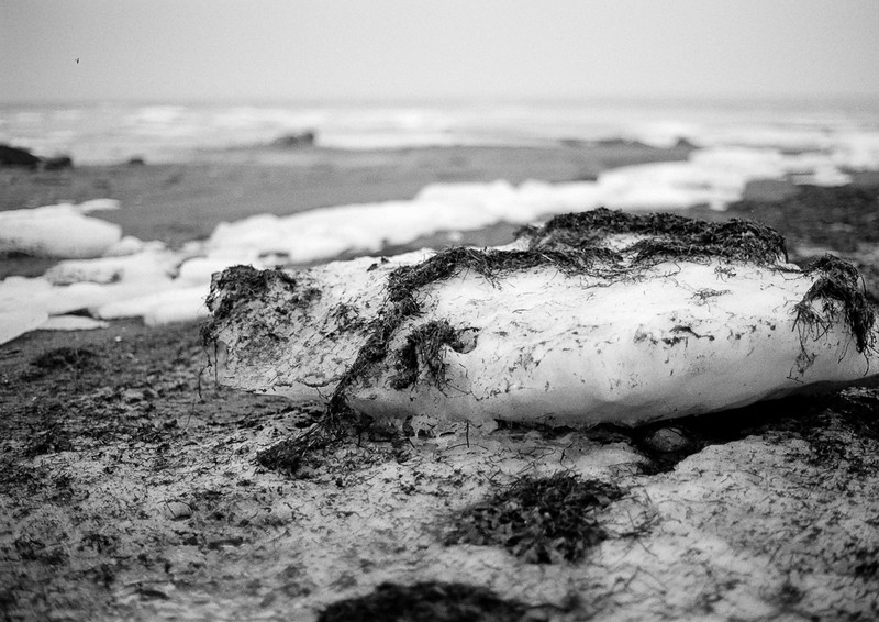
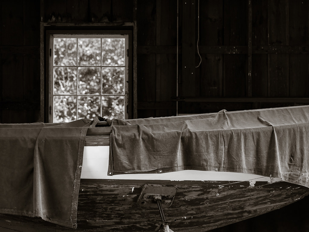
Fog and rain, F6, 50mm/f1.4, Pan F:
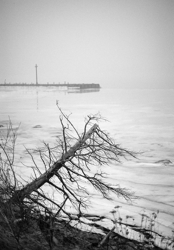
Wharf by chrism229, on Flickr
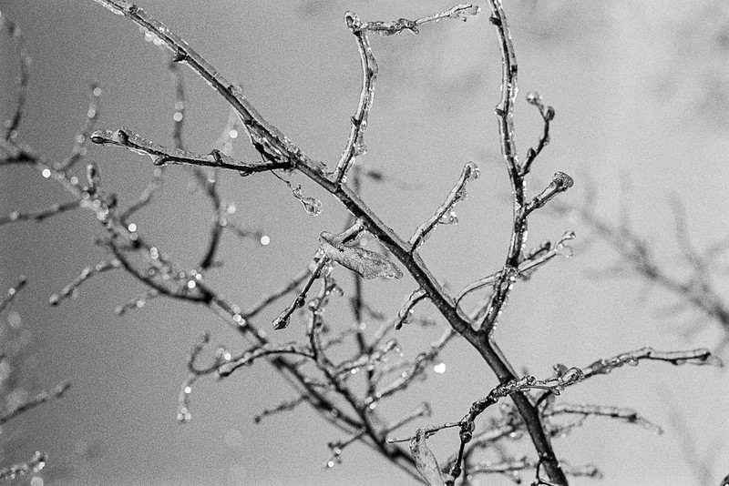
Frozen spring by chrism229, on Flickr
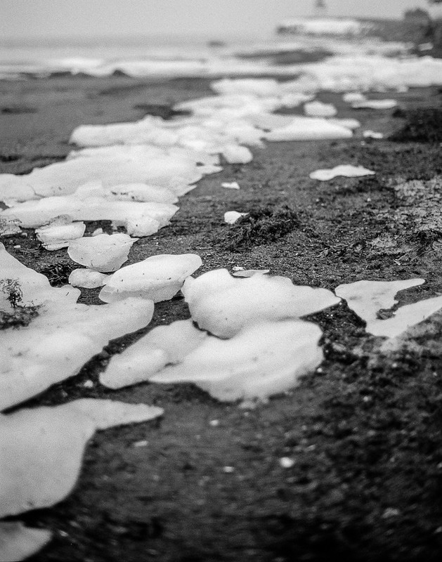
Beach by chrism229, on Flickr
Seaweed and snow by chrism229, on Flickr
Chris
Wharf by chrism229, on Flickr
Frozen spring by chrism229, on Flickr
Beach by chrism229, on Flickr
Seaweed and snow by chrism229, on Flickr
Chris
chrism
Well-known member
And a change from film - I saw this out of the window and had to grab it quickly:
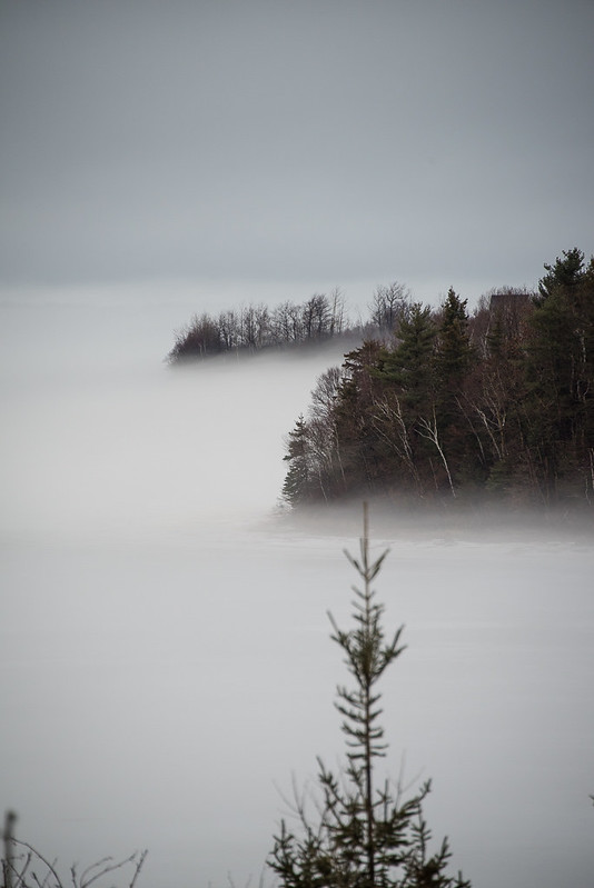
Headlands in the mist by chrism229, on Flickr
D810, 28-300.
Chris
Headlands in the mist by chrism229, on Flickr
D810, 28-300.
Chris
stngoldberg
Well-known member
Black Dog
Stanley
Stanley
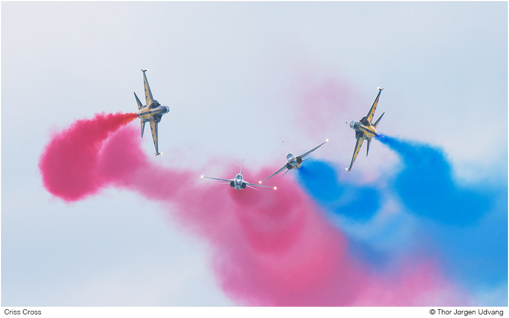
Jorgen Udvang
Subscriber Member
D810 with Nikkor 24-120mm f/4 @ 110mm and f/5.6

Hulyss Bowman
Active member
Winter sucks -

I agree with DOGS, even not taking into account the more pleasing colour the image that 'breathes' is my preference.Looking for advice ...
Jorgen Udvang
Subscriber Member
I learned a couple of things today:
- That the buffer of the D810 can take much more when I use fast cards, like the Sandisk CF Extreme Pro 64GB that I bought two of and Sandisk SD Extreme Pro 64GB that I bought one of a couple of days ago, all for the price of a perfectly usable digital camera.
- That when utilising those cards to the maximum, even a 64GB card fills up at an incredible speed. I managed 2,300 images and roughly 90GB during an hour of the aerial display at Singapore Airshow today :shocked:
D810 with 200-500mm f/5.6 @ 500mm and f/8
- Status
- Not open for further replies.