The GetDPI Photography Forum

Great to see you here. Join our insightful photographic forum today and start tapping into a huge wealth of photographic knowledge. Completing our simple registration process will allow you to gain access to exclusive content, add your own topics and posts, share your work and connect with other members through your own private inbox! And don’t forget to say hi!

Ricoh GXR - Show your images

Irenaeus

Member
I'm really enjoying seeing your work and comments, Keith and Godfrey ~ I look for them just about every time I boot up. Haven't had time to digest the latest, except to say I'm intrigued, and more power, insight, light and luck to all of us!

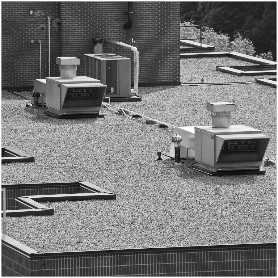
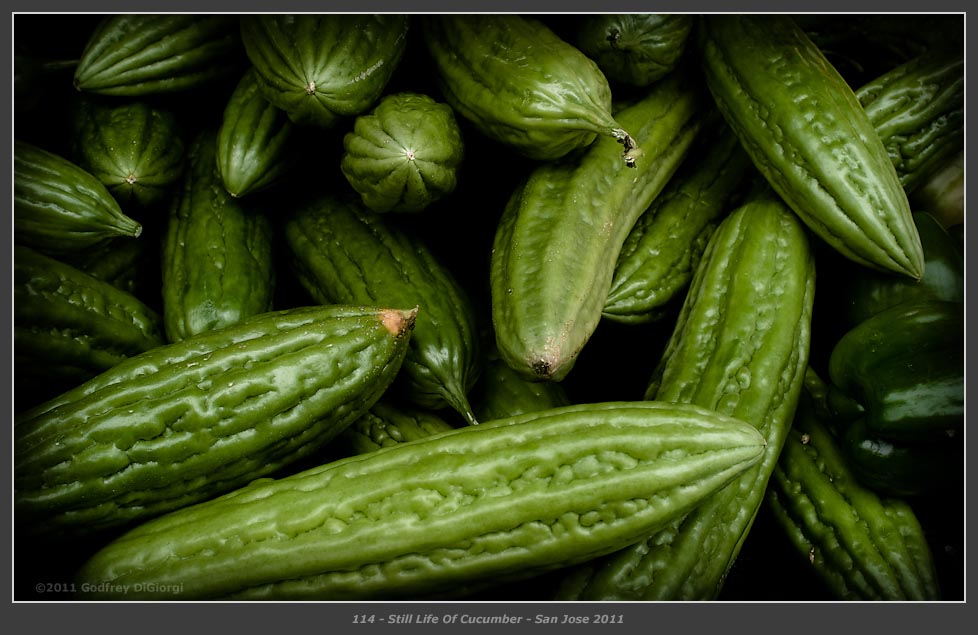
Did manage to make one of my own yesterday, though. It was nice in "Basic Green," but I prefer it in black and white, as any form it might have is clearer to me that way.

And all the best ~
 

Godfrey

Well-known member
Still Life Of Cucumbers


Ricoh GXR + A12 50mm f/2.5 Macro
ISO 200 @ f/8 @ 1/60 second

Walking in the farmer's market this morning, these cucumbers struck my eye.

Thanks for looking, comments always appreciated.
 

jonoslack

Active member
Godfrey - I like communicating 52, and 54 is great (if a little glib), not so convinced by 53 (Gombei isn't enough is it?). The cucumbers are dense and concentrated and work really well.

Keith - my everyday walk is through the marshes at the moment (I think it's really difficult) - I agree with Godfrey about the first marsh shot - I think the second one is much better, but still slightly lacking in the killer punch. What I've learned is that you really do have to have compositional structure, there isn't an option - if you don't, however good the light might be, and however well you might have processed and taken the shot, it still won't really work. Marshland photography is really a challenge - it all 'feels' so lovely, but actually grabbing that feeling is really tricky.

Hey - this isn't my thread, I don't have this camera, I'm rudely butting in . . .but there were pictures I really like, and more to the point there are real comments rather than the normal congratulations (I plead guilty) which don't help any of us!

sagar - the iPhone and fingers shot is just the ticket . . . splendid
 

Godfrey

Well-known member
Thank you, Keith!

One back from the last ... "Communicating #53" ... was somewhat surprising to me. I'd been shooting in abysmal light the evening before, doing "high texture" b&w work using ISO 3200, and I'd forgotten to reset the ISO control to something more reasonable. I made this photo in quite normal light at ISO 3200 and was pleasantly surprised to see that it could render so cleanly.

This is a 1:1 detail concentrating on the focus plane line of his fingers and beard:


The only smoothing/noise reduction implemented was all inside Lightroom using the standard Detail panel tools, and it was done pretty lightly. That's pretty darn good for ISO 3200, IMO. :)
 

Godfrey

Well-known member
Godfrey - I like communicating 52, and 54 is great (if a little glib), not so convinced by 53 (Gombei isn't enough is it?). The cucumbers are dense and concentrated and work really well. ...
...
Hey - this isn't my thread, I don't have this camera, I'm rudely butting in . . .but there were pictures I really like, and more to the point there are real comments rather than the normal congratulations (I plead guilty) which don't help any of us! ...
lol ... I like any and all commentary, Jono. As long as it isn't delivered rudely. ;-) ;-)

Thanks for the comments and compliment!

I've been thinking about cloning the "Gombei" sign out of the background on that one. I think it is somewhat distracting ... What's important to me are the expressions and body language of the two principle figures for the purposes of the series.

i'm not sure #53 will make the cut when I do a final sort, grade and assembly of the project. I'm up to about 60-70 candidates in this series (yes, there are several I haven't finished rendering as yet) and it will likely take a bit of curating/culling before I'm done. My plan is to keep shooting on it through the year and then produce a complete set in some form (book, pdf, exhibit, etc) next year.
 

woodmancy

Subscriber Member
Hi Jono

It's appropriate that you chimed in, because I predict that sometime in 2012 (or even ealier) you will have a GXR - if they get the m-mount right:rolleyes:

Ontario marshes are tricky, because they are a bit boring. Here is a more interesting marsh, the Everglades. Not taken with a GXR/P10, but the nearest thing you can get to it, the GX-200 :)

Keith


Godfrey

Well-known member
... I've been thinking about cloning the "Gombei" sign out of the background on that one. I think it is somewhat distracting ... What's important to me are the expressions and body language of the two principle figures for the purposes of the series. ...
I took "Gombei" out, and I do think it strengthens the photo to be without it:


Any thoughts?
 

Godfrey

Well-known member
Keith,

Thanks for your comment on the Communicating #53 re-do. :)

I like the industrial architecture shot, although the tree on the left does distract a bit. The color palette seems slightly subdued, was that intentional or just an artifact of the web JPEG?
 

woodmancy

Subscriber Member
Keith,

Thanks for your comment on the Communicating #53 re-do. :)

I like the industrial architecture shot, although the tree on the left does distract a bit. The color palette seems slightly subdued, was that intentional or just an artifact of the web JPEG?
Hi Godfrey

It is a single image HDR and I deliberately went for the flat color kind of look. It was actually taken in very early spring and in evening sun. I notice that I am tending to move toward lower saturation a lot these days - this maybe a result of dabbling around with the single image HDR process. After I've tone mapped this tends to be the result, but I think I like it.

Keith
 

Irenaeus

Member
another P10 . . .

Keith

I really like this kind of stuff, Keith, and you've done a marvelous job with it. I agree that it's reminiscent of Dali, but it's certainly capable of standing on it's own.

I do like the toned down Lakeshore Blvd. bus stop, too, though, so maybebe developing catholic tastes....

Here are a couple of my own rather different recent ones. The second is a drive by shooting that I think hit the target, but I since like shiny things enough that I'm considering *Madcap Morning Magpie* for a new moniker, I may have been overly influenced by cheap thrills!

And have you, yourself, considered the no doubt as yet unspoken for *Tin Woodmancy?*
 
Last edited:

woodmancy

Subscriber Member
Irenaeus - thanks for the kind comments

I can't get my head around #1 :cool:, but I love the truck. It comes out a titch dark on my monitor. Have you tried it in black and white? I would crop out the overhead wire.

Woodmancy is of my wife's father's three christian names and is his paternal grandmother's maiden name. OK in the eighteen hundreds, but not sure I would name my kid that today :bugeyes:

Keith
 
Last edited:

woodmancy

Subscriber Member
Godfrey's communication series has inspired me to do one myself. I'm calling it "Infrastructure" and it consists of images taken at my condo in Toronto. I'm fascinated by the robotic looking boxes on the top of buildings that keep everyone inside hot or cold depending on the season. There are also masts, towers, dishes, stairwells etc that provide a wonderful source of abstraction - especially with black and white images.

This one is "Infrastructure #1" Ricoh GXR with P10 lensor

Keith

 
Top