ggibson
Well-known member
I did a color comparison between my GF1 and DP1x. To some it may be fairly obvious, but can you guess which is which?
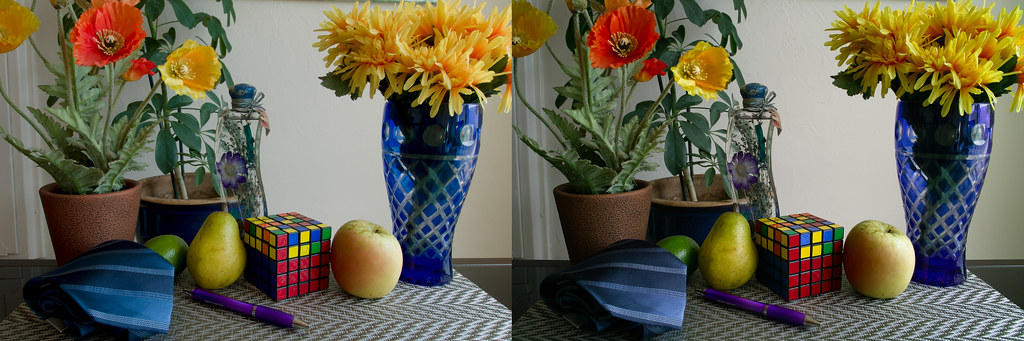
28mm equivalent on both
ISO 100 | F8 | 1/13s on tripod
Standard Color Settings
DP1x exported to JPG first using SPP, GF1 processed with Adobe RAW
GF1 image scaled down and exposure adjusted -0.3 EV in Photoshop to match DP1x as closely as possible for comparison. DP1x was cropped slightly, but this is not a resolution test.
Original size is here:
http://farm7.static.flickr.com/6175/6263066764_5fae48d81d_b.jpg
Left: Panasonic GF1
Right: Sigma DP1x
Conclusions/thoughts:
- Judging from the colors is a difficult way to know which is which. One clue is the green/magenta pattern in the dark areas of the table. My camera also has a bit of that Sigma cyan shift in the corners, which is why the GF1's corners are warmer in color.
- The red on the cube seems to be the "red herring" here. The DP1x pulls off a very nice rendering, whereas the GF1 has a bit of blue in it. I remember reading about past Sigma cameras showing reds as a more magenta hue, but clearly they have improved in this regard.
- I would say that the tie & vase's blue colors are better on the sigma, but maybe slightly too purple. The GF1's rendering of the tie has too much cyan and is oversaturated.
- The yellows in the flowers are too orange in the GF1, but not quite orange enough in the DP1x's image. The DP1x's color may suffer here a bit due to the cyan shift in the corner.
- Aside from the color, I don't judge the results of either too harshly. I tried to focus on the bottle in the center, but there may be some slight variation in focus in other areas. The GF1 does capture a bit more fine detail judging by the details in the bottle, but the difference is slight.
- One thing to note is that the GF1 is using the mZD 9-18mm set at 14mm. It's performing quite well against a prime lens, but you can see a slight bit of R/B color separation in the edges. The Sigma image has more contrast as well, but I'm not sure if this is the lens or a difference in processing.
I originally just shot this comparison for my own use, but I thought it would be at least interesting for others to look at. I like the Sigma's rendering more, personally, though my wife seems to like the GF1's better.