E
ellemand
Guest
Hey you all.
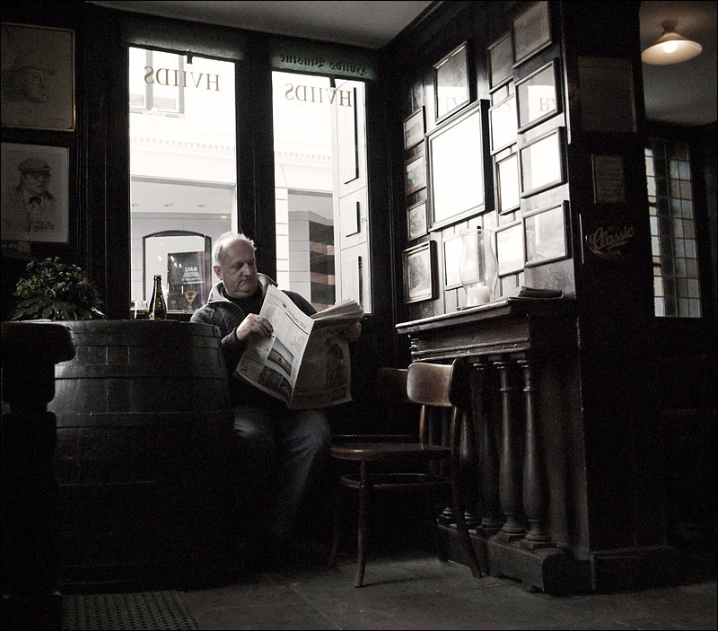
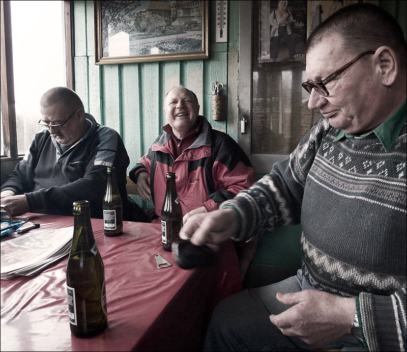
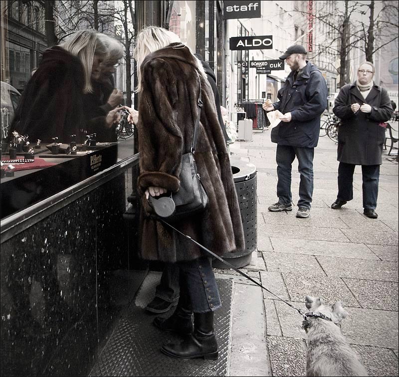
I decided to try out a new "style" than the ordinary b/w, you've seen from me. I would be very happy to hear your opinion.
Thank you very much.
Ellemand
http://www.flickr.com/photos/ellemand/
I decided to try out a new "style" than the ordinary b/w, you've seen from me. I would be very happy to hear your opinion.
Thank you very much.
Ellemand
http://www.flickr.com/photos/ellemand/
")