The Ute
Well-known member
Re: Fun with the Sony A7 Series Cameras( all of them)
Wow !
617 HP is just ungodly.My 617 hp 2011 Camaro, Chantilly Lace, sunbathing.

Wow !
Great to see you here. Join our insightful photographic forum today and start tapping into a huge wealth of photographic knowledge. Completing our simple registration process will allow you to gain access to exclusive content, add your own topics and posts, share your work and connect with other members through your own private inbox! And don’t forget to say hi!
617 HP is just ungodly.My 617 hp 2011 Camaro, Chantilly Lace, sunbathing.
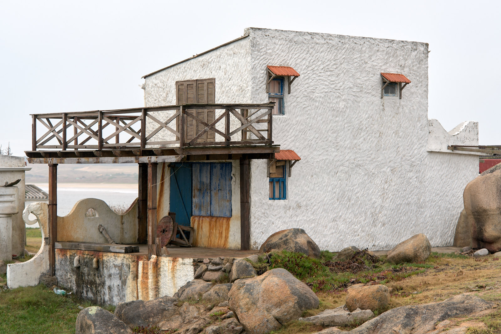
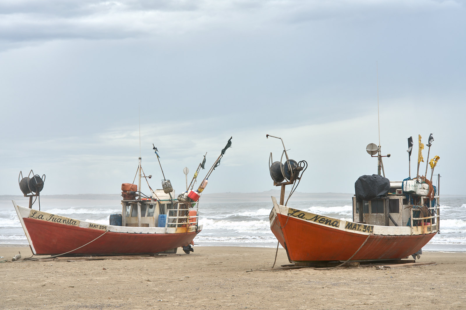
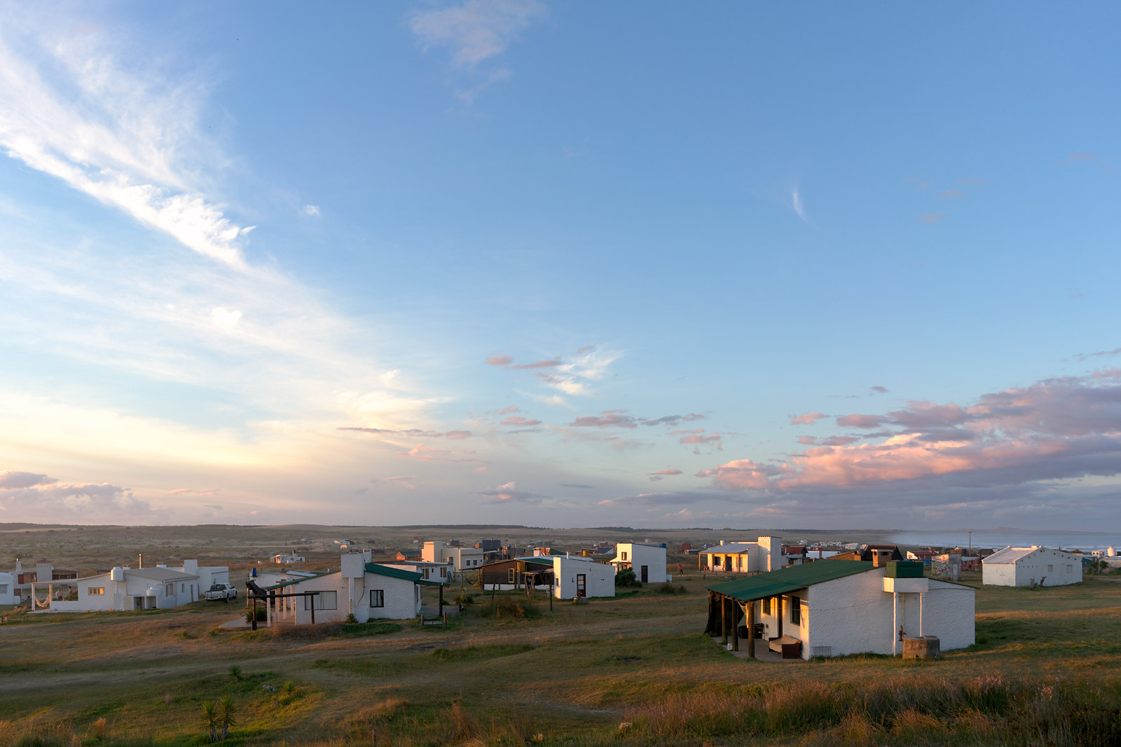
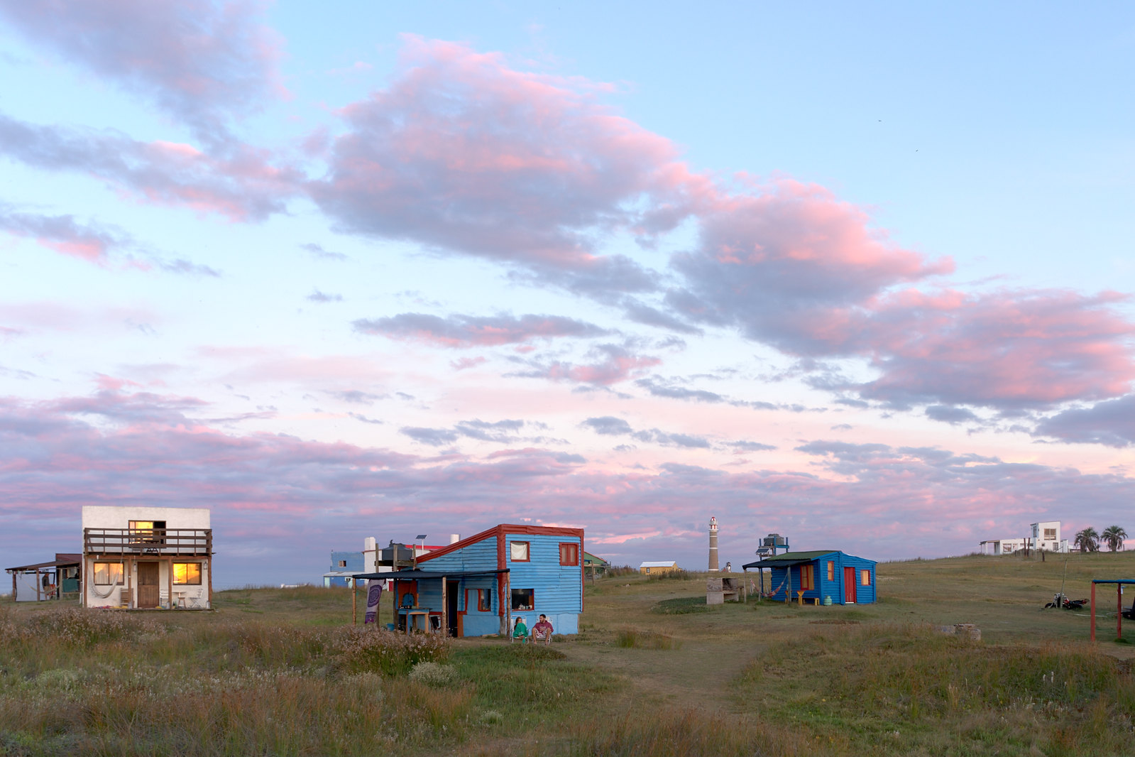
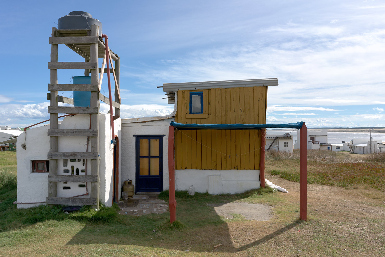
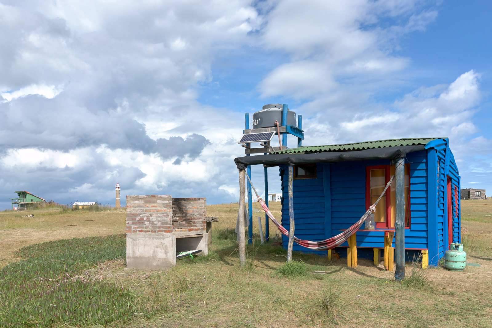
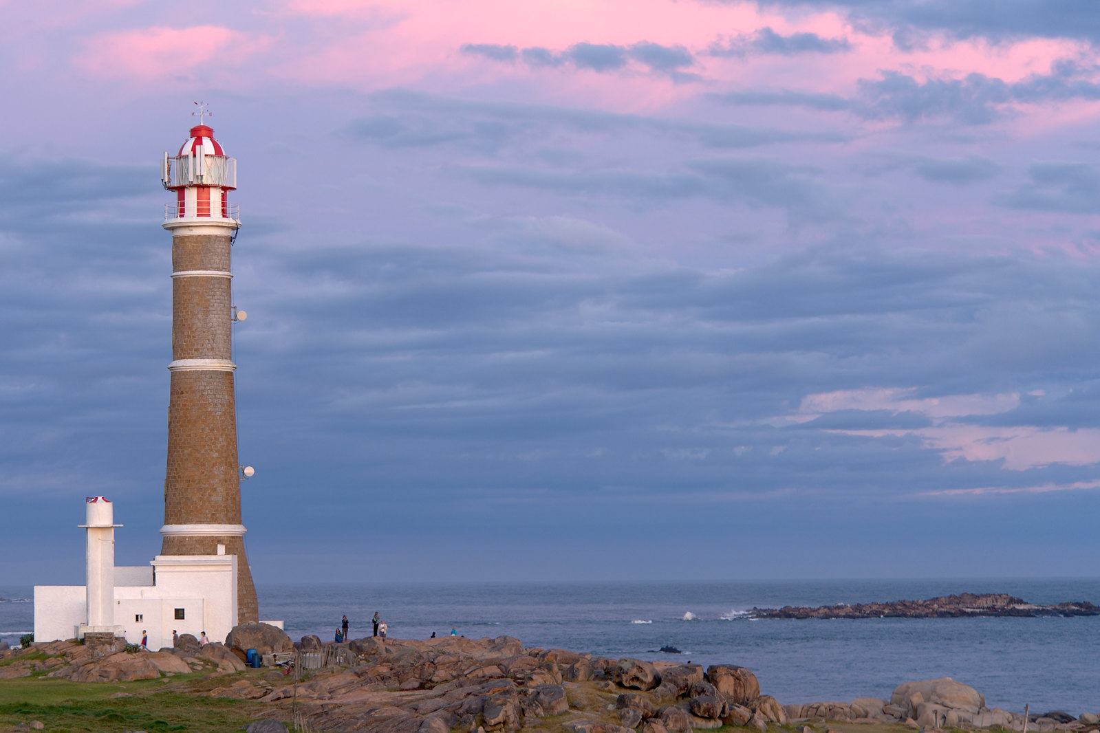
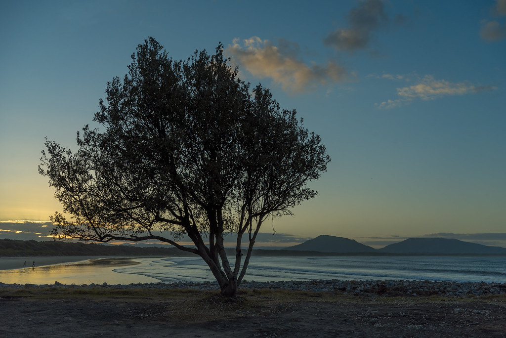
I like the last one the best.I had (at last!) some time to go back to my holiday shots this february. Here are some more of Cabo Polonio (Uruguay):
It's an nature reserve to protect the darvin frog. In the middle of this nature reserve, there is a small fishing village and a few rocks with seals. In the 80s Hippies started to build some houses and a community there. Today it's a tourist magnet and some of the illegal builded houses are out of stone and can be rented.
All shots with A7RII + 28/2 or 90/2.8
(there are some more shots on flickr)
 Norway by christilou1, on Flickr
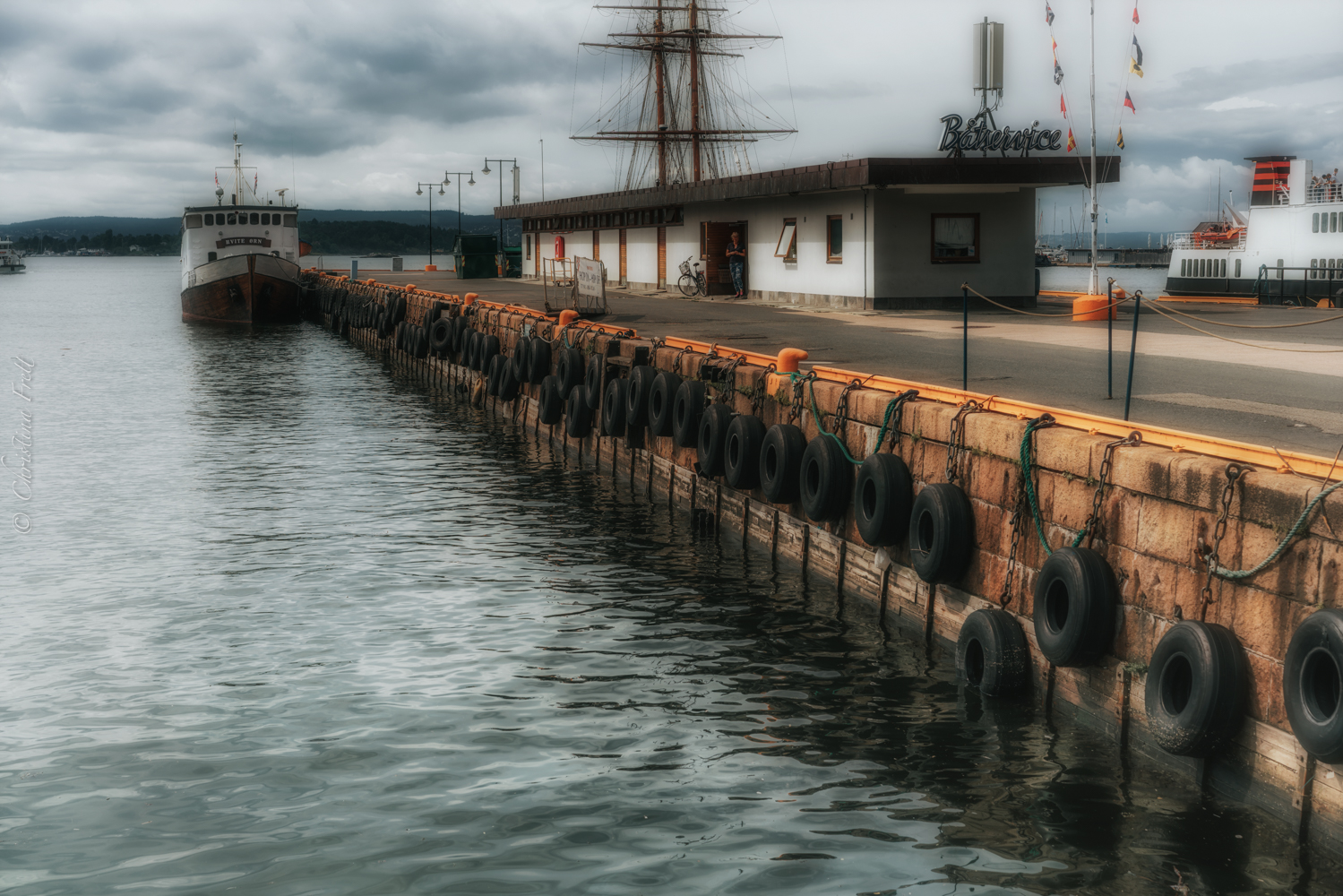 Norway by christilou1, on Flickr
 https://flic.kr/p/JSNsLP https://www.flickr.com/photos/80621138@N05/
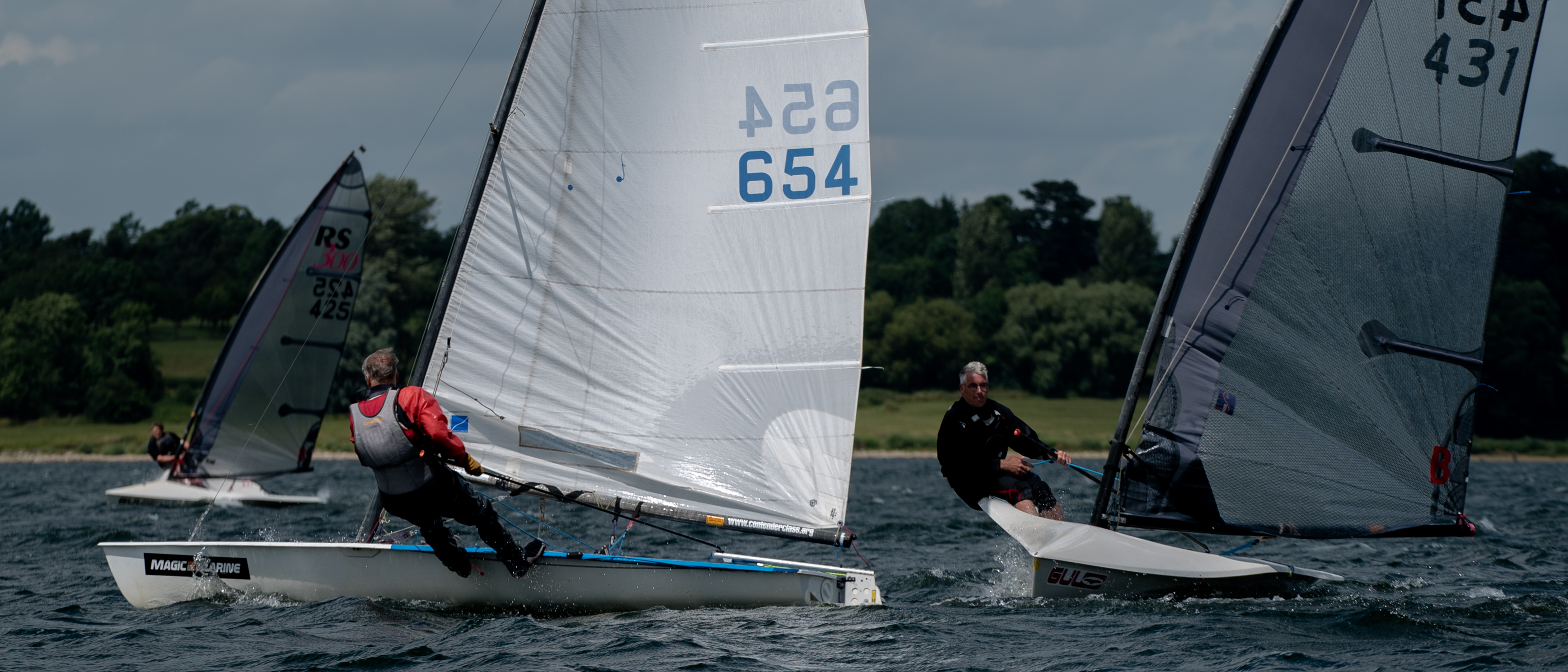 https://flic.kr/p/J4HJaEhttps://www.flickr.com/photos/80621138@N05/
 https://flic.kr/p/HBkUC2
Thanks, I was trying to see if B&W works with a slightly different view. Over all, I think I like the color version better as wellLike this. Do not like the mnochromed version.
")
I’m going to get all critical; please don’t get upset with me! All that follows is personal opinion, of course.Thanks, I was trying to see if B&W works with a slightly different view. Over all, I think I like the color version better as well

I’m going to get all critical; please don’t get upset with me! All that follows is personal opinion, of course.
It’s a nice scene with a touch of menace, with the contrast between death and life as a theme, foreground-to-background. Both renders (was it shot RAW?) are much too contrasty IMO, with inky shadows, particularly in the dead stumps. And I find the colour version, which I also prefer, way too saturated—the blues in the BG are especially distracting. Is there any more sky available? I find the top of the frame a bit heavy. And a small amount of vignetting would concentrate the foreground—I use Capture One’s vignetting tool a lot; it can be used quite subtly.
Re the contrast, I open up shadows with C1’s Shadow HDR tool in just about every processed image from my a7 and Olympus E-M5, unlike with my seldom-used-any-more Leaf back.
I’d like to see a mono reworking of the image with some silvery mid-tones …
Hope you find this POV of some use.
[and is your monitor calibrated?]
I can think of only two ways to further improve this version. One is to even out the sky’s colour and tone across the frame (I know that’s fiddling with Nature!), and I would desaturate the dead stumps somewhat to emphasise their deadness. And on my iMac’s screen, the shot looks a little yellow overall (but I haven’t calibrated for some time).Hi Ian:
Thanks for taking the time for your very thoughtful response - I think you're on the money with everything you say below. I tried to rework the picture with some of your feedback as best as I could. It looks like I've developed some post processing bad habits: aggressive cropping of the sky, a little heavy on the S-curve (that's what increased the contrast and saturation) etc. Also, once you mentioned it, I noticed the blue cast in the tree stump :-(
Anil
Yeah, I'm going to tackle that now (with a somewhat fresh outlook)And a full-range mono version perhaps?
Anil, I like the second version better, there is an obvious WB issue with the first one.Hi Ian:
Thanks for taking the time for your very thoughtful response - I think you're on the money with everything you say below. I tried to rework the picture with some of your feedback as best as I could. It looks like I've developed some post processing bad habits: aggressive cropping of the sky, a little heavy on the S-curve (that's what increased the contrast and saturation) etc. Also, once you mentioned it, I noticed the blue cast in the tree stump :-(
Anil