thompsonkirk
Member
Re: Fun with the Sony A7 Series Cameras( all of them)
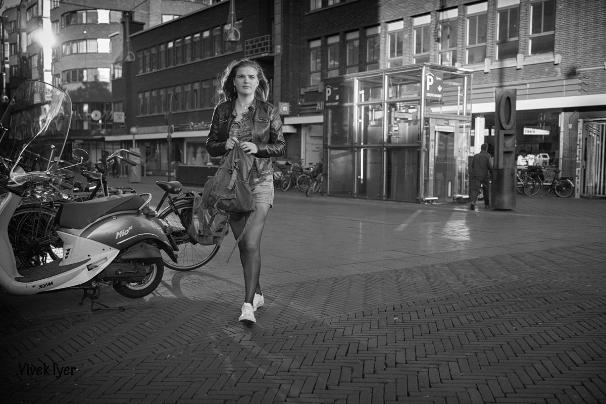
I was so pleased to see seb's first series above, with gentle pastel tones!
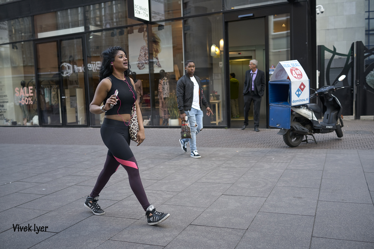
IMO Anil's problem has mainly been over-processing, trying to achieve what's called pop instead of trying to attain a rich tonal range, which is IMO the widest-spread 'sin' that I see on the web - though it's just not acceptable for reputable gallery/museum exhibits, book publication, and the like. The present version has blocked-up highlights. Trying to achieve pop through contrast (or color saturation) too often has this result. Suggest making a Curve to open the shadows more, bring the midrange down a bit, and introduce gradation into highlights. (I think mediumcool and I have similar ideas about this.)
Wandering off topic In the direction of a couple of previous comments: I have trouble when folks discuss the aspects of technique that merge into style by invoking what is an 'amateur' or 'professional' standard. Quality in any field - photography, boatbuilding, ceramics, etc.- isn't a matter of untutored preference, nor of commercial acceptance. There's always a 'state of the art,' and work that's moderately interesting accepts it, while creative work pushes it a bit farther. Neither the web viewer nor the hired photographer has a privileged grip on this. It takes some knowledge of the history of photography and quite a bit of time spent looking at images in galleries or museums or on occasional trips to a library. There's a tradition of excellence, to be viewed and internalized but not just imitated.
Meandering farther, I believe it also helps to take art classes (not just workshops from folks with a gimmic to promote) and to join a critique group with others who are trying equally hard to express themselves.
Just another two cents, and apologies for wandering so far from the topic of images taken with Sony cameras. I tend appreciate it when folks say more than 'Like' and try to help one another with their work. So glad to see others doing this on this thread.
Kirk
I was so pleased to see seb's first series above, with gentle pastel tones!
IMO Anil's problem has mainly been over-processing, trying to achieve what's called pop instead of trying to attain a rich tonal range, which is IMO the widest-spread 'sin' that I see on the web - though it's just not acceptable for reputable gallery/museum exhibits, book publication, and the like. The present version has blocked-up highlights. Trying to achieve pop through contrast (or color saturation) too often has this result. Suggest making a Curve to open the shadows more, bring the midrange down a bit, and introduce gradation into highlights. (I think mediumcool and I have similar ideas about this.)
Wandering off topic In the direction of a couple of previous comments: I have trouble when folks discuss the aspects of technique that merge into style by invoking what is an 'amateur' or 'professional' standard. Quality in any field - photography, boatbuilding, ceramics, etc.- isn't a matter of untutored preference, nor of commercial acceptance. There's always a 'state of the art,' and work that's moderately interesting accepts it, while creative work pushes it a bit farther. Neither the web viewer nor the hired photographer has a privileged grip on this. It takes some knowledge of the history of photography and quite a bit of time spent looking at images in galleries or museums or on occasional trips to a library. There's a tradition of excellence, to be viewed and internalized but not just imitated.
Meandering farther, I believe it also helps to take art classes (not just workshops from folks with a gimmic to promote) and to join a critique group with others who are trying equally hard to express themselves.
Just another two cents, and apologies for wandering so far from the topic of images taken with Sony cameras. I tend appreciate it when folks say more than 'Like' and try to help one another with their work. So glad to see others doing this on this thread.
Kirk
Last edited:

")