W
Wim van Velzen
Guest
hi all,
In this thread Shelby commented that my images were too saturated.
As I always preferred Provia to Velvia in the film days, I was quite surprised to hear that my images were oversaturated.
I then asked for more comments, and more people found the level of saturation too high.
So I want to ask you: which of the versions do you prefer - the more saturated or the less saturated ones? Or should I even trim down further?
1)
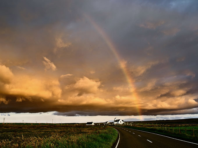
or 2)
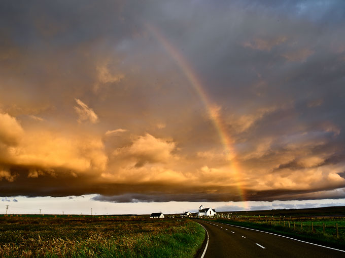
and 1)
or 2)
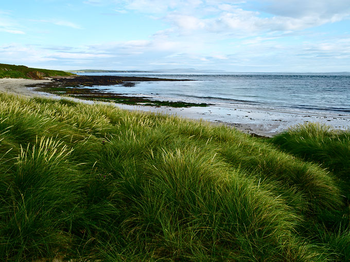
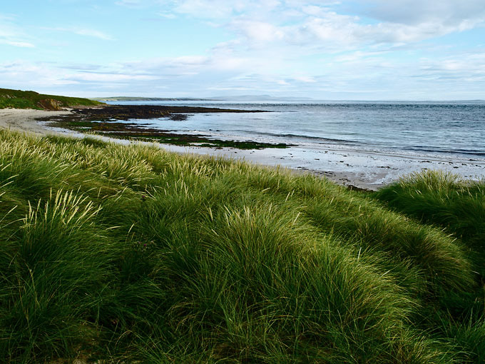
In this thread Shelby commented that my images were too saturated.
As I always preferred Provia to Velvia in the film days, I was quite surprised to hear that my images were oversaturated.
I then asked for more comments, and more people found the level of saturation too high.
So I want to ask you: which of the versions do you prefer - the more saturated or the less saturated ones? Or should I even trim down further?
1)
or 2)
and 1)
or 2)
")