The GetDPI Photography Forum

Great to see you here. Join our insightful photographic forum today and start tapping into a huge wealth of photographic knowledge. Completing our simple registration process will allow you to gain access to exclusive content, add your own topics and posts, share your work and connect with other members through your own private inbox! And don’t forget to say hi!

Image Feedback Request

M

Mark Turney

Guest
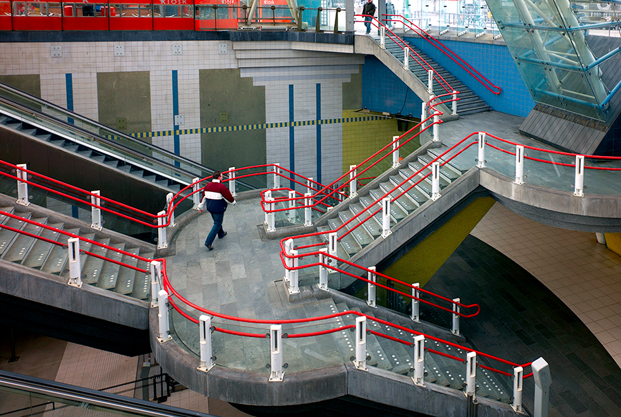
I posted this image in the GRD/GX100/GRDII forum last night; but, this seems to be a more appropriate venue, as I would like feedback. The first photo is the image straight from my GRD as a jpg, with no adjustments other than those set in the camera. The second is a conversion using the jpg as a start and Photoshop CS3's B&W conversion tool, as well as a lot of dodging and burning using layer masks and various blending modes. Please, let me know what you think. Thanks.
 

Jack

Sr. Administrator
Staff member
Re: Image Critique Request

Hi Mark:

I moved your image off my sticky post so you could have your own seamless thread ;) (Makes more sense when others start to post too.)

That said, I like the B&W better, for sure. I think the sky is perhaps too dark and the SPA sign should be highlighted a bit. I like the treatment on the building as-is.

Cheers,
 
M

Mark Turney

Guest
Jack,

Thanks for the feedback. I agree with your assessment completely, especially after a day of letting the image 'sink in'. It's always easier to see these potential modifications with an objective eye (after a good night's sleep), or with the guidance of another, objective viewer.

Thanks also for moving the thread. I think I see now what 'sticky' means.

Take care.

Mark T.
 
M

Mitch Alland

Guest
I agree with Jack about liking the B&W better and about highlighting the sign a bit, but I wouldn't touch the sky as you have a good, expressive print with that dark sky. However, I like strong contrast and have been under the influence of Moriyama Daido's expressionist photography.

—Mitch/Bangkok
http://www.flickr.com/photos/10268776@N00/
 

MoJo

Registred Users
The B&W print is powerful for me, the dark sky really serves to emphasize the building - a tower of light.

I am undecided whether to lighten the sign or not, if lightened it might take away from the center of interest of the building.

My 2 cents.
 

jaapv

Subscriber Member
Well - yes- that was the general idea to emphasize the geometry of the railings.And the architect's too I suppose. But by your comment it seems indeed too much.
 
L

Lewis

Guest
Yea it's a nice shot, but the railings are very prominent! I like the composition though.
 
R

roey

Guest
Jaap,

I like it. I would try to crop out the red stripe at the top, though. It draws my eyes away from the center of the image and with it gone the complimentary green will do a better job of balancing the composition.
 

fultonpics

New member
again, newbie here, but the rail looks over saturated. if you submit to a leading agency you might have a problem with the editors. i realize you did it for effect, but it can be troublesome for some customers. on the other hand it catches your eye.
 

jaapv

Subscriber Member
Jaap,

I like it. I would try to crop out the red stripe at the top, though. It draws my eyes away from the center of the image and with it gone the complimentary green will do a better job of balancing the composition.
Not a bad idea at all, rather a good one, actually :)
 
Top