Special thanks to my friend Bob Freund for his help on this project. As many of you know, I have been searching for a credible digital to mono conversion routine for quite some time. To date, none of the traditional goto methods nor any of the third party plug-ins I've tried have impressed me -- yes even Silver-Fx left me mostly "meh." I've spent a lot of time tweaking C1 color responses and curves and gotten better results, but not truly satisfactory as something has always been there for me to feel it's just not "the same."
Last week Bob told me he was looking forward to shooting some Acros out of his Lecia film camera. I said awesome, please do me a favor and take a well exposed frame of your color checker, scan it and send it to me. Scanning it actually flat turned out to be more difficult than either of us originally assumed, but in the end he got it sorted and we got a very workable file from his Imacon. From it I was able to construct a luminosity response curve in C1 that mimics Acros, and after that was able to build a CMYRGB filter pack that mimics it as well. Armed with those, I built a grain pack and combined them all into a one-button base Acros "style" for C1. This style equates to printing a processed digital color image file out as a fairly "straight process" B&W would have appeared on #2 paper. I am pretty stoked. Here are some before and exemplars:
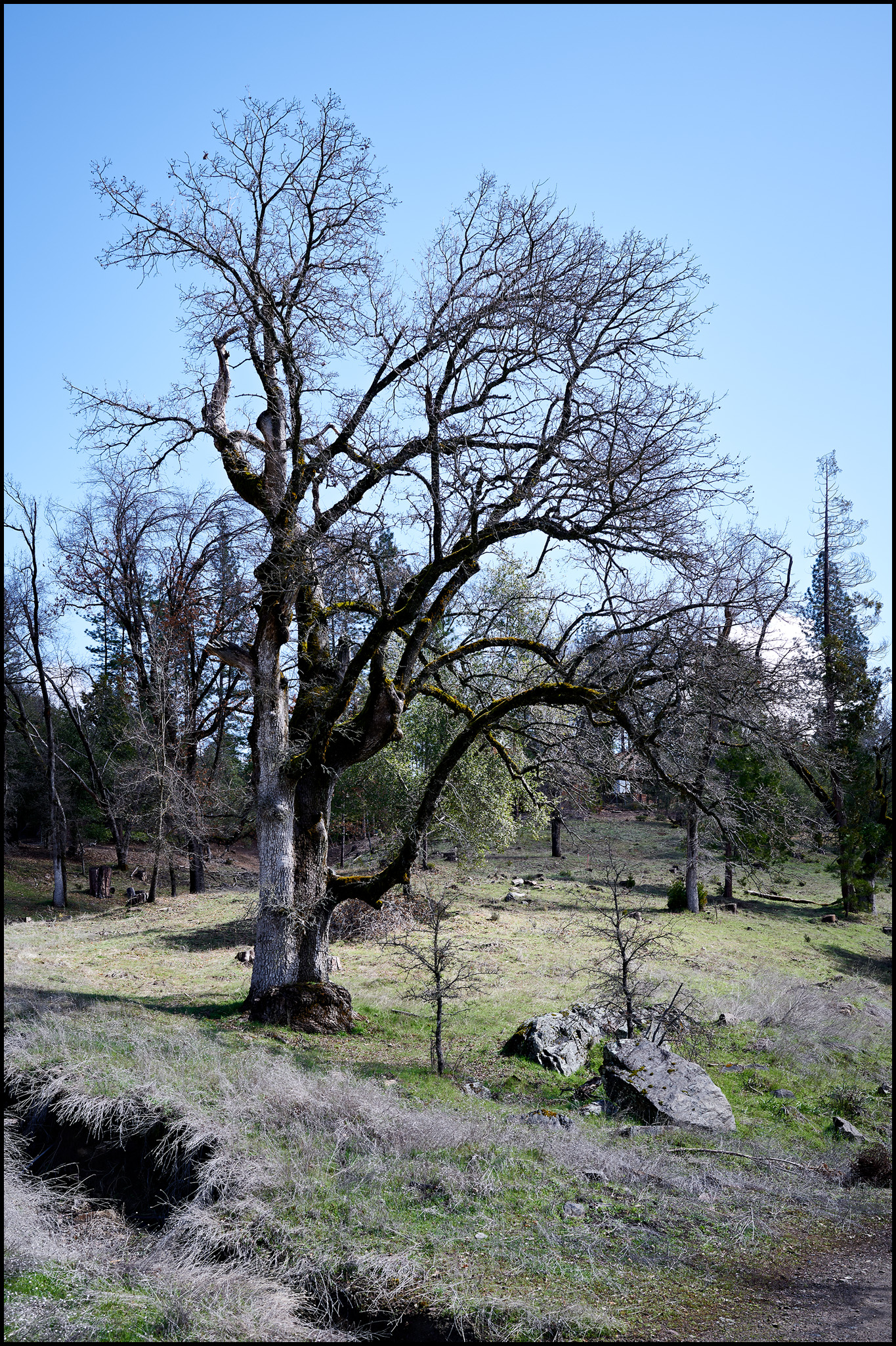
First, the color image:
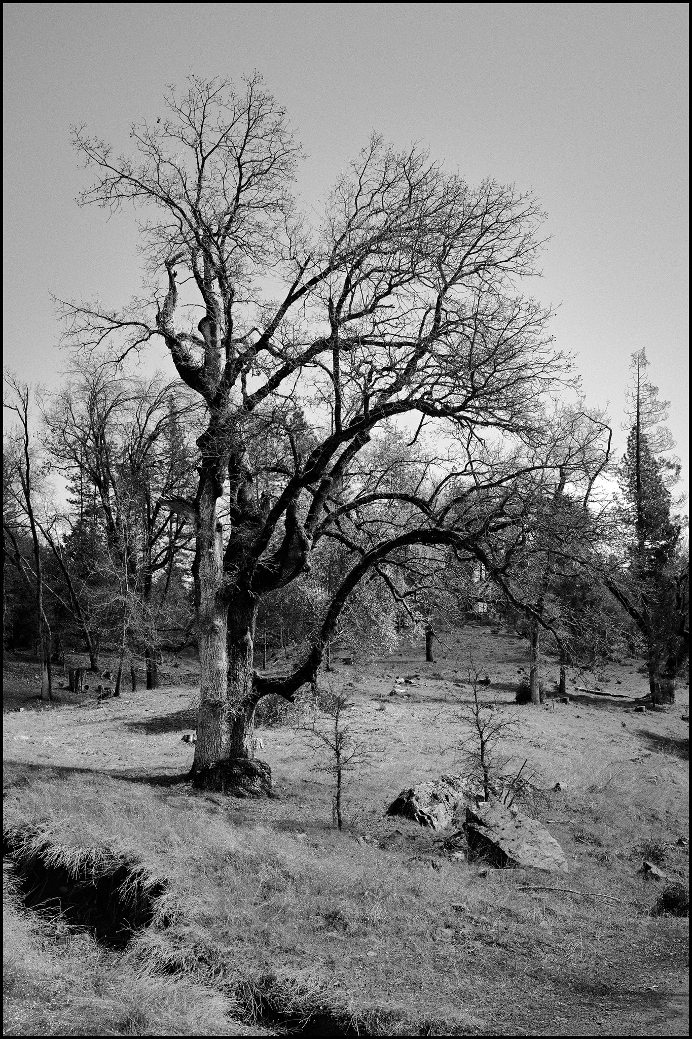
Next, the base Acros style applied to the above image:
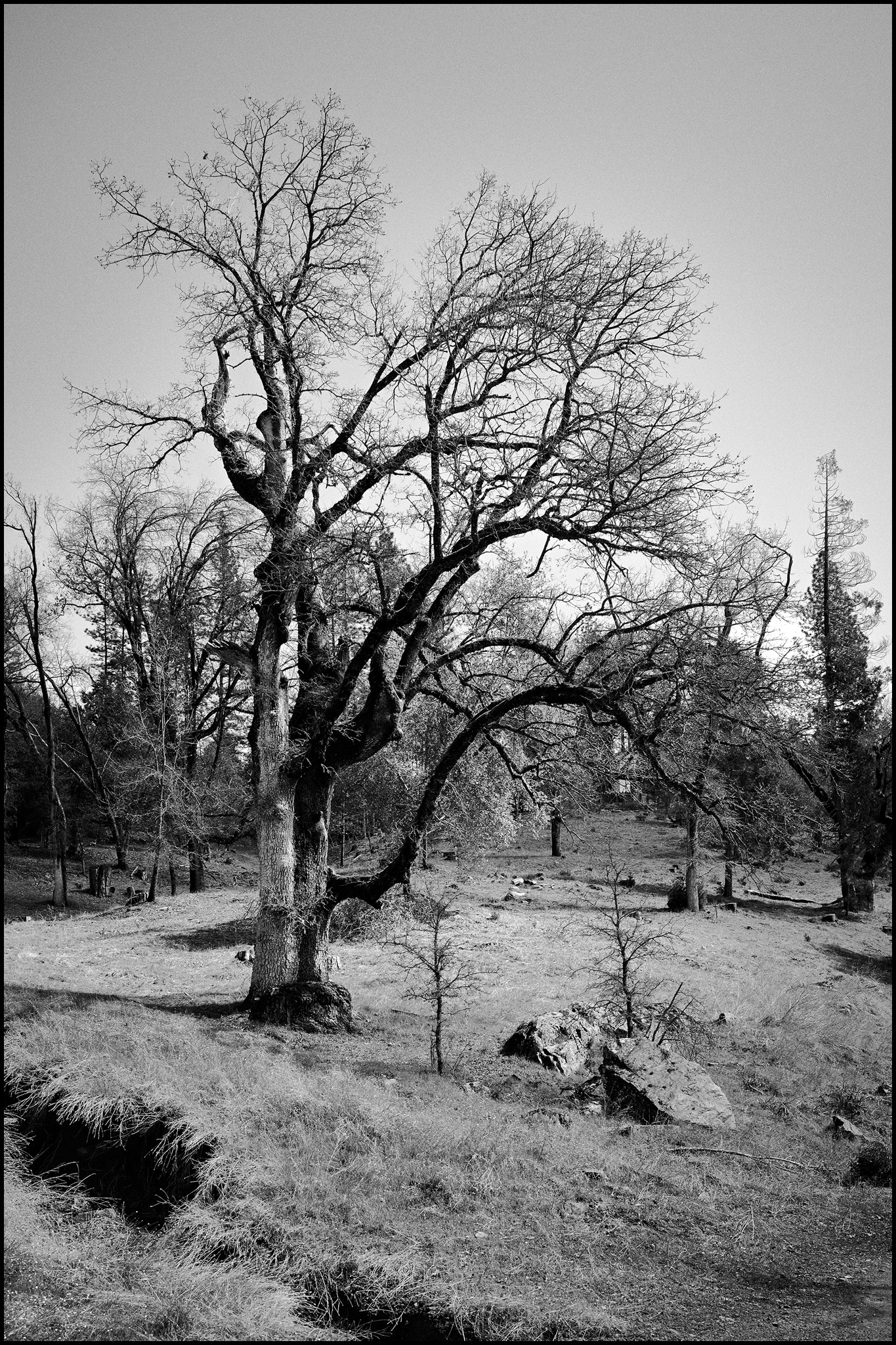
Next, we need to adjust contrast. Here I think the most correct method is to tweak your levels slider to create a more realistic black point and and white point limit to more closely match film DR, which is a good 3 or 4 stops less than most digital cameras are capable of at normal ISO. Of course you can also do this in the curves dialog as well, but for my workflow I prefer to use levels for the black and white point sets. I did build the film curve on the L channel in C1 though, so it leaves the RGB curve flat for more precise user tweaking. But then, with this image I wanted to show some further flexibility with this style that is not so common -- and that is simply using the contrast slider -- yes folks, I can confirm that with a correct film response curve that simple adjustment tool actually works extremely well! So for this image, I simply bumped it 10 points. Somewhat ironically I find that 10 points of contrast in C1 emulates about 1 paper grade in a wet darkroom -- which is incredibly convenient for any of us that ever did any conventional B&W printing! Oh, I did also add a slight "enlarger-like" vignette here for a little more wet darkroom authenticity -- probably should have left that out until the next step, but oh well")
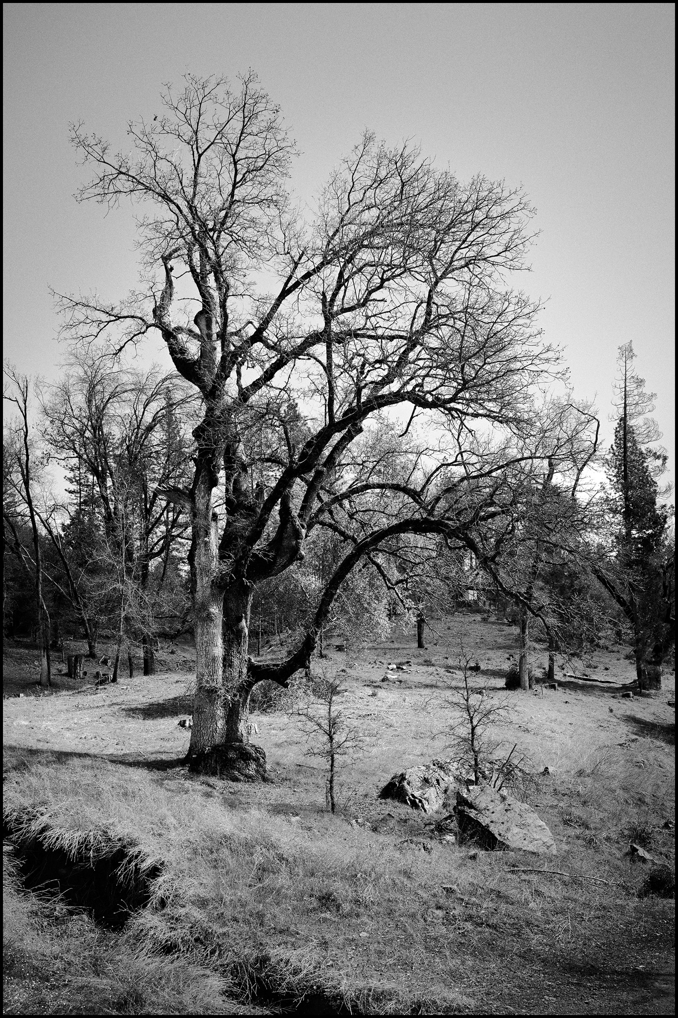
Above with some select layered Dodge and Burn using C1's new style brushes -- which are fantastic BTW!:
And finally just for fun, some finals split toned. This one is the above with a cool-shadow/warm-highlight split tone and a C1 watermark:
And this one with the split toning reversed, warm-shadow/cool-highlight. I'm curious if people prefer either of these over the straight mono -- I am undecided, I like them all, but probably lean most to the straight mono.
C&C welcome!
Last week Bob told me he was looking forward to shooting some Acros out of his Lecia film camera. I said awesome, please do me a favor and take a well exposed frame of your color checker, scan it and send it to me. Scanning it actually flat turned out to be more difficult than either of us originally assumed, but in the end he got it sorted and we got a very workable file from his Imacon. From it I was able to construct a luminosity response curve in C1 that mimics Acros, and after that was able to build a CMYRGB filter pack that mimics it as well. Armed with those, I built a grain pack and combined them all into a one-button base Acros "style" for C1. This style equates to printing a processed digital color image file out as a fairly "straight process" B&W would have appeared on #2 paper. I am pretty stoked. Here are some before and exemplars:
First, the color image:
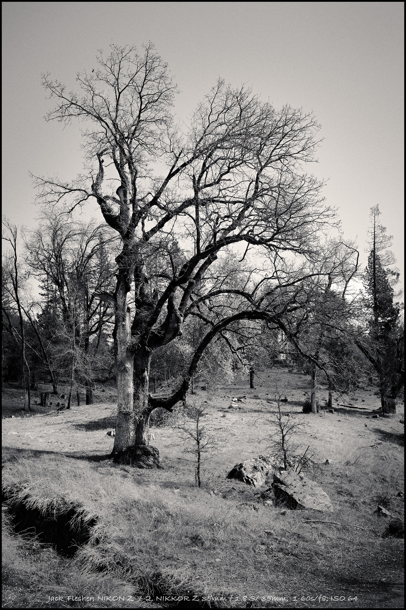
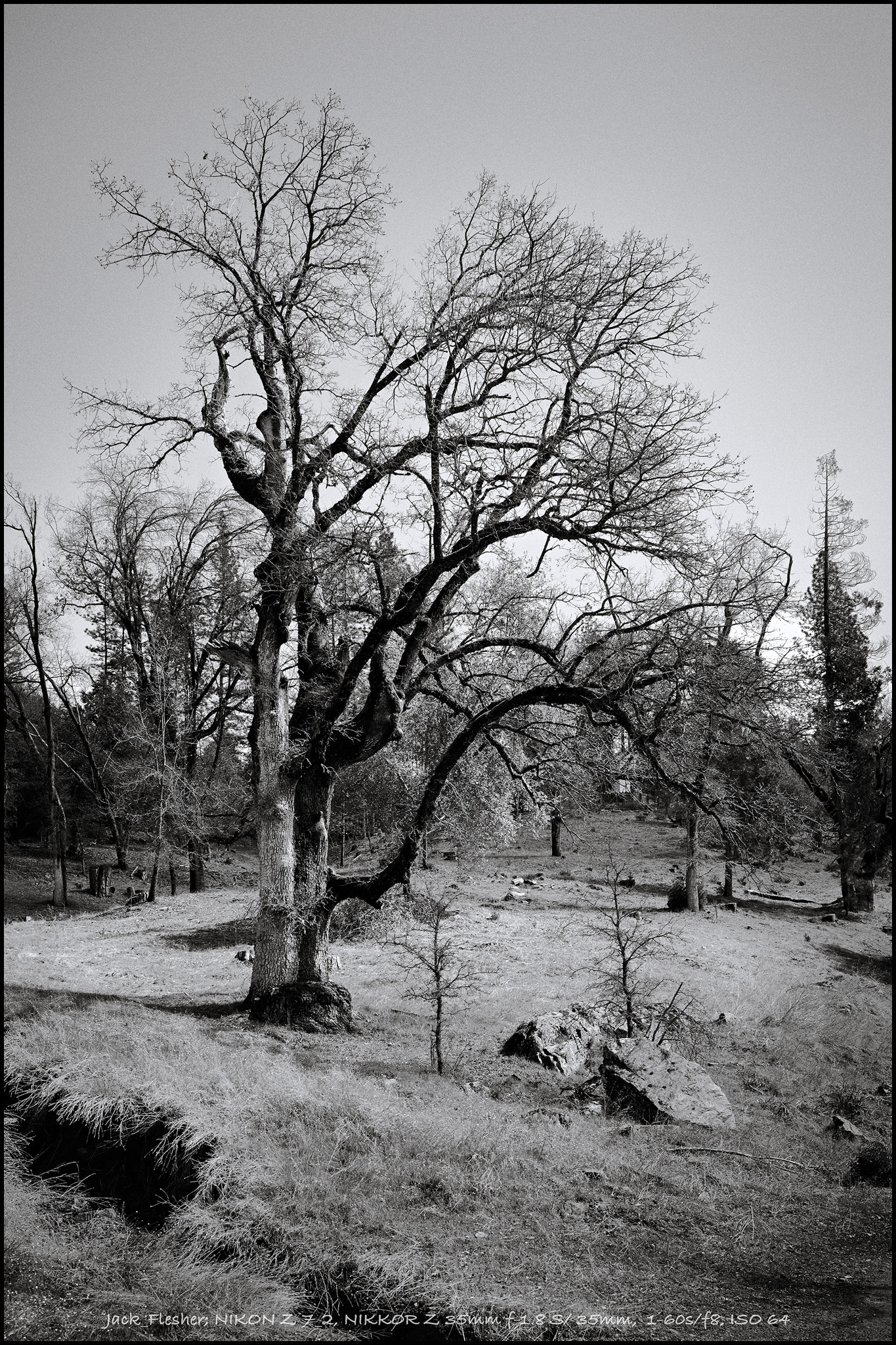
Next, the base Acros style applied to the above image:
Next, we need to adjust contrast. Here I think the most correct method is to tweak your levels slider to create a more realistic black point and and white point limit to more closely match film DR, which is a good 3 or 4 stops less than most digital cameras are capable of at normal ISO. Of course you can also do this in the curves dialog as well, but for my workflow I prefer to use levels for the black and white point sets. I did build the film curve on the L channel in C1 though, so it leaves the RGB curve flat for more precise user tweaking. But then, with this image I wanted to show some further flexibility with this style that is not so common -- and that is simply using the contrast slider -- yes folks, I can confirm that with a correct film response curve that simple adjustment tool actually works extremely well! So for this image, I simply bumped it 10 points. Somewhat ironically I find that 10 points of contrast in C1 emulates about 1 paper grade in a wet darkroom -- which is incredibly convenient for any of us that ever did any conventional B&W printing! Oh, I did also add a slight "enlarger-like" vignette here for a little more wet darkroom authenticity -- probably should have left that out until the next step, but oh well
Above with some select layered Dodge and Burn using C1's new style brushes -- which are fantastic BTW!:
And finally just for fun, some finals split toned. This one is the above with a cool-shadow/warm-highlight split tone and a C1 watermark:
And this one with the split toning reversed, warm-shadow/cool-highlight. I'm curious if people prefer either of these over the straight mono -- I am undecided, I like them all, but probably lean most to the straight mono.
C&C welcome!


