.
.
.
I'm a bit frustrated... I posted a question last week in the Imaging and Processing forum and it has yet to be approved/ posted despite me sidetracking another thread hoping to get someones attention so I am resurrecting this thread of mine to post a new issue I hope someone can help me with:
New Issue below:
Equipment:
PhaseOne camera With Linear Polarizing Filter on lens
Capture One
ColorChecker Camera Calibration software with Passport and their Larger card.
When I create a custom ICC profile and implement it to my images the images all look faded/milky in color. I’ve been fighting this lately and have no idea why.
I'm trying to do my best in producing accurate colored files of my artwork that can be published in magazines and entered into contests. I'm not looking for giclee' quality files just something that represents my paintings well.
Process:
Take photo of oil painting and of color checker card hanging on the oil painting in very controlled studio lighting.
Lights are two LED lights set at 5600 with linear polarizing filters.
Open C1 and crop out the color card.
Change Settings in C1 to:
Under BASE CHARACTERISTICS change to “NO COLOR CORRECTION”
Under CURVE change to LINEAR RESPONSE.
Done with changes.
Screen shot of image with these settings:
Crop around the color card and Export as a TIFF file:
Load into Color Checker Software and it creates the ICC profile and I give it a unique name.
*******
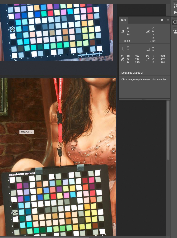
Restart C1 and load my image without the card displayed. See screenshot of image below.
Change Settings in C1 to:
Under BASE CHARACTERISTICS change to the “new ICC Profile”
Under CURVE change to AUTO
Leave “WHITE BALANCE” > “AS SHOT”
Done and image looks like crap. See screenshot:
I have no idea what I’m doing wrong. The only way I can get a decent image is by using my Canon camera and Color Checker software with a new ICC.
The screenshot below is what the image should look like. This image when printed on a calibrated Canon200 printer is 99.9% accurate to the painting. See screen shot below.
Thoughts on what is messed up in C1 that would cause such differences?
*******
Another issue I have been fighting is White Balancing the images either in-camera or post. Using a grey card and setting the WB it completely turns the image orange. I've used several grey cards and all produce the same image. This happens if WB is done In-camera or PP in C1 or Adobe. I've placed the camera closer to the card and farther away and I moved the lights around trying to find something that may help but nothing works. I have no clue why this is happening and the only thing that I can think of is that the LED lights are screwing/falsifying how the camera is seeing the card....thoughts? I've tried setting the LED lights from 5600 to 5200 and no difference, same results.
What about the linear polarizing filter on the lens and lights causing colors to be misread on the card?
Before WB applied and this is close:

After WB applied and this is way off:

Kevin
Attachments