I apologise for not responding directly. No I have not calibrated our monitor.
Until you do, you will have results all over the place. This can be frustrating, but also expensive time-wise (five kids!). And the type of monitor affects your work in that an LCD that uses TN technology—rather than a good IPS-based screen—will show different colours and brightness if you move your head even a little. Unfortunately, the sky’s the limit for monitor pricing, but my iMac and its modest 21.5" screen does a reasonable job. I have previously mentioned macOS’s OK calibration, but don’t know if there’s any equivalent
free alternative for Windows. Hardware calibration is the best solution, but costs.
We have had a number of pictures printed from a high quality company on fine art paper and they all turned out great. So I had figured it was okay.
But, given the cost of prints,
luck can be an unreliable partner …
I do see the greenish color cast but just couldn't figure out how to fix it. Your comments have been most helpful. Thanks.
Firstly, thanks for your gracious reply—not everyone is as charitable/forgiving!
")
Landscapes can be difficult to colour-balance—where are the neutral colours to click on? Capture One has a white balance tool that is quite powerful, and I use it a lot; if I shoot a portrait or an interior, I can place a Kodak grey card in the scene, then balance the colour temperature pretty well with one click; though local adjustment is often needed for best results—but try doing that in a landscape! But please read my comment further down about profiles—it may be helpful for you.
I looked at the capture one software but couldn't figure out which one to download or which one is free with my equipment. I will look into it some more.
Simply download the full version of C1; when you start it up the first time, it will display some big buttons—click on the button that mentions MF digital backs, and you’re laughing. It supports Leaf Aptus backs, as well as the Phase One backs mentioned by another contributor; the profiles for the Aptus 22 are superb and allow you to get off to a good start in processing your shots.
Again I apologise for not putting my best foot forward, you did rightly chastise me for seeking help when I could have done more myself.
Please feel free to continue with the helpful comments. I do value them.
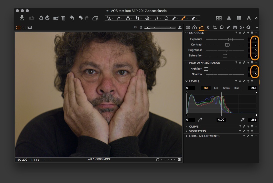
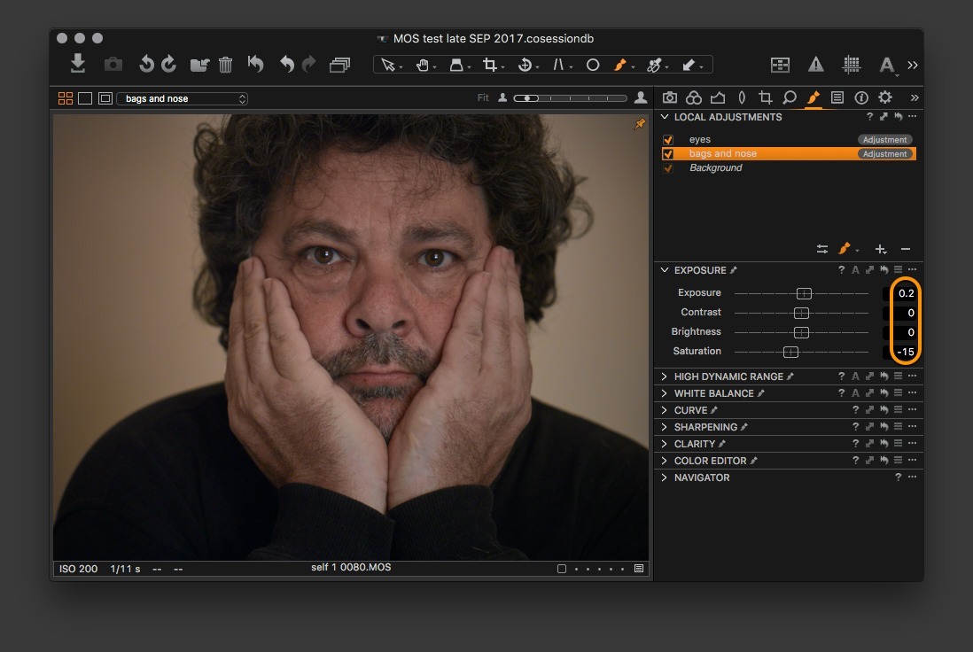
Here is a sequence of screenshots showing how I work in C1 on an Aptus 22 file (from 2011); it may help you get started. Capture One has a very dense interface, and it can be overwhelming trying to work out which tools and controls do what. Tools have their own bar, but there are also tabs in another part of the interface (on the RHS, close to the top) which allow you to go from activity to activity (I start in the COLOUR tab, to work on profiles and colour). Next is EXPOSURE, which controls exposure, contrast, brightness, and saturation. All of these items can be re-arranged to suit the user.
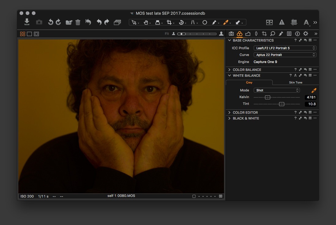
Opening the .MOS file
On import, the pic is obviously under-exposed and yellow/red—window light and tungsten in a cream-painted room.
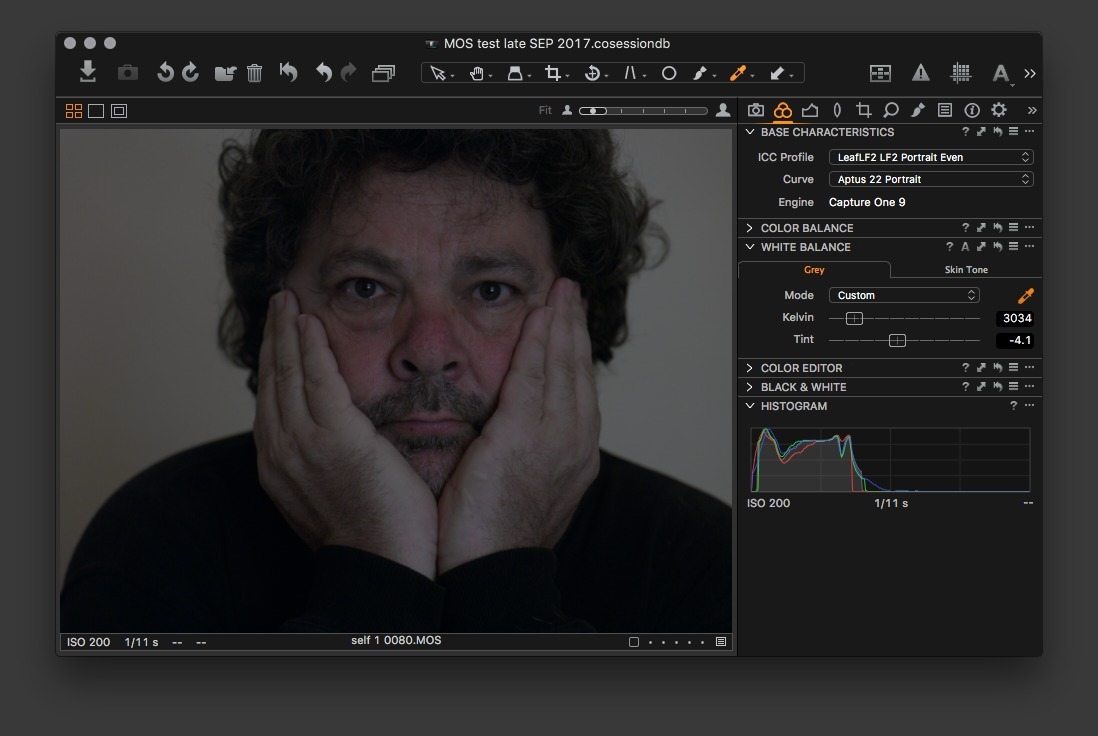
Trying another ICC profile
A little bit better—less red, but still far too yellow. And still too dark.
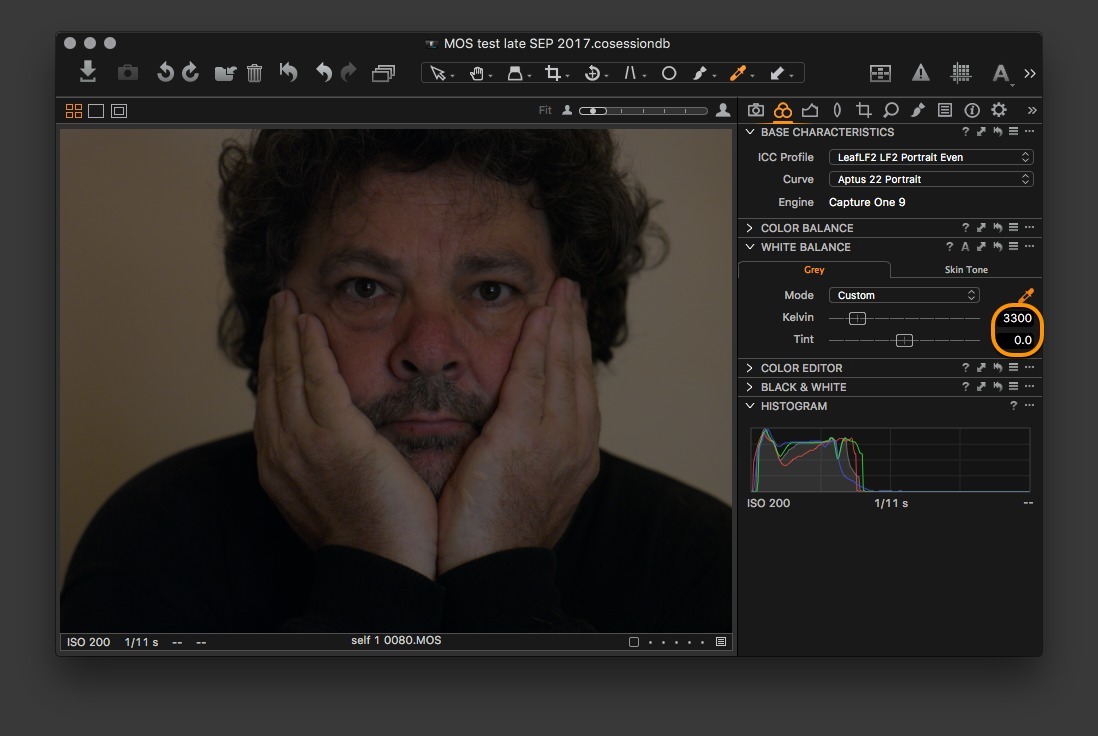
Clicked on the cream-coloured wall with the WHITE BALANCE dropper
This pushed the colour temperature way down, and the tint moved into green territory; but beetroot still becomes a player!
Manually adjusted Colour Temperature by 300°, and pushed Tint to zero
Exposure—adjustments as highlighted
Two adjustment layers
To make me more beautiful—or less old.
Good luck!