ChrisLivsey
New member
This thread needs more pictures:
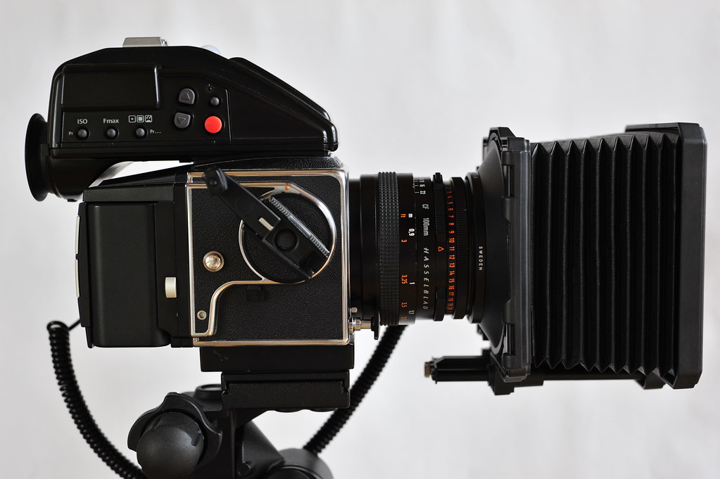
Back is P20
Back is P20
Great to see you here. Join our insightful photographic forum today and start tapping into a huge wealth of photographic knowledge. Completing our simple registration process will allow you to gain access to exclusive content, add your own topics and posts, share your work and connect with other members through your own private inbox! And don’t forget to say hi!


Erik -
At the risk of continuing down a road long travelled, can I ask a few questions, please?
- why not try one of the different 40mm lenses? Regardless of the MTF charts, it is likely there are better examples out there.
- given your rather neutral, or even not-so-happy experience with your MF camera setup, why so much interest in its performance?
- if there is a particular interest in seeing if it can be improved, might you consider Jack's suggestion of C1v9?
Jack,
I agree that one can (only) get the most out of the P1 files using C1. At the risk of dragging this thread off topic (but in the spirit of getting the most out of a V system/MFDB set-up), can one generalize about the benefits of using the C1 "flash" profiles for the other backs as well? I'm shooting on an IQ160 and seem to get pretty pleasing results with it although I certainly don't work with a flash on this particular rig.
Thanks.
John
P.S. Beautiful images, both!


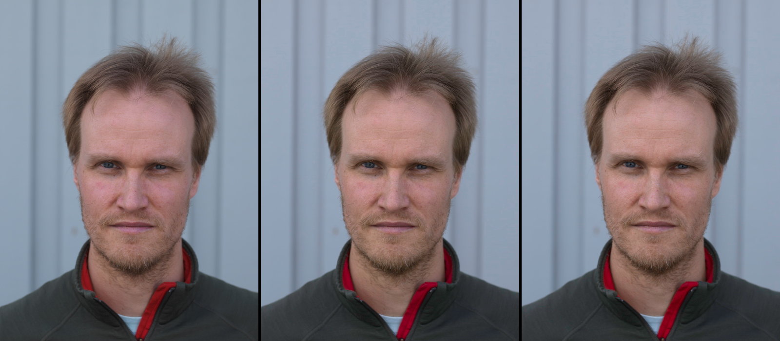
") . To make MFD-style pleasing skintones one need to make some subjective tuning of them.
. To make MFD-style pleasing skintones one need to make some subjective tuning of them.Comments on Erik's DCamProf/LR vs C1 example, with reservation that I'm at an uncalibrated screen for the moment. In this light/setting I actually prefer the skintones from C1, it looks too yellow/saturated with DCamProf, I'm not fully pleased with the C1 result either, but I'm suspecting a somewhat problematic light condition due to the low sun, and possibly problematic makeup. I like the skintone on the left girl's hand which is without makeup and in shadow.
A default DCamProf profile doesn't try to do anything subjective, only correct for perceptual color changes due to the contrast curve (there's no standard to do so, so it's a model subjectively developed with my eyes and a few helping ones). It's intended effect is to make as realistic colors as possible, that is if they're unpleasing in real life they should look unpleasing in the photo
I can clearly see that C1 is the right, due to the yellow cast of most colors (almost as if white balance is different, but neutrals are neutral), bringing out a warm tone which I assume many find pleasing but I just find it untrue and rather prefer a more realistic rendering; if I want yellow I make yellow. However, in my example of a subjective profile ("neutral+") I do add some warmth to yellows and greens to make a more pleasing effect in this type of light (and arguably more realistic as a single white balance cannot really reproduce the eye/brain response at the scene of warm sunlight mixed with cool sky-lit shadows), but less so than Phase One does it (and less global), and actually very similar to how I've seen Hasselblad do it.
C1 and DCamProf contrast curves are similar but not exactly the same, the DCamProf profile has lower contrast. A simple difference in contrast can affect skintones more than one think, as well as transition into whitepoint in the case of high key portraits (not this one). When going further than making a default DCamProf profile carefully considering contrast curve and possibly making a custom one is one key aspect. Often it's a good idea to mimic the contrast curve from the manufacturer.
Personally I think the C1 curve looks a bit too harsh, too much crushing as a starting point, but certainly not bad as a subjective end output for this image. C1 allows you to select different curves though and as part of the contrast is built into the profile itself (eg you can never get truly linear rendering) the color distortions when using a different curve is mild, they have surely primarily designed the profile for the default curve though.
Hi Anders,
We were using one of those "golden" reflectors to lighten up the shadows. So some of that yellow comes from that reflector. Ouch… :-(
I normally don't shoot portraits, but these was an outing with the camera club and these nice ladies so I got this one and a few others.
Processing was essentially minimal.
I may add that I will recalculate those DCamProf profiles. I did not do glare correction and used reference values for the old colour checker (pre 2014).
A few questions:
- My understanding is that you have some "looks", can those be downloaded?
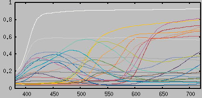
- You have also shot your own home made target, which paper did you use to print it? I have some problems finding OBA free paper.
You are probably right on the makeup, the lady on the left was coming directly from a soccer match while the one on the right was "full production".
Best regards
Erik

| Year | Total | P45+ |
| 2013 | 7490 | 1674 |
| 2014 | 7505 | 1949 |
| 2015 | 7881 | 1013 |
| 2016 | 3489 | 187 |
Erik,
"...very few of my MFD images made it to the wall, although I have a lot of MFD images I really like."
You have written this on several occasions, but have you considered why it is the case?
Could be important.
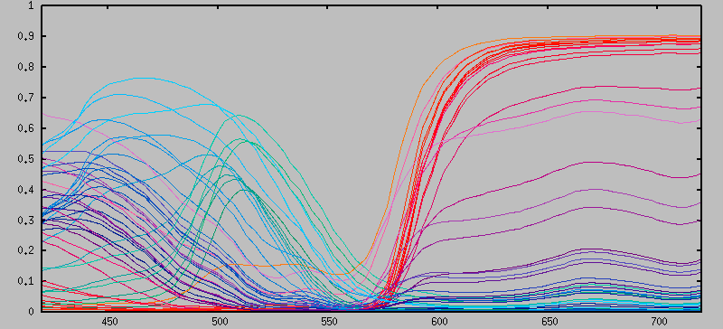
Forgot to answer the second question about the home-made target. First I'd say when it comes to making a profile for general-purpose photography rather than reproduction of a specific subject in specific light it's hard to improve on a simple target like the Xrite/Macbeth CC24.
…
I would say without hesitation, the default renderings in C1 are absolutely the best available for Phase backs of any generation, period!As far as I understand the popularity of C1 over LR as raw converter is mainly for the default rendering, not the tuning possibilities.
I personally think defaults are as good as Capture NX for my D810 files, and beat Sony for their files, but then I know the C1 workflow, so it is my favorite for essentially any other cam it supports. The fact I can create and save a dedicated profile for any camera in multiple shooting/lighting conditions in C1 makes it the goto processor for me for accurate color, but respect others opinions will vary. The facts that its demosaicing is unparalleled and I can edit individual hues so specifically to a desired level via color editor, are what seals the deal *for me* .For now, LR does not recognize the IQ3100 RAW files so I have decided to give C1 a try with this cam. Screens look OK, but so far most color prints looking flat, but I am sure it is my workflow.We can't put color/profiles on a single scale from bad to good, as there's lots of subjectivity involved in terms of look.
Making colors "sing" or images "pop" doesn't mean the same to us all
Say if you know a LR/PS workflow and like it, why not continue with it if you get great results? Believe your eyes. If it looks good, it is good. Sure you can get a little extra in fine-tuned noise reduction (not at all as important with CMOS) and demosaicing (also decreasing in importance with better microlenses and smaller pixels) by using the native raw converter but it's marginal (easy to compare too if unsure), it's not worth dumping your workflow for that.
If you don't get colors to work due to "bad" profiles (=profiles with a look that you don't like) however, you should consider trying something else, or try making a custom profile.