The GetDPI Photography Forum

Great to see you here. Join our insightful photographic forum today and start tapping into a huge wealth of photographic knowledge. Completing our simple registration process will allow you to gain access to exclusive content, add your own topics and posts, share your work and connect with other members through your own private inbox! And don’t forget to say hi!

Me and my Götschmann…

ErikKaffehr

Well-known member
Hi,

I have planned for long to shoot my Götschmann projector and I have include my own head as a reference.

This image was shot with the P45+ on my Hasselblad. It was a small exercise in setting light and an amusing experiment.

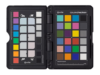
The image enclosed here was processed in Lightroom, using my own profile generated by DCamProf. It was also processed in Capture One using the built in "easy flash" profile. There are two versions, one is with WB set to flash and the other one with WB measured from a ColorChecker. What is your take?

Screen Shot 2017-03-14 at 20.23.19.jpg

Best regards
Erik
 

D&A

Well-known member
Of the three versions posted, the 1st is the most neutral and possibly closer to being more accurate but comes across a bit on the cool side. Since a bit of warmth is generally more attractive, I thus prefer the 3rd image (bottom one). Personally I found image #2, too warm. Again this is my own subjective opinion.

Dave (D&A)
 

ErikKaffehr

Well-known member
Hi Dave,

I think I would agree. This was shot on the P45+.

The image at the top is processed in C1, white balanced on a ColorChecker not present in the image. Centre image is processed in Lightroom using my own profile, while the third image at the bottom is using C1, with white balance set to flash.

Best regards
Erik

Of the three versions posted, the 1st is the most neutral and possibly closer to being more accurate but comes across a bit on the cool side. Since a bit of warmth is generally more attractive, I thus prefer the 3rd image (bottom one). Personally I found image #2, too warm. Again this is my own subjective opinion.

Dave (D&A)
 

jng

Well-known member
Erik,

I agree that #2 is touch too warm. #1 seems to be the most neutral but your complexion looks much healthier in #3, which I prefer.

Cheers,

John
 

Transposure

New member
Erik,
Did you try white balancing on the various portrait patches on the Colorchecker? There are 5 for portraits (left column in photo) and 5 for landscapes (right column in photo).
They are meant to tweak the warmth/coolness to taste.
You should try each of the 5 for portraits and post for opinions.

 
Top