Now that the Trichromatic is back in the barn, aside from satisfying my curiosity I am not sure what I accomplished. I had this idea in my head that development of the TC was for applications that had little to do with what I shoot. Like cultural heritage or some obscure military application. I neither verified or dispelled that notion in my head.
I definitely like the OOC color from the TC better. At least,
better than the three 3100 profiles I compared, with the lighting I had. Capture One gives you "many choices" [ :-} ] of profiles and curves to experiment with. I tried a fraction of those. In general, I like the TC's color because I think it beautifully handles and maintains greens as the white balance is adjusted. Victor and I agree on a lot of things, and apparently this is another one. It is something I've struggled with for a long, long time. Anyone remember using an 81A with Velvia on a cloudy day? I didn't love those results either.
Although I do struggle with C1's white balance, the results I get from that struggle are better than what I get out of LR. My worflow is weird: I import everything into a LR WIP catalog. I try to work on images I like in LR, but usually end up opening that image in C1 and getting a result I prefer because of color nuances. Then I export a tiff into my LR MASTER catalog. Often I do further processing in LR (or PS) after that import. I am pretty agnostic when it comes to LR vs C1. I use them both in a way that suits my personal needs and preferences.
Victor, Erik and I have been bitching about those greens going yellow. But the 3100 is better than anything else I've previously tried in either C1 or LR. Just because the TC is better doesn't make the 3100 a dog. Erik, you are right: it would have been interesting to add the a7rii in the colorchecker images. But the lens would be different, so I am not sure what it would have told us. All I can say is in the past when I've done P1/Sony comparisons for myself, I like the P1 results better. I will not go there since it is easy for others to chalk my preference up to wishful thinking.
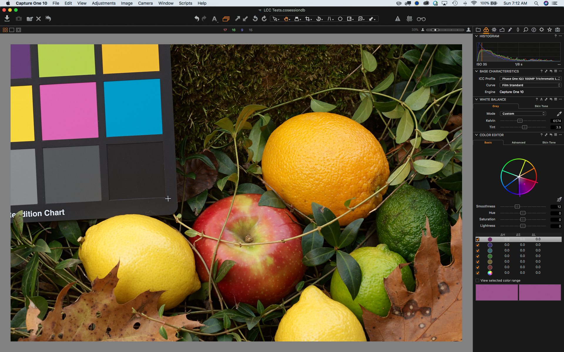
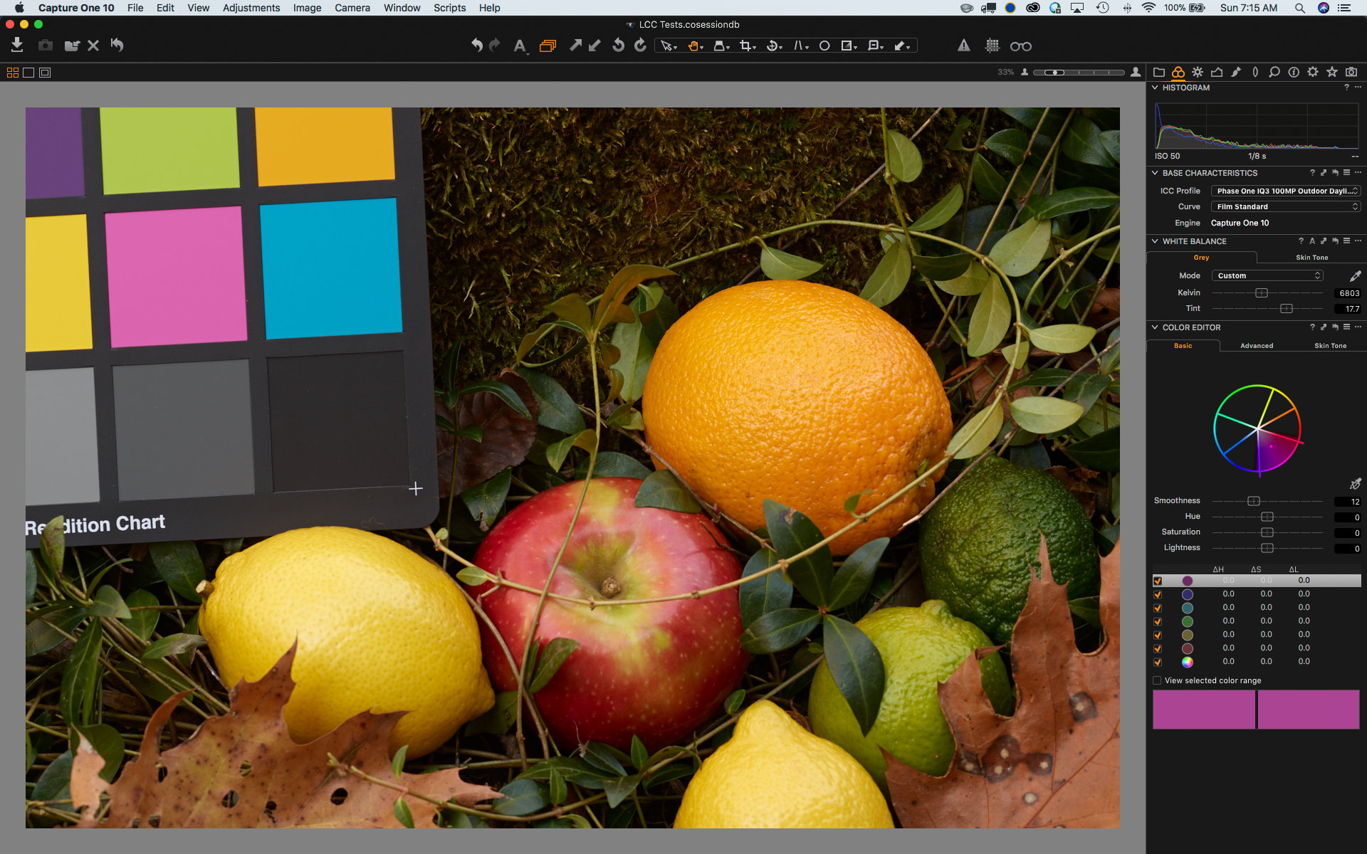
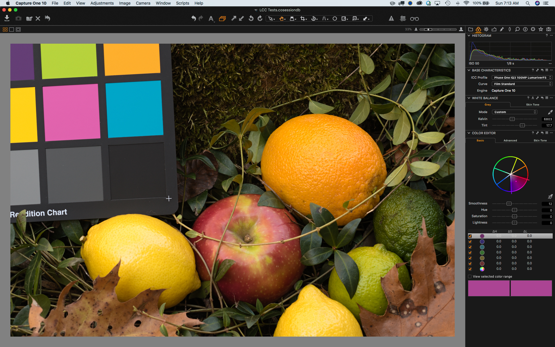
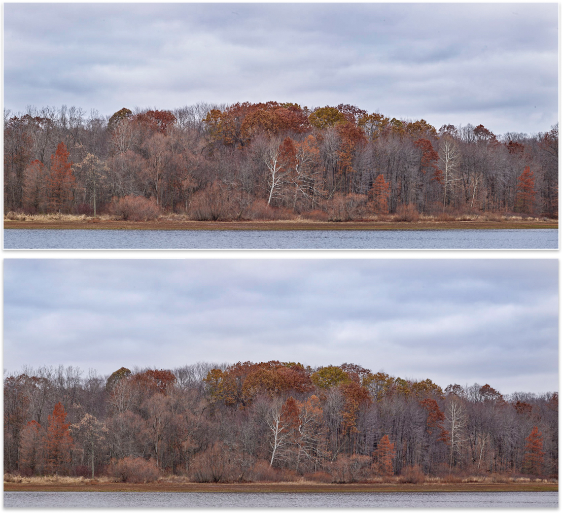
I am happy I went through this exercise. It helped me hone in on that difference, and come up with a way to manage it with the tools I have. Here are the two backs' rendering of the image I previously posted:
I think they are pretty close, and I did not even need to go into C1's excellent color tools to do it. Just a subtle combination of temperature and tint that I couldn't find before. Now, Eureka! **
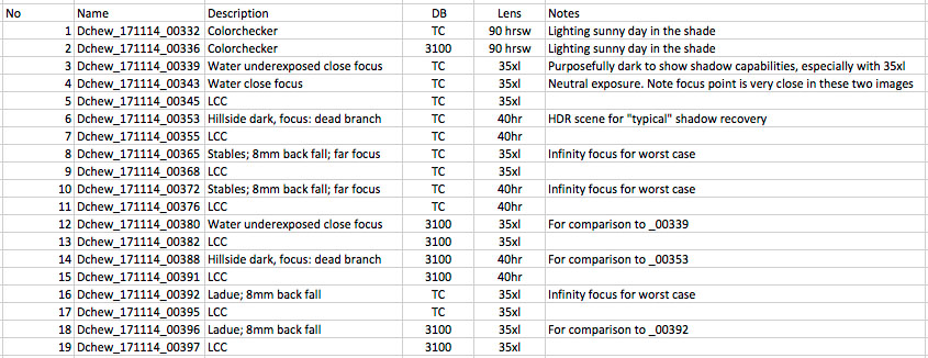
Comparing shadow recovery is even more fraught with "what ifs." The backs don’t expose precisely the same, so comparing is tricky. I do have several different exposures from those water/hillside series, so if anyone wants to see other exposures let me know. For all intents and purposes, I think shadow recovery is identical, or at least within the limits of anything I can tell from a cursory look. I am sure the 35 ISO has some benefit. Maybe DXO will find it in there somewhere…
As for wide angle color cast, that jury is till out in my head. The TC may be marginally better with the 35xl. Hard to really tell because the exposures are not exactly the same between the backs. The LCC's look different, with a slightly different cast in different places.
Am I going to trade in my 3100? Nope. As a follow up to Doug's question of price, indirectly I heard the delta is something around $15k or less. If this was a hardware retrofit option for a few thousand I might do it. Especially if sometime in the future I had to send the back in for other service and I could piggyback the work. But that is not the option. I will continue "indefinitely" (thanks Adobe) into the future thoroughly enjoying the 3100.
Ciao,
Dave
**If you want to know which is which, I'll give you a clue: let's just say my 3100 sensor needs cleaning...