The GetDPI Photography Forum
Great to see you here. Join our insightful photographic forum today and start tapping into a huge wealth of photographic knowledge. Completing our simple registration process will allow you to gain access to exclusive content, add your own topics and posts, share your work and connect with other members through your own private inbox! And don’t forget to say hi!
Fun with Nikon Images
- Thread starter Lloyd
- Start date
- Status
- Not open for further replies.
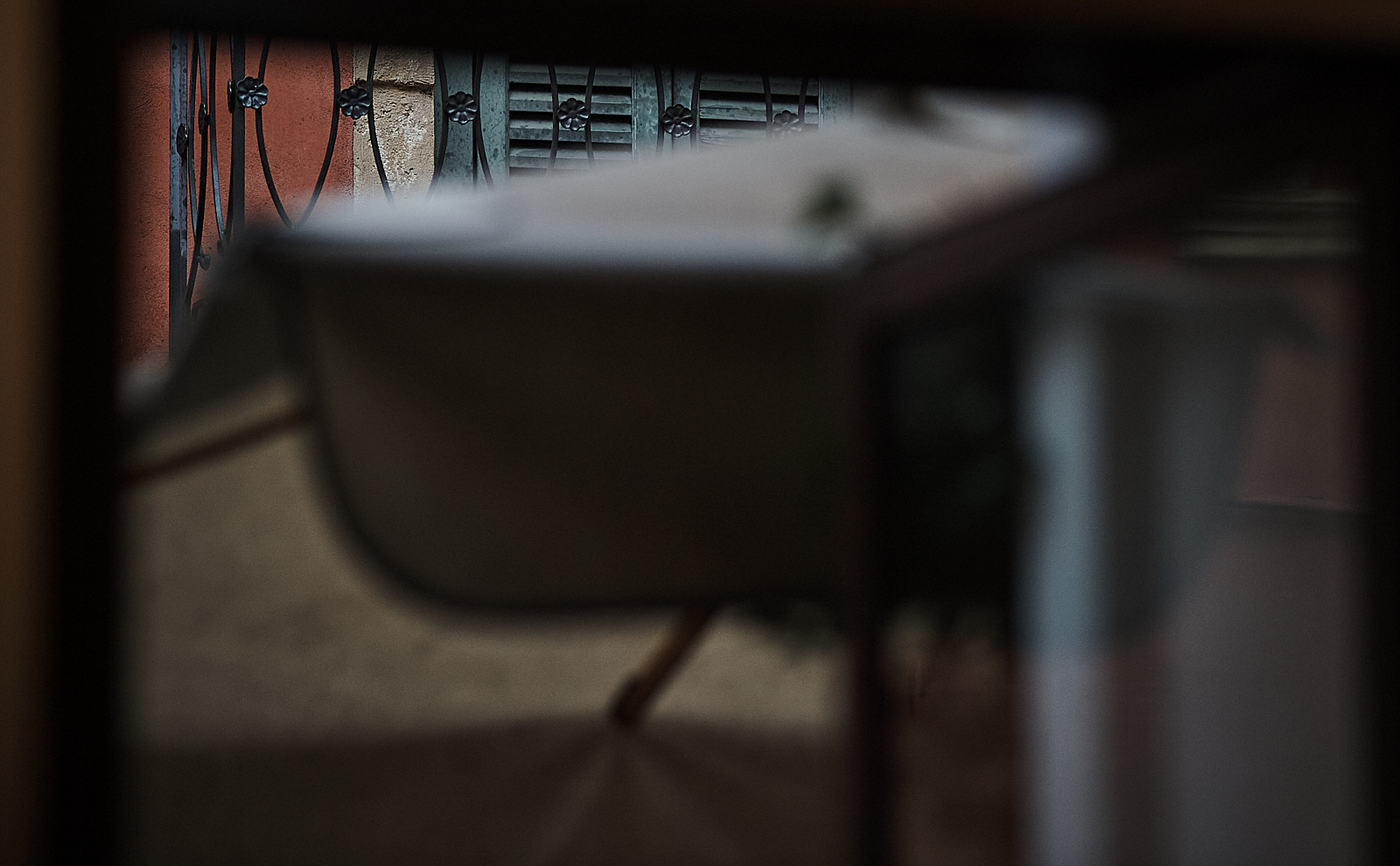
It is a truly remarkable lens, isn't it??? :clap::clap::clap:Waiting for drying up - Verona
the 180/2.8 spatter finished lens - I didn't have any expectations but I'm positively amazed by the possibility’s. The old dream hiding back in the brain, being able to make color pictures with the B&W feeling, might get some inches closer with these old glasses on the Df
Now wait until you find a 28/1.4 asph, same look in a moderate wide :grin::grin::grin: But finding a good one, let alone the price ----- :facesmack:
Already mentioned the 105 DC renders similarly, as does the older 85/1.4 AF-D -- and for my needs decided I don't need both, so stick with the 105, though might be a good match for somebody with the 135DC :angel: But I've yet to find a 50 that is in the same category, though somewhat ironically the Sigma pre-ART 50/1.4 was pretty close.
PS: And I do really love the colors! :thumbs:
Last edited:
Yes :thumbs::thumbs: it certainly is !!! (and I'm afraid I have to bother you all with more Verona seen through it :shockedIt is a truly remarkable lens, isn't it??? :clap::clap::clap:
Now wait until you find a 28/1.4 asph, same look in a moderate wide :grin::grin::grin: But finding a good one, let alone the price ----- :facesmack:
")
Just hush hush, I dare not speaking a word on the issue 28/1.4D (my wife Irene could be in risk reading this...) but I will keep you updated...:angel::angel:
Best Thorkil
It is a truly remarkable lens, isn't it??? :clap::clap::clap:
Now wait until you find a 28/1.4 asph, same look in a moderate wide :grin::grin::grin: But finding a good one, let alone the price ----- :facesmack:
Already mentioned the 105 DC renders similarly, as does the older 85/1.4 AF-D -- and for my needs decided I don't need both, so stick with the 105, though might be a good match for somebody with the 135DC :angel: But I've yet to find a 50 that is in the same category, though somewhat ironically the Sigma pre-ART 50/1.4 was pretty close.
PS: And I do really love the colors! :thumbs:
...but yes I do also consider the 105DC, but I just (at first) have to fight the feeling, gambling all the pension away....Yes...those colours...
How about the Nikkor 18/2.8D, got a friend who strongly recommend this too..
shockedI recently picked one up -- I have not shot with it enough to say anything yet, but stay tunedHow about the Nikkor 18/2.8D, got a friend who strongly recommend this too..
>>> Earlier I was asked for a D810/Df color comparison. I am house-bound for about the next 4 days, so will take some time to shoot in my backyard and try and deliver some exemplar images of both.

I think the colours are getting considerable cooler when uploading.
Is it just me?
best
thorkil
PS changed to the Spyder5Pro calibrated profile and liftet saturation with +22 and +24 in C1, but stil not the glow from C1, and specially skintones are not there as the more delicate ones in C1 (with 0 saturation)
Is it just me?
best
thorkil
PS changed to the Spyder5Pro calibrated profile and liftet saturation with +22 and +24 in C1, but stil not the glow from C1, and specially skintones are not there as the more delicate ones in C1 (with 0 saturation)
Last edited:
Here is the 28/1.4D, Jack. Got it mint condition.Now wait until you find a 28/1.4 asph, same look in a moderate wide :grin::grin::grin: But finding a good one, let alone the price ----- :facesmack:
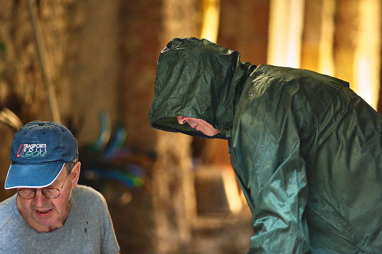
Nice weather in Copenhagen today:

Nikon Df with Nikkor 28/1.4D at iso 450 1/640 f1.4 through C1pro10win
thorkil
Why the Spider pro profile? You now look over saturated and weirdly warm to my eyes. Your above wet Copenhagen color seems over-saturated in the red/oranges and color balance overall off -- looks a lot like a profile mis-match somewhere in your chain if anything to my eyes. The young lady's hair looks brassy and her skin and the man in shorts skin both look glowy spray-tan orange -- I like the composition though!I think the colours are getting considerable cooler when uploading.
Is it just me?
best
thorkil
PS changed to the Spyder5Pro calibrated profile and liftet saturation with +22 and +24 in C1, but stil not the glow from C1, and specially skintones are not there as the more delicate ones in C1 (with 0 saturation)
I use the camera native profile as input profile for C1, and my working profile is usually Prophoto, though C1 does all editing in your selected OUTPUT profile -- and for direct to web images, I of course select one of my pre-sized sRGB output processes. (Alternatively, I will sometimes output the image from C1 as a full-sized 16-bit Profoto tiff from C1, then size and convert for web in Photoshop -- I have built web-converter actions expressly for this purpose that will size to a given set of sizes and sharpen ideally for each size, then convert to sRGB for web views.)
FWIW, I think your above two images from the rainy Verona look great, and would go back to using whatever method you were using there.
Last edited:
Ok, thanks Jack, I will give it at try below in some minutes, at the Copenhagenpicture...Why the Spider pro profile? You now look over saturated and weirdly warm to my eyes. Your above wet Copenhagen color seems over-saturated in the red/oranges and color balance overall off -- looks a lot like a profile mis-match somewhere in your chain if anything to my eyes. The young lady's hair looks brassy and her skin and the man in shorts skin both look glowy spray-tan orange -- I like the composition though!
I use the camera native profile as input profile for C1, and my working profile is usually Prophoto, though C1 does all editing in your selected OUTPUT profile -- and for direct to web images, I of course select one of my pre-sized sRGB output processes. (Alternatively, I will sometimes output the image from C1 as a full-sized 16-bit Profoto tiff from C1, then size and convert for web in Photoshop -- I have built web-converter actions expressly for this purpose that will size to a given set of sizes and sharpen ideally for each size, then convert to sRGB for web views.)
FWIW, I think your above two images from the rainy Verona look great, and would go back to using whatever method you were using there.
Yet another try, from fresh, no crop, not picking up whitebalance, in output "embed camera profile" as ICC profile, no saturation, brightnes down because of overexposed, highligt damping up, some sharpening in output for screen etc., some punch in clarity (11 and 7) so here we give it a try...(the girls hair was almost white)(and yet its more neutral)(by the way, so far....a wonderfull lens)
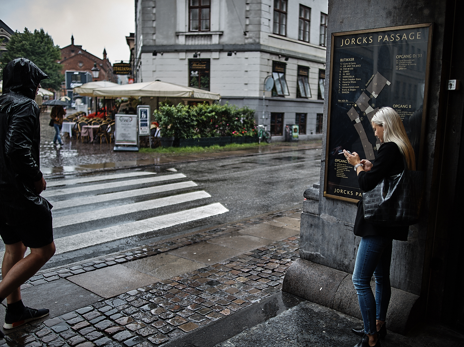
Nikon Df with Nikkor 28/1.4D at iso 450 1/640 f1.4 through C1pro10win
thorkil
Nikon Df with Nikkor 28/1.4D at iso 450 1/640 f1.4 through C1pro10win
thorkil
Last edited:
IMO, the revision is MUCH better! WB is a little cool due to overcast -- do you use Auto WB in your Df? I ask, because I generally find it excellent and advise it over any of the static WB settings unless you have a specific need. Either way, it's adjustable in post if you shoot raw, so not a huge deal, just generally less work with Auto WB in newer Nikons. The way I do it in images like this is to look for a "good gray" in an area that is near the main subject. In this case, I would try a dropper WB on the darker long stain on the building cement side a couple feet in front of the girl's leg and see how it looked. If too warm, try another area or dial the first back a bit to taste. Try that and let me know
IMO, the revision is MUCH better! WB is a little cool due to overcast -- do you use Auto WB in your Df? I ask, because I generally find it excellent and advise it over any of the static WB settings unless you have a specific need. Either way, it's adjustable in post if you shoot raw, so not a huge deal, just generally less work with Auto WB in newer Nikons. The way I do it in images like this is to look for a "good gray" in an area that is near the main subject. In this case, I would try a dropper WB on the darker long stain on the building cement side a couple feet in front of the girl's leg and see how it looked. If too warm, try another area or dial the first back a bit to taste. Try that and let me know
..I always use the Raw's and i always use the AWB in the camera, and its rather good. I did try to find a good light grey to pick up WB from, but went wrong on the backside of round sign on the other side, the settings are matching the verone apart from picking up WB from the cornice above the left open window + some slightly manual adjustment in kelvin and tint, and minor finetuning on the colourwheels...(contrast at +3):salute:
Last edited:
JohnBrew
Active member
When the marsh turns green. D810, 70-200/4 @ 116mm, f11, 30 seconds.
Attachments
-
 886.7 KB Views: 263
A couple gratuitous astro shots from my archives. Was fortunate to do a fly fishing trip to the northern Patagonia region of Chile and got to witness the darkest skies I've ever seen. The first is from a pano showing a shooting star between the milky way and large magellenic cloud, the second the milky way core with a full moon hiding behind a cloud. Taken with the D800E and Nikkor 24mm F1.4 (which as it turns out isn't a great astro lens, at least my copy wasn't, but it was the only camera/lens I had with me at the time ). Not the greatest compositions but it was 4am and the full moon was rising quickly.


). Not the greatest compositions but it was 4am and the full moon was rising quickly. Thanks!Is that lens flare over the tree in the first pic, or a nebula? (I'm not the best astronomer
I'm not an astronomer either, but I think the feature you are referring to is the Large Magellenic cloud (https://en.wikipedia.org/wiki/Large_Magellanic_Cloud), which is a galaxy
Back in Italian mood.
AWB (the AWB2 setting, which preserve colours from warm light), camera ICC profile embedded, no Exposure changing (exposure, contrast, brightnes, saturation) just lifting darknes a tiny bit (just tiny while I do think darknes is just as importent as light, and can contribute to a special balance that can trigger our braincells to not to get too bored, so what seems "out of balance" can actual be a keyword in getting better balance, while the unconscious interpretention in our brain often can overrule our preconcepted view of how things ought to look, and in that gap, in that sort of tension, one might hope to get lucky, that things can happen)(sorry, no more words) and taking highlight down and only modest clarity and structure in punch setting

Nikon Df with Nikkor 180/2.8D at iso 100 1/640 f2.8 through C1pro10win
Verona
thorkil
AWB (the AWB2 setting, which preserve colours from warm light), camera ICC profile embedded, no Exposure changing (exposure, contrast, brightnes, saturation) just lifting darknes a tiny bit (just tiny while I do think darknes is just as importent as light, and can contribute to a special balance that can trigger our braincells to not to get too bored, so what seems "out of balance" can actual be a keyword in getting better balance, while the unconscious interpretention in our brain often can overrule our preconcepted view of how things ought to look, and in that gap, in that sort of tension, one might hope to get lucky, that things can happen)(sorry, no more words) and taking highlight down and only modest clarity and structure in punch setting
Nikon Df with Nikkor 180/2.8D at iso 100 1/640 f2.8 through C1pro10win
Verona
thorkil
- Status
- Not open for further replies.