The GetDPI Photography Forum
Great to see you here. Join our insightful photographic forum today and start tapping into a huge wealth of photographic knowledge. Completing our simple registration process will allow you to gain access to exclusive content, add your own topics and posts, share your work and connect with other members through your own private inbox! And don’t forget to say hi!
Even More Fun Pictures with Nikon
- Thread starter Lloyd
- Start date
Jorgen Udvang
Subscriber Member
Good one, Corlan.Taken a few minutes before, before setting up for the shoot, opposite direction.
Priorities are difficult. There's always the hunt for perfection, and sometimes priorities colide. How two have to good dinners the same evening, and take perfect photos of a somewhat reluctant subject in terrible lighting with a too slow camera and a junky old 85mm? Then, of course, I end up with a photo that is partly out of focus, partly too grainy and partly has motion blur, only to discover that perfection may be just that; an imperfect photo
")
Matt,
She was eating. One doesn't take photos of Thai women eating. One waits for them to apply some make-up and find a "natural" (all but, but never mind) pose, count to three and then take the photo. After several hours of retouching, skin-whitening etc., the photo is ready for publishing, and her friends and her mother will all go "Ooooh, Aaaah".
Last edited:
m_driscoll
New member
Corlan: I missed that connection the first time. I see it now. Very colorful detail at the chocolate shop. Cheers, MattAgreed, the second one is definitely more technically controlled.
To answer your question, well no time to think at the time, what struck me then was the mere contrast between the two groups of three' look and looks which sufficed to make me smile
A nearby chocolate shop was showcasing a colorful selection of treats to help dealing with this year's endless winter:
and yes, i brought some back home

http://mdriscoll.zenfolio.com
Jorgen Udvang
Subscriber Member
Corlan,A nearby chocolate shop was showcasing a colorful selection of treats to help dealing with this year's endless winter:
and yes, i brought some back home
Nice photo, but there should be some kind of warning attached: Not suitable for chokoholics!
The summer has started here btw. Around 35 degrees C every day. You want some?
Lloyd
Active member
Definitely not Spring here yet, several inches of snow today, and still coming down. I do, however, agree with Jorgen's concern about a warning!!Corlan,
Nice photo, but there should be some kind of warning attached: Not suitable for chokoholics!
The summer has started here btw. Around 35 degrees C every day. You want some?
M
mikoo
Guest
Corlan, Beautiful!Taken a few minutes before, before setting up for the shoot, opposite direction.
http://forum.getdpi.com/gallery/files/2/9/6/2/clf_2495b_small.jpg
==
My Bike

Giant Trance X0
--
D300 17-55mm f/2.8


Lloyd
Active member
Nice bike... and nice pix. I especially like the shadow, and the one of the man and the child on the bikes... great light in that one! Looks like everyone was having fun on wheels in these, however. I did about three hours on my bike this morning before the snow started. :thumbup:Corlan, Beautiful!
==
My Bike
Giant Trance X0
--
Jason Muelver
Member
Mikoo, that's a downhill. Bike, yes?
Love the shot of the Guy running in a gee.
Love the shot of the Guy running in a gee.
Jason Muelver
Member
Mikoo, that's a downhill bike, yes?
Love the shot of the Guy running in a gee.
Love the shot of the Guy running in a gee.
Lloyd
Active member
Take a closer look Jason. He's not running, he's levitating!Mikoo, that's a downhill. Bike, yes?
Love the shot of the Guy running in a gee.
Jason Muelver
Member
Jorgen, 35c? Its 35f here in Chicago with light misting rain now. You're mean!
m_driscoll
New member
Re: A PP Critique desired
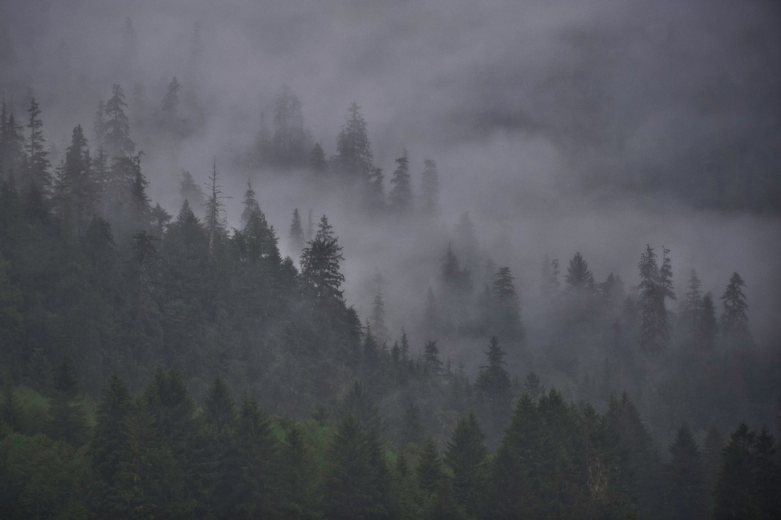
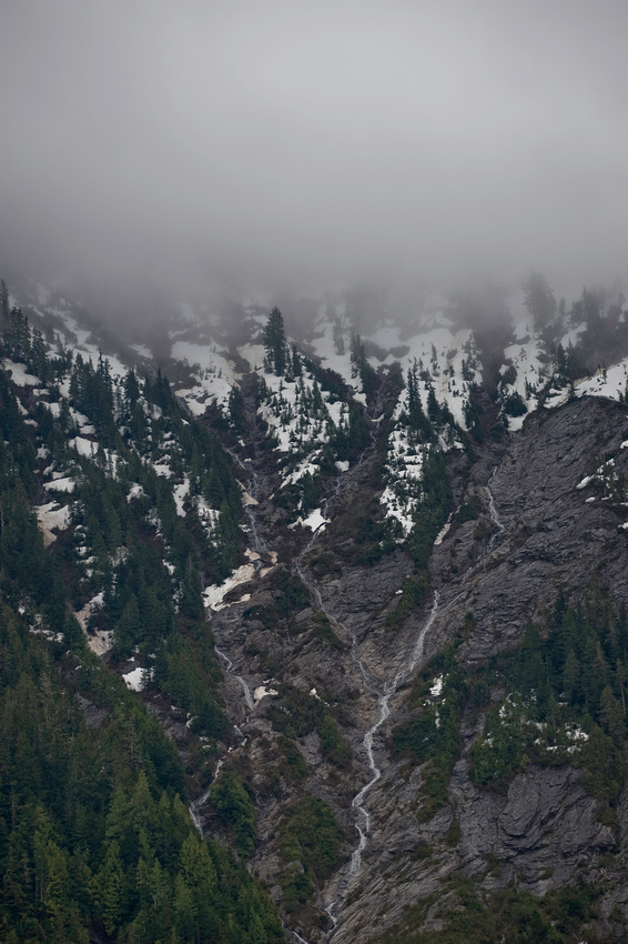
This photo was processed up to a point (Lightroom 2, Nik Define 2.0, and Nik Sharpener 3.0) and then copied and the final processing was done in two different ways. The first was pp'd in Nik Color Efex Pro and the second in Lightzone (pushed towards "HDR"). Any thoughts on which one's better? Thanks for looking and commenting. Cheers, Matt.
D3; 200mm f/2; 1/500s @ f/4; +1 EV; ISO 1600
http://mdriscoll.zenfolio.com
M
mikoo
Guest
Thanks Lloyd. :thumbup:Nice bike... and nice pix. I especially like the shadow, and the one of the man and the child on the bikes... great light in that one! Looks like everyone was having fun on wheels in these, however. I did about three hours on my bike this morning before the snow started. :thumbup:
Yes its a downhill bike and it can go up hill too.Mikoo, that's a downhill. Bike, yes?
Love the shot of the Guy running in a gee.
http://www.giant-bicycles.com/en-US/bikes/mountain/1288/29373/
shtarka1
Active member
Corlan...Like the crop,subject matter & dof! Very nicely done!A nearby chocolate shop was showcasing a colorful selection of treats to help dealing with this year's endless winter:
and yes, i brought some back home
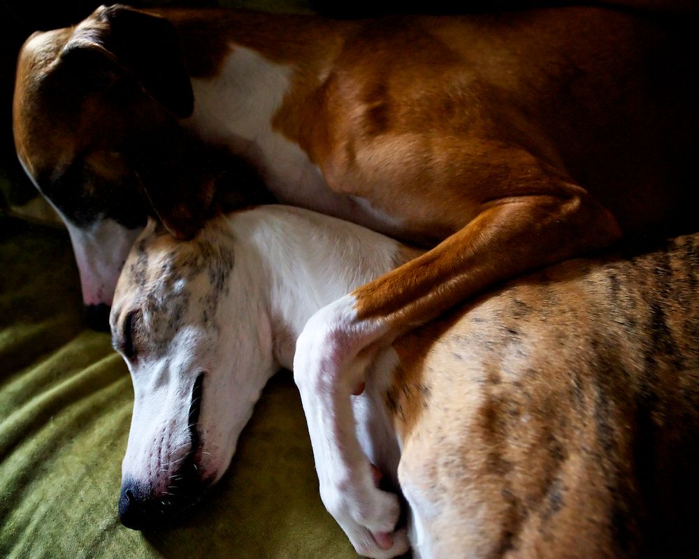
The Cutest! Great B&W Poker set 2!And just plain cute... my girls
Loving the first one Matt!This photo was processed up to a point (Lightroom 2, Nik Define 2.0, and Nik Sharpener 3.0) and then copied and the final processing was done in two different ways. The first was pp'd in Nik Color Efex Pro and the second in Lightzone (pushed towards "HDR"). Any thoughts on which one's better? Thanks for looking and commenting. Cheers, Matt.
D3; 200mm f/2; 1/500s @ f/4; +1 EV; ISO 1600
http://mdriscoll.zenfolio.com
shtarka1
Active member
--
D300 17-55mm f/2.8
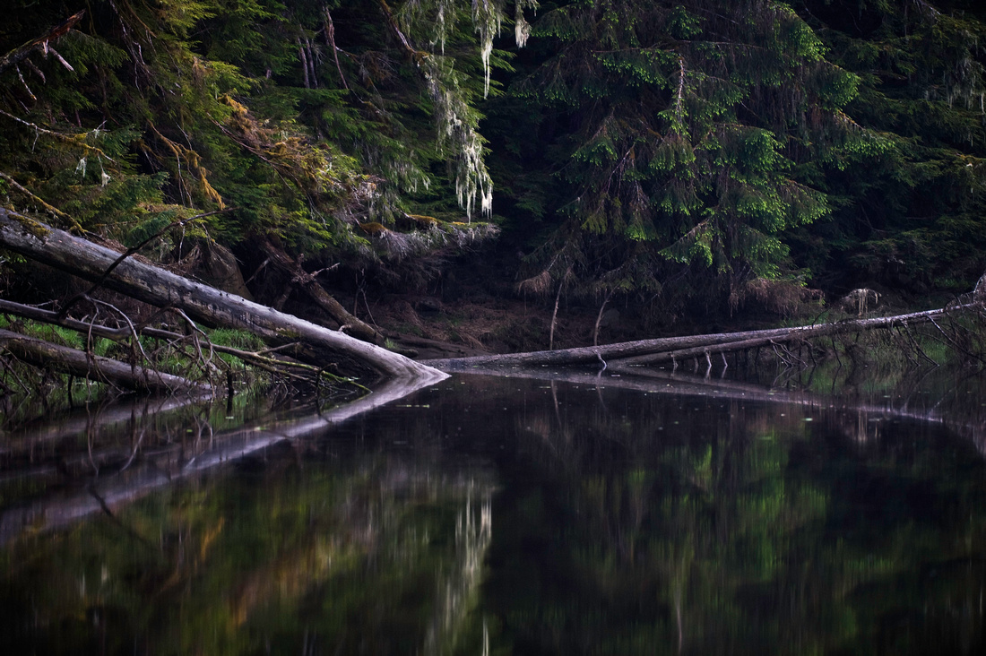
Mikoo this one is Brilliant!
Corlan F.
Subscriber Member
Keen observation indeed :toocool:Take a closer look Jason. He's not running, he's levitating!
And nice series Mikoo, as some others my next favorite is the bike & shadow.
Thanks all for the kind comments -even though i'm not fooled and quite aware that using chocolate as a subject is a major form of expediency when it comes to benevolent feedback
Matt- personal taste i like the soft, more atmospheric rendering of the first one significantly better. Shades of green look more natural here (esp. foreground), so is the fog's texture and cast.Any thoughts on which one's better? Thanks for looking and commenting. Cheers, Matt.
That said, the second version with its extra sharpened zones have some merits. Printing output for display then viewing from a greater distance comes into mind.
I would still distribute the sharpened zones less in the front, for the more progressive approach in the first image posted will allow the beholder to dive into the main subject (fog with emerging trees) in a smoother way.
And in all instances, for this very reason i would try and "heal" (more probably using multi clones) the leafless section in the lower right, possibly blocking the way you want the image to be "read".
In one word, beside the last relatively incidental point, i'd use the first version.
Though depending of the intended use (typically large print or distant display) some of the extra sharpening present in the second version might be incorporated -but only selectively on some tress and not on the foreground, and leaving the fog alone in this regard, too.
My 1/50th
Last edited:
Lloyd
Active member
Re: A PP Critique desired
I also prefer the first. The clouds look more natural (and more white) to my eye. Also, the green in the left-hand foreground appears more natural to me.This photo was processed up to a point (Lightroom 2, Nik Define 2.0, and Nik Sharpener 3.0) and then copied and the final processing was done in two different ways. The first was pp'd in Nik Color Efex Pro and the second in Lightzone (pushed towards "HDR"). Any thoughts on which one's better? Thanks for looking and commenting. Cheers, Matt.
D3; 200mm f/2; 1/500s @ f/4; +1 EV; ISO 1600
otumay
New member
Re: A PP Critique desired
Osman
Completely agree with Lloyd.I also prefer the first. The clouds look more natural (and more white) to my eye. Also, the green in the left-hand foreground appears more natural to me.
Osman
m_driscoll
New member
Re: A PP Critique desired
Thanks again. Cheers, Matt
http://mdriscoll.zenfolio.com
Corlan...Like the crop,subject matter & dof! Very nicely done!
The Cutest! Great B&W Poker set 2!
Loving the first one Matt!
Keen observation indeed :toocool:
And nice series Mikoo, as some others my next favorite is the bike & shadow.
Thanks all for the kind comments -even though i'm not fooled and quite aware that using chocolate as a subject is a major form of expediency when it comes to benevolent feedback
Matt- personal taste i like the soft, more atmospheric rendering of the first one significantly better. Shades of green look more natural here (esp. foreground), so is the fog's texture and cast.
That said, the second version with its extra sharpened zones have some merits. Printing output for display then viewing from a greater distance comes into mind.
I would still distribute the sharpened zones less in the front, for the more progressive approach in the first image posted will allow the beholder to dive into the main subject (fog with emerging trees) in a smoother way.
And in all instances, for this very reason i would try and "heal" (more probably using multi clones) the leafless section in the lower right, possibly blocking the way you want the image to be "read".
In one word, beside the last relatively incidental point, i'd use the first version.
Though depending of the intended use (typically large print or distant display) some of the extra sharpening present in the second version might be incorporated -but only selectively on some tress and not on the foreground, and leaving the fog alone in this regard, too.
I also prefer the first. The clouds look more natural (and more white) to my eye. Also, the green in the left-hand foreground appears more natural to me.
Everybody: Thanks for the thoughtful comments. I agree that the first one is better. I have trouble with processing this kind of photo and maintaining the sense of clouds/fog and depth. Too much color and contrast and it's gone. There were some cloud/fog shots in the Leica M forum a week, or so, ago that were stellar. Corlan: good comment about the leafless section.Completely agree with Lloyd.
Osman
Thanks again. Cheers, Matt
http://mdriscoll.zenfolio.com
m_driscoll
New member
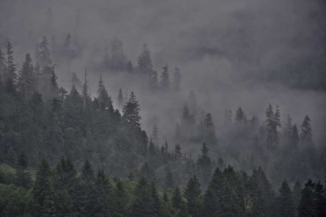
Here's two more. I took the first photo into Nik Viveza 2 and desaturated the tree trunks to remove the purple. They still look tinted on my MacBook Pro and they didn't on the MacPro! Screen calibration? Cheers, Matt.
1. D3; 200mm f/2; 1/200s @ f/4; ISO 1600
2. D3; 200mm f/2; 1/250s @ f/4.5; ISO 320
http://mdriscoll.zenfolio.com
1. D3; 200mm f/2; 1/200s @ f/4; ISO 1600
2. D3; 200mm f/2; 1/250s @ f/4.5; ISO 320
http://mdriscoll.zenfolio.com