The GetDPI Photography Forum

Great to see you here. Join our insightful photographic forum today and start tapping into a huge wealth of photographic knowledge. Completing our simple registration process will allow you to gain access to exclusive content, add your own topics and posts, share your work and connect with other members through your own private inbox! And don’t forget to say hi!

Opinions on image?

sizifo

New member
I'd be grateful for any comments & opinions on this photo. Especially the PP. GRD II - 21mm converter. Am wondering in particular about some of the stuff I'm doing in Aperture. Not sure if the effects are as I see them. Staring at your own stuff too long can make you lose touch with reality.

 
Last edited:

Streetshooter

Subscriber Member
It seems to me on my monitor...somewhat flat....maybe it needs some contrast and some fill light.....
It's easier for me to critique the content of an image than the PP of that image....

you see that white wave out there....yeah, that one in the center...that there be your irritant.....that needs to do what it is supposed to do.....irritate the eye travel....bring it up and make it white but not to loud......

shooter
 

TRSmith

Subscriber Member
Not sure if the effects are as I see them. Staring at your own stuff too long can make you lose touch with reality.
By this I take it you don't trust your monitor? It should pretty much be WYSIWYG.

The image does look flat but it's hard to tell where it started. I would have guessed that the boys were more in shadow and you tried to bring them up by hitting the fill really hard. OR they were really bright and you hit the recovery slider (or whatever the highlight control is in Aperture). Almost looks as if you adjusted so far the tones started to posterize.

What changes did you apply? What was the original like?
 

pollobarca

New member
Sizifo,
I was not getting satisfaction from rawTherapee and Silkypix(free) so I have been trying the Ricoh software bundle. Need to get into the logic of the software but.... I like it now. I also ran your photo (downloaded from flickr)
through PP using the Irodio software. I also have a problem of getting lost in my pictures. I normally give 24 hours from saving to disk before getting an idea about the pix I've taken. I also find that what I think are not so good are the pix that get faved and used......
Hope you dont mind this fix, Auto levels and a bit of sharpening. Cloned out the boat. All in the bundled Ricoh software.
 

sizifo

New member
Thanks for the responses.

I was trying to do something that goes against conventional wisdom, and see if an image with the histogram very far to the left, and almost no highlights, can work. I think the answer is no.

I had done what you suggest, as in the attached examples. What made me pull everything down, was that, if you let your eyes adjust to the dark flat image, it reproduced the atmosphere of the deep evening much better than the conventional renderings. And I liked it better. 24 hours later, I'm not sure at all.

Now I think the best version is probably the darker one of the two attached. But I'm not too fond of the image any more.

Should also note that the original image was underexposed, which made PP quite difficult. This is why pulling the exposure up too far messes up the colors somewhat.

TRSmith, yes I had pulled the sliders way down, and then back up until I thought posterization was no longer visible, that's where I had thought it looked best (but no longer do). Wish I had exposed more.

Streetshooter, very good point about the boat (it is a boat). In other photos that I took before the kids came into the scene, I had waited for the boat to come into just the right position, but when the kids arrived, it would have been better if it was further to the left, but what can one do :). I agree it needs to be made whiter, but I need to export to the dodge&burn plugin, and haven't yet bothered to do it.

"I also have a problem of getting lost in my pictures. I normally give 24 hours from saving to disk before getting an idea about the pix I've taken. I also find that what I think are not so good are the pix that get faved and used......"

Very true.
 

Streetshooter

Subscriber Member
What happens without the boat (wave)....
The eye gets lazy and just sees the overall image....
The boat creates the irritant to not let the eye travel rest
but keeps it moving thru the image.....
 

TRSmith

Subscriber Member
Thanks for the responses.


"I also have a problem of getting lost in my pictures. I normally give 24 hours from saving to disk before getting an idea about the pix I've taken. I also find that what I think are not so good are the pix that get faved and used......"

Very true.
I agree. In fact, that's a big part of the fun. And I highly recommend going back through old stuff now and again to give it a second look. As time goes by, my PP skills change (I won't say get better although that's what I'm hoping for) and shots I dismissed as losers before suddenly seem very different.
 

sizifo

New member
What happens without the boat (wave)....
The eye gets lazy and just sees the overall image....
The boat creates the irritant to not let the eye travel rest
but keeps it moving thru the image.....
Probably more accurately described as a ship, not a boat :)

One of the best things in photography is getting the "irritant" right - especially if it's on purpose - when it makes a possibly good but typical photo into something original.

It is also extremely rare, at least in my case.

I'll attach two examples where I think I've done it, just because I can't resist doing so :) .


In this one, taken a while back, the paper bag makes the image.


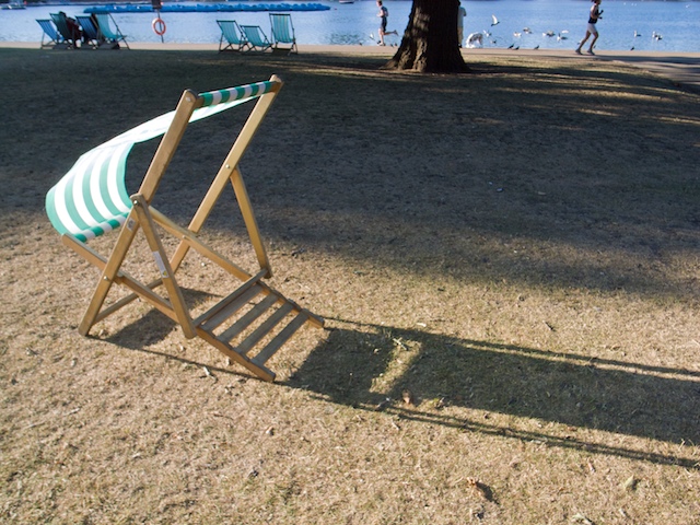
In this one, taken recently, I think the precise arrangement of the runners and chairs in the background may make it (still too recent to be sure). OK, maybe here they don't qualify as "irritants", but close enough.
 

Streetshooter

Subscriber Member
The bag is right.......

The tree seems to be it on the lower one but
those 2 runners in oposite directions is brilliant...
The tree ties the shadows together and brings
the travel down ward.....
Thats a cool image......
Don
 

TRSmith

Subscriber Member
I don't know guys, this whole "irritant" thing. Probably true to some extent, but geez. It's a little like saying that Gwyneth Paltrow is hot because she has a nice gall bladder or a perfect navel.
 

sizifo

New member
I like the idea of some quirk making the difference, and it's often true I think. But not always. Irritant is not the perfect word :)

Supermodels, actors, Gwyneth Partlow, Cindy Crawford, the quirk is usually to do with the face.

On the mona lisa the smile is the irritant - :clap: May use this for the signature.
 

Streetshooter

Subscriber Member
Well in visual arts, there is always an irritant.....most artist/photographers are not aware of that but do it anyway. Regardless of media...we are dealing with eye travel.....
that's what makes seeing work....so, using the tools to your advantage is crucial to getting your message/intent across to the viewer....an irritant is one of these tools....

don
 

TRSmith

Subscriber Member
Yeah, ok. It's there and some use it better than others— If they are aware they are doing it and it's intentional, then it can certainly be a factor. However, in the case of the shot of the chair and the runners, the framing that chops the heads off the runners isn't an irritant, it's a distraction. To me it's a miss. Rather than spending precious milliseconds of concentration attempting to include an irritant, I say use the time to watch your frame edges. So many shots are near-hits because of unconscious framing.
 

pollobarca

New member
Irritant. The truck stopped and the driver was there waiting and waiting I got fed up and took the picture, as the saying goes there are 2 things that are always Brown and 1 of them is UPS


I normally wait for people to walk into empty spaces not for trucks in a pedestrian zone.
 

sizifo

New member
Yeah, ok. It's there and some use it better than others— If they are aware they are doing it and it's intentional, then it can certainly be a factor. However, in the case of the shot of the chair and the runners, the framing that chops the heads off the runners isn't an irritant, it's a distraction. To me it's a miss. Rather than spending precious milliseconds of concentration attempting to include an irritant, I say use the time to watch your frame edges. So many shots are near-hits because of unconscious framing.
I'm getting a feeling there are a few near misses in this exchange. I wasn't consciously looking for an irritant, or anything dumb like that. Never even heard the term used until now, and don't particularly like it, but I feel represents an important concept, whatever name you want to give it. Discussing whether framing is more important than the unfortunately named "irritant idea" is not something I want to get into. Obviously one wants to get everything right.

On a lighter note, as far as the chopping off the heads, I can't say that it was intentional. But it makes no difference to what I like about the image, and I think it's even pretty cool.
 
Top