The GetDPI Photography Forum
Great to see you here. Join our insightful photographic forum today and start tapping into a huge wealth of photographic knowledge. Completing our simple registration process will allow you to gain access to exclusive content, add your own topics and posts, share your work and connect with other members through your own private inbox! And don’t forget to say hi!
Fun With Sony Cameras
- Thread starter fotografz
- Start date
- Status
- Not open for further replies.


KeithDM
Well-known member
KeithDM
Well-known member
Probably 99% of my photography is seascapes. The owners of our favorite tavern/restaraunt (where I exhibit about 70 big framed prints) asked me if I would photograph food to use, among other things, on the Shuttle Bus that runs up and down on the island in season. I do not have a studio, so they were all done in situ. Over head atrium sky lights with natural light, and a reflector that Sharon held to fill the shadows. Even with the reflector (a piece of 20"x30" fome core with aluminum foil on it), the shadows were too dark. I ended up taking three exposures, each 2 stops apart, then blending all three into one image, to hold detail in shadows and highlights.I think worked.
Thanks for looking.....when you see the shuttle whiz by, look for my foodies!
Dave
P.S. Sony A7RII with Sony/Zeiss 55mm f 1.8 Sonnar lens f13. I shot a whole series the week before with my new Fuji GFX 50R and 32-64mm lens, but the minimum focus was not suitable for closer shots like above, The photos were nice and sharp, but just not close enough. I have a renewed respect for food and product photographers!!! My hat is off to you!
P.S. AGAIN: I notice the colors are way off on this post. My Color Space is ProPhoto, which I probably should have changed for these down resed JPGs.
Thanks again
Dave
Attachments
-
 717.3 KB Views: 18
 -
 523.7 KB Views: 22
 -
 574.3 KB Views: 10
 -
 602.6 KB Views: 12
 -
 552.8 KB Views: 10
 -
 589 KB Views: 13
 -
 589.2 KB Views: 17
pegelli
Well-known member
The colours indeed look weird and muted and it may be the colours or the sharpening but they look a bit too crunchy (oversharpened) to my eye at this size. But for an ad whizzing by on a van this might be just what they need (for sharpness, not colours). Even with these colours the food looks good :thumbup:Thanks for looking.....when you see the shuttle whiz by, look for my foodies!
Dave
P.S. Sony A7RII with Sony/Zeiss 55mm f 1.8 Sonnar lens f13. I shot a whole series the week before with my new Fuji GFX 50R and 32-64mm lens, but the minimum focus was not suitable for closer shots like above, The photos were nice and sharp, but just not close enough. I have a renewed respect for food and product photographers!!! My hat is off to you!
P.S. AGAIN: I notice the colors are way off on this post. My Color Space is ProPhoto, which I probably should have changed for these down resed JPGs.
Thanks again
Dave
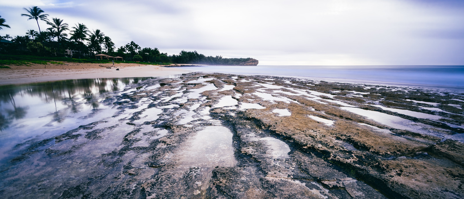
Something different, a photographer on the beach (these days everybody with a phone is a photographer)

A7 + Heliar 40/2.8

Barry Haines
Active member

ggibson
Well-known member
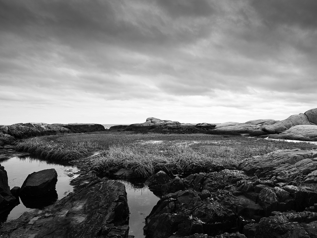
Voigtlander 15mm, 20s x16 exposures in smooth reflection app (5m20s exposure):

Time and Tides by Graham Gibson, on Flickr
Time and Tides by Graham Gibson, on Flickr
ggibson
Well-known member

ggibson
Well-known member
Patrick Kolb
Member
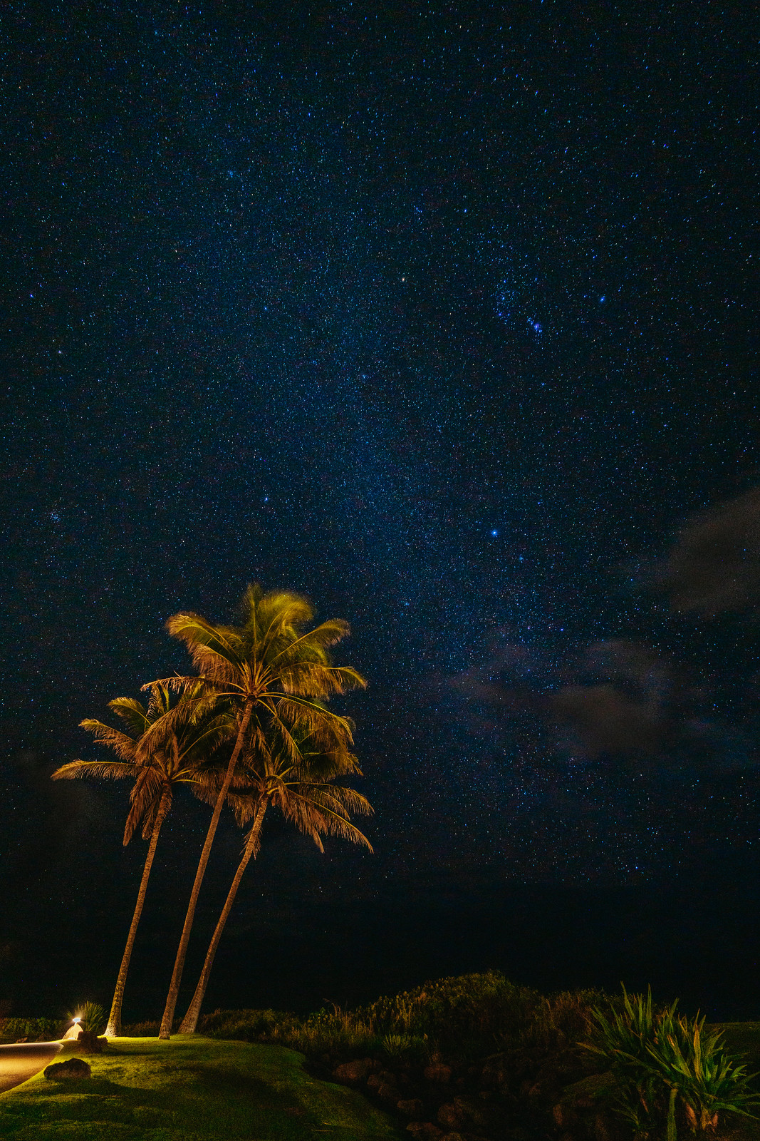
Out on morning walk at Thousand Palm Oasis, CA
Sony ILCE-7RM3 FE 85mm F1.8
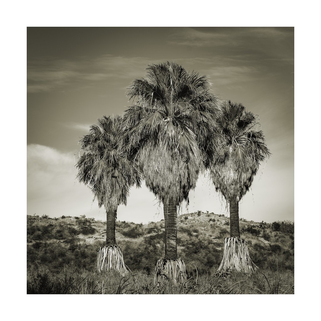 _DSC3402 by Patrick Kolb, on Flickr
Sony ILCE-7RM3 FE 85mm F1.8
_DSC3402 by Patrick Kolb, on FlickrKeithDM
Well-known member
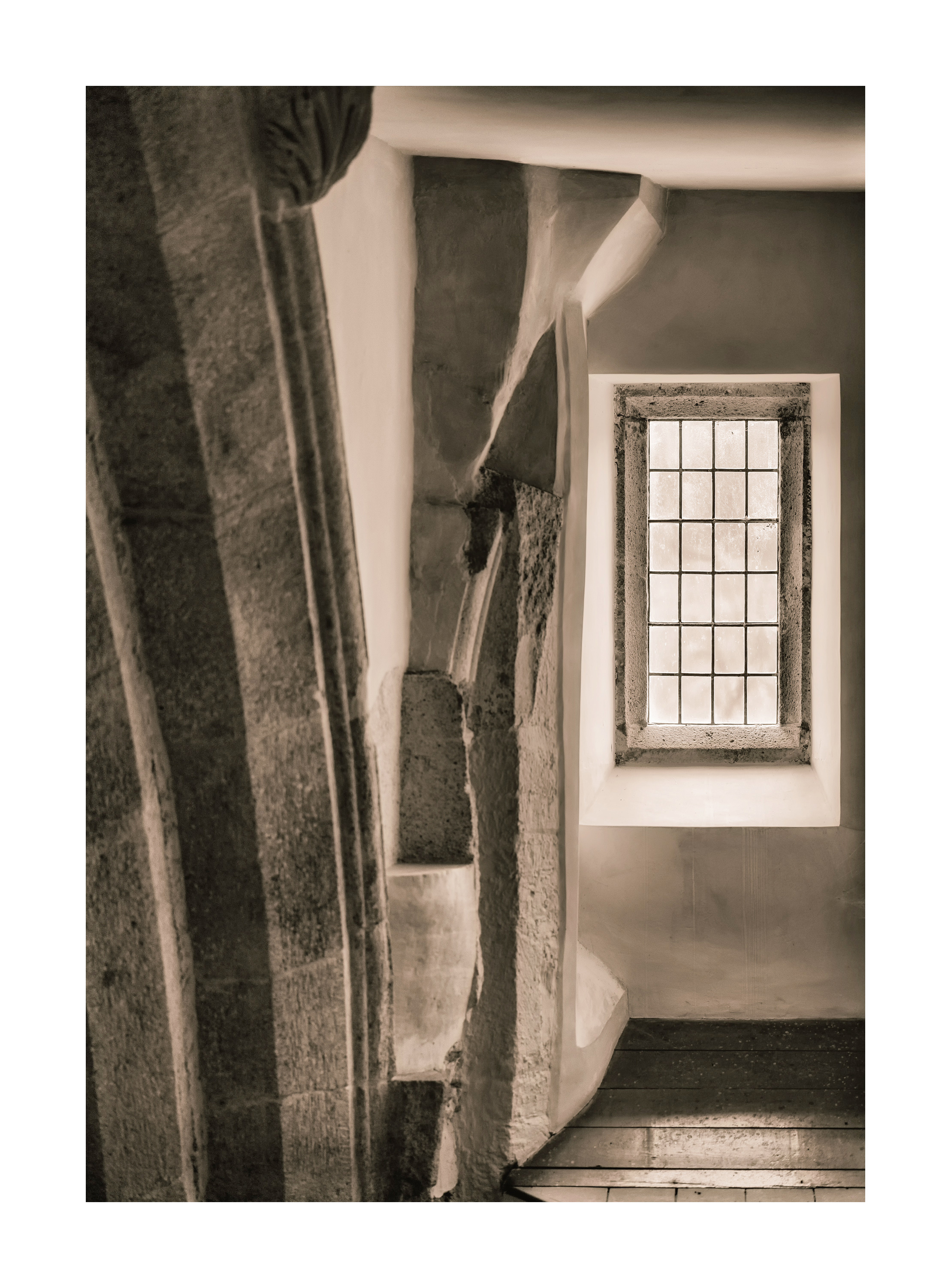
In Swindon's Designer Outlet Village. A7III, 25mm Loxia f2.4.
View attachment 140216
View attachment 140217
View attachment 140216
View attachment 140217
- Status
- Not open for further replies.