I stopped using C1 when I found out it did not support Pentax MF files and that the round-tripping from PS or other filters (Silver Efex Pro etc) was not as robust as with LR.
I only print via QImage and as discussed here before, it does a much better job (IMHO) than either LR or PS.
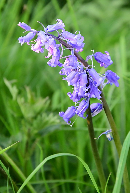
I am not particularly fussy about color accuracy as long as I see what I like on the screen and the print matches it. I think color is a highly subjective aspect of an image. How does one know what the scene looked like, unless you put in a Macbeth color chart in every shot? Skin tones too are so variable, but arguably easier to 'correct' since we intuitively know what they should look like. Landscapes, buildings, objects, flowers, who is to say what the correct RGB value should be or the saturation?
Overall, I am quite happy with LR at present, it could certainly improve in certain areas, but it checks most of the boxes for me.
Just to note, Capture One profiles are not designed for accuracy. It's designed for a pleasing look, and is as such highly subjective.
Color accuracy using established scientific models is only possible for reproduction use case, where you copy say an painted artwork by photographing it under controlled light and print it. No contrast curve is involved in that process.
For a real scene you need to add contrast for the output medium otherwise it will look dull, as the output medium generally has lower dynamic range and brightness. This is a normal psychovisual phenomenon. Adding a single global S-shaped contrast curve is a bit simplistic but very effective, and that's what we've been doing since the film days and what the camera profiles still do today.
When we add contrast many things happens to the colors which needs compensation, and there's no standard to follow, each manufacturer does it differently. Pleasing skintones may be more about how the tones are rolled off gradually into the whitepoint and how saturation is controlled in the shadows than about the hue itself. All is controlled by the camera profile. The camera profile can also to some extent control color separation, it can be increased in some ranges and decreased in others. One example is that some profiles desaturates close-to-neutral colors to unify neutrals but also separate them from others. Various more or less subtle subjective adjustments that add up to a total color behavior and look.
I guess my point is that there's much more to pleasing color behavior than what the hues are, and the bundled Lightroom profiles are generally less well designed than bundled Capture One profile, at least if you ask me. It's all subjective though. It think one can objectively say though (not with 100% certainty though as I don't have all facts) that Adobe's profile design methods are much simpler than Phase One's, but as color is about taste that does not guarantee that you will like their color better.
Personally I just make my own profiles, and I love the freedom I get from that, I don't feel locked in to a particular manufacturer's look, and while accuracy is not really possible (as discussed above), it is possible to make colors look more realistic than most manufacturers provide with their bundled profiles, and to me that doesn't hurt. It's a good reference point. I rather have that than my colors change radically as soon as change camera brand or in some cases even just camera model. Then I can on top of that base look make color adjustments for creating atmosphere/mood or whatever the subject and context requires.