The GetDPI Photography Forum
Great to see you here. Join our insightful photographic forum today and start tapping into a huge wealth of photographic knowledge. Completing our simple registration process will allow you to gain access to exclusive content, add your own topics and posts, share your work and connect with other members through your own private inbox! And don’t forget to say hi!
Even More Fun Pictures with Nikon
- Thread starter Lloyd
- Start date
Lloyd
Active member
Thanks Bro.Thats quite a nice set up. Agree about the reflector on the right. Good luck with the shoot!
Corlan F.
Subscriber Member
Both eye candy, i really love the second one Steve. Great framing and PP.Life & Death...
D700, Zf 100, Zf 35")
"ever-patient"... that she is!A friend my wife knows through triathlon asked me to shoot some bridals (I didn't even know she had a daughter that age!). Turns out she wants some, as she puts it, "Cover Girl" looking shots. So last night, my ever-patient wife was good enough to stand in for some lighting tests.
D300, 17-55/2.8 @ f11, 1/250, ISO 200:
Nice test shots LLoyd, if you elect to go this high-key route on a bright bkgd for the final shooting, maybe you might want not to be shy on the amount of make up for the model... and why not try longer focal lengths if the studio setup allows for enough room?
Just a thought...
Lloyd
Active member
Good thoughts both, Corlan. Mimi had very little advance warning; she'd been on the computer, doing a work project (it is ever thus"ever-patient"... that she is!
Nice test shots LLoyd, if you elect to go this high-key route on a bright bkgd for the final shooting, maybe you might want not to be shy on the amount of make up for the model... and why not try longer focal lengths if the studio setup allows for enough room?
Just a thought...
), and came downstairs to see what I was doing. Other than a little mascara, no makeup at all. I will be using the D3, with 105 VR, and my 70-200 (and maybe the 85/1.4), for the actual shoot. I just happened to have the D300, with that lens mounted, sitting nearby when I decided to check it out.
Jorgen Udvang
Subscriber Member
Lloyd, those look perfect as is. If you add a reflector on her right, I'm afraid it will look flat, but this is all a matter of taste, isn't it?Thanks Steve. Background is a 60" OctoBox, lit with a Photogenic 1250 DR at 22 WS. Mimi is lit from directly in front, with two Potogenic 1250 DRs, each @ 22 WS, the upper one has a 22" Mola beauty dish, and the lower a 40x40cm softbox. Those are arranged in a "clam shell" configuration and set at the same power for 1:1 lighting ratio. I shot from between the two front lights. There is also a white wall to her left. I think I could have used a reflector on her right, as there is a little fall off on that side.
Lloyd
Active member
Thanks Jorgen. I'm a big fan of your lighting... So I take that as high praise, and an excellent suggestion.Lloyd, those look perfect as is. If you add a reflector on her right, I'm afraid it will look flat, but this is all a matter of taste, isn't it?
Corlan F.
Subscriber Member
Talkin' about colour vs. bw, and Zeiss glasses... we have an age-old family tradition dating from way back when some ancestors were serving as Steward in royal households: on the first January sunday following the stressful period of year-end holidays, the hostess don't do cooking or any work... except receiving flowers. This year was no exception.
Two interpretations of -almost- the same shot.

D700 - CZ 50M - f2
Two interpretations of -almost- the same shot.
D700 - CZ 50M - f2

Lloyd
Active member
Both are really beautiful, Corlan. I think I slightly favor the color version, but only a little. Amazing... really amazing bokeh. Nice. :thumbup:.
A color version:
D700 - CZ 50M - f2
Jorgen Udvang
Subscriber Member
Colour, Corlan, colour :thumbup:
Jorgen Udvang
Subscriber Member
You're far too kind, Lloyd.Thanks Jorgen. I'm a big fan of your lighting... So I take that as high praise, and an excellent suggestion.
I notice that there's a slight wrap from the background lighting on her right cheek. Again, it's a matter of taste if you want it there or not, but moving her further from the background and/or balancing the output between the background and foreground lighting differently will change it or make it go away.
I prefer to use two strobes placed symmetrically for a blown background, and I use some home-made cardboard disks to shield them, to avoid wrap. Because of a low, white ceiling, I also shield the top of the background strobes, but since you use a softbox there, you probably don't have that problem.
Lloyd
Active member
Good ideas, thanks again! :thumbup:You're far too kind, Lloyd.
I notice that there's a slight wrap from the background lighting on her right cheek. Again, it's a matter of taste if you want it there or not, but moving her further from the background and/or balancing the output between the background and foreground lighting differently will change it or make it go away.
I prefer to use two strobes placed symmetrically for a blown background, and I use some home-made cardboard disks to shield them, to avoid wrap. Because of a low, white ceiling, I also shield the top of the background strobes, but since you use a softbox there, you probably don't have that problem.
Corlan F.
Subscriber Member
ok, so... i'll keep both versions of the rose.
Spouse now wants the two printed anyway...
Thanks all for the kind words!
Jorgen, talkin about strobes & al, did you eventually turn this so called living room of yours into its obviously more appropriate photo studio use?
Spouse now wants the two printed anyway...
Thanks all for the kind words!
Jorgen, talkin about strobes & al, did you eventually turn this so called living room of yours into its obviously more appropriate photo studio use?
Jorgen Udvang
Subscriber Member
I'm working on it. It has been a bit busy since I moved in, but the living room isn't being used for anything else. I just need a white backdrop and some arrangement to make part of the ceiling black without painting it. I already use one corner as a tabletop studio. Last half of February is the target.Jorgen, talkin about strobes & al, did you eventually turn this so called living room of yours into its obviously more appropriate photo studio use?
Corlan F.
Subscriber Member
Ash particles recovering the mantle, and an old style glass bottle...
Two treatments again, one for the book with a midtoned monochromatic, magazine type processing:

I kinda liked the original photo, though (pretty much out of C1, very little PP):

sorry for the slight noise here, but jpeg this size it was that or a soft looking file...
Two treatments again, one for the book with a midtoned monochromatic, magazine type processing:
I kinda liked the original photo, though (pretty much out of C1, very little PP):
sorry for the slight noise here, but jpeg this size it was that or a soft looking file...
Jason Muelver
Member
Trying to keep up here! Ugh.. the talent here... luv it! Learning lots!
Per Lloyd's earlier comment, here is a neighborhood shot at 1:25 AM, New Year's Day
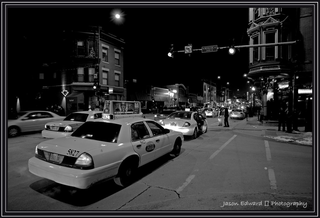
Per Lloyd's earlier comment, here is a neighborhood shot at 1:25 AM, New Year's Day
Lloyd
Active member
Very nicely composed, and a wonderful b/w conversion. Beauty.Trying to keep up here! Ugh.. the talent here... luv it! Learning lots!
Per Lloyd's earlier comment, here is a neighborhood shot at 1:25 AM, New Year's Day
Corlan F.
Subscriber Member
Thanks for the comment, Lloyd. The original was shot on purpose keeping in mind that for the final "mid grey" look (no black, nor white, equivalent to the classic "Faded" analog processing) to work, it's preferable to have some strong zone contrast, and a good deal of blacks...I really like that processing on the top one, Corlan. The original is nice to, but there is a character to that first one that really stands out to me.
Jason, super night shot from the Second City!
(second to none, of course) :toocool: