When I started printing my work myself, in January, I bought calibration tools and printers. So my first try was color and I decided to chose Hahnemühle as my paper. I tested some papers and chosen one who suit me the best : Photo Rag Satin 310 Gsm. This is one tricky paper if you ask me.
Once all calibrated with profiles and all, I started printing colors shoots and was not that happy because of the lack of dynamic on the print compared to my screen display. I'm Gamma 2.2 - White point 5800K.
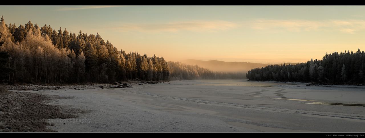
Here is one example where I was not happy with the print (
but I rapidly found the trick).
Then I started printing Black and White and didn't had any problems (
Black too Black and whites too white), that because of my rendering.
So yes the prints are less flat than the screen display because (
and I may be wrong) I always shoot my work for printing ; not for internet display. For my clients who want web photos for websites and all (
or weddings), I give them more contrasty photos, more saturated.
I understood that in Black and White, people are sensible to contrasty pictures, like Leica pictures, a mix of sharpness and contrast. So I did a sort of scientific test on a panel of 20 unknown ppl I chosen on my Facebook friend list (I never seen a lot of them so they are strangers), 10 ppl were between 16yo and 30yo and 10 ppl were between 35yo and 65yo.
What I found is very interesting :
The more the people are young (
Male or Female do not mater but I may test it later) the more they do not care about what we are actually studying here. The 16 to 30 panel, who are not educated about photo art, this is important, found the pictures very cool, independently of their display device. They are asked to not be shy in their answer.
A part of the 35 to 65 panel vastly prefer the contrasty photo, and I may know why. The older ppl are more sensible to contrast and more you age more you like it. This is due, IMO, to a physiologic transformation or alteration at the optic level. I'm not brain doctor but I do not think yet this fact is linked to psychologic issues, like life experiences, knowledge and maturity but more related to the eye himself. More an eye age, more he need contrast ... that's my statement.
Be aware that I was ready (
not really but I found myself obliged), by the end result of my test, to change completely my B&W rendering if the majority preferred the standard "contrast" version. Democracy voted so I'm safe

and I must admit I was a tad lazy to work around an another way to find a "special" black and white.
Hope you do not find that too weird (
sometime I think so !) and that helped you a bit