The GetDPI Photography Forum
Great to see you here. Join our insightful photographic forum today and start tapping into a huge wealth of photographic knowledge. Completing our simple registration process will allow you to gain access to exclusive content, add your own topics and posts, share your work and connect with other members through your own private inbox! And don’t forget to say hi!
Fun With Sony Cameras
- Thread starter fotografz
- Start date
- Status
- Not open for further replies.


Re: Fun with the Sony A7 Series Cameras( all of them)
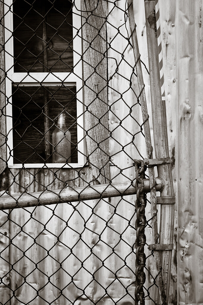
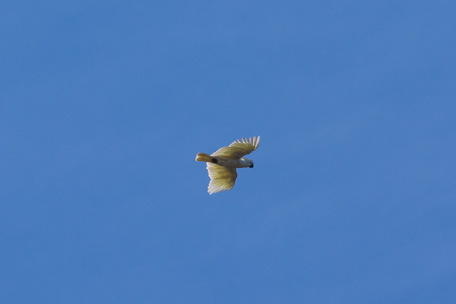
Terrific!!!'bottle' - a7rII / Zeiss 135 APO
thompsonkirk
Member
Re: Fun with the Sony A7 Series Cameras( all of them)
QUOTE: "On a more serious/curious note, I'm curious to know what paper you would print these on eventually...I'm guessing a warm cotton rag type as opposed to some bright white glossy coated type.
About a decade ago I tried to emulate as far as I could that is, some of the old photographic printing processes and experimented with different types of digital matt art papers (mainly cotton rag etc...) I found that the image sat to close to the surface and was not to my liking at all!..although the D-max was good the images lacked any depth and any feeling IMHO ...I then moved away from convention experimenting with a few non digital art papers textured and smooth...The papers D-Max obviously was somewhat reduced and some papers suffered terribly from the ink spreading (bleeding sideways and too deep down into the fibrous pores of the paper) and some just gave you muddy looking prints but some papers responded really quite well as long as you got the ink nozzle head as close to the paper as possible...I then went back to Digital Art papers experimenting with pre-soaking the paper in a very dilute solution of a surfactant "Tween 20" https://www.bostick-sullivan.com/articles/tween20.html this meant I had to print slightly darker to allow for more of the ink to be absorbed into the papers pores to keep a decent D-max of the paper...Bottom line was I got distracted and went back to making digital negatives and hand coating papers in combination with different light sensitive solutions...Anyway I'm following with interest what you are doing...On the screen some of those images have a lovely feel to them, much to my liking...Cheers Barry" :QUOTE
_____________
I hope, Barry, we aren't conducting a purely private conversation, which wouldn't belong on a 'Fun with..." thread. But on the other hand, Sony images, especially with new sensor, are so detailed that just posting on the web can't do them justice; they need printing for all their richness to be revealed, and that should be of interest to others who are having their 'fun' here.
For color, I print as before on Harman Gloss Baryta paper, though most of my colleagues seem to have shifted to Canson. I still have lots of the Harman on hand. My wide-format Canon printer sits idle because I see improved resolution with the new Epson P800. With these files, it does make a difference.
But your question was about BW printing of hi-res (Sony) files. I'm in the midst of printing a book of screwpost-bound archival prints – a form that allows removal of individual images for framing. One goal was to come as close as possible to 'f64' technique via digital processes. But the paper has to be flexible – therefore matte – to go in a book. A friend who's a color management consultant helped with tests of papers and printing techniques (short of Piezography), and we found that after all the DMax measurements, the greater problem was metamerism in BW printing with Epson inks. We came up with an odd solution that suits this book, but I won't go into it here. I ended up using Moab Entrada paper, which can be special-ordered in a bookbinding format. This is definitely not a high DMax paper, but the eye quickly adjusts, when looking at a book, to 'calling' the darkest tones black, even when they're not. Differences in DMax show up mostly on the wall in group exhibitions, where you can see the difference between one printing style and another. Otherwise the eye accepts the darkest tone as faux black.
The point about Sony (and Leica Monochrom) files is that they have almost contact-print detail in not-too-large prints. Regarding tonal range, I sometimes used Tony Kuiper's (or Kuyper's?) Zone System masks, which allow fairly subtle modifications of the tonal range. His Zones don't correspond exactly to A. Adams's, but it's easy to compensate. The technique is much more flexible than darkroom printing!
For this little 'digital Pictorialism' experiment, I've begun printing on Epson's Velvet Fine Art textured paper (RGB files with a boost to R and Y for sepia tone). This paper was a favorite with landscape photographers in early digital printing days. Again, it's not a deep DMax paper; but when I look at vintage prints prior to the 1930s, they don't rely on deep blacks. (When Weston discovered chlorobromide papers, he said these were what he'd always hoped for; but Pictorialism came before this discovery.)
Sorry if this has wandered off-topic or is out-of-place,
Kirk
PS to Pegelli: I will investigate Brenizer technique!
PPS: All of this is relatively new to me – until a few years ago, I worked at street photography in color. Any BW skill or judgment that I retain comes from large-format work long long ago. Reverting to ancient techniques in old age?
Last edited:
Barry Haines
Active member
Re: Fun with the Sony A7 Series Cameras( all of them)
I will leave it here and briefly finish off as we are both straying OT (my fault") )....But it's uncanny the papers that you have selected are also some of my favourites too :grin: (Harman Gloss Baryta paper + Epson's Velvet Fine Art) I always keep in various sizes...I use the original though from St Cuthberts Mill though as opposed to Epson Velvet (Digital and Non Digital velvet and satin...not the heavier textured version though) St Cuthberts Mill // Somerset Printmaking Paper + St Cuthberts Mill // Somerset Enhanced Fine Art Inkjet Paper or Arches Platine for making 14x11 and 10x8 contact prints...Pt/Pd or I had until recently some old Kodak AZO Chloride paper from Michael A Smith (E Westons favourite) for contact silver printing...Agree your eyes get accustomed to the lower faux Dmax and enjoy the long tonal curve of these kind of images...those images invite exploring rather than a cursory glance....Anyway thanks for sharing Kirk...Cheers Barry
)....But it's uncanny the papers that you have selected are also some of my favourites too :grin: (Harman Gloss Baryta paper + Epson's Velvet Fine Art) I always keep in various sizes...I use the original though from St Cuthberts Mill though as opposed to Epson Velvet (Digital and Non Digital velvet and satin...not the heavier textured version though) St Cuthberts Mill // Somerset Printmaking Paper + St Cuthberts Mill // Somerset Enhanced Fine Art Inkjet Paper or Arches Platine for making 14x11 and 10x8 contact prints...Pt/Pd or I had until recently some old Kodak AZO Chloride paper from Michael A Smith (E Westons favourite) for contact silver printing...Agree your eyes get accustomed to the lower faux Dmax and enjoy the long tonal curve of these kind of images...those images invite exploring rather than a cursory glance....Anyway thanks for sharing Kirk...Cheers Barry
________________________QUOTE: "On a more serious/curious note, I'm curious to know what paper you would print these on eventually...I'm guessing a warm cotton rag type as opposed to some bright white glossy coated type.
About a decade ago I tried to emulate as far as I could that is, some of the old photographic printing processes and experimented with different types of digital matt art papers (mainly cotton rag etc...) I found that the image sat to close to the surface and was not to my liking at all!..although the D-max was good the images lacked any depth and any feeling IMHO ...I then moved away from convention experimenting with a few non digital art papers textured and smooth...The papers D-Max obviously was somewhat reduced and some papers suffered terribly from the ink spreading (bleeding sideways and too deep down into the fibrous pores of the paper) and some just gave you muddy looking prints but some papers responded really quite well as long as you got the ink nozzle head as close to the paper as possible...I then went back to Digital Art papers experimenting with pre-soaking the paper in a very dilute solution of a surfactant "Tween 20" https://www.bostick-sullivan.com/articles/tween20.html this meant I had to print slightly darker to allow for more of the ink to be absorbed into the papers pores to keep a decent D-max of the paper...Bottom line was I got distracted and went back to making digital negatives and hand coating papers in combination with different light sensitive solutions...Anyway I'm following with interest what you are doing...On the screen some of those images have a lovely feel to them, much to my liking...Cheers Barry" :QUOTE
_____________
I hope, Barry, we aren't conducting a purely private conversation, which wouldn't belong on a 'Fun with..." thread. But on the other hand, Sony images, especially with new sensor, are so detailed that just posting on the web can't do them justice; they need printing for all their richness to be revealed, and that should be of interest to others who are having their 'fun' here.
For color, I print as before on Harman Gloss Baryta paper, though most of my colleagues seem to have shifted to Canson. I still have lots of the Harman on hand. My wide-format Canon printer sits idle because I see improved resolution with the new Epson P800. With these files, it does make a difference.
But your question was about BW printing of hi-res (Sony) files. I'm in the midst of printing a book of screwpost-bound archival prints – a form that allows removal of individual images for framing. One goal was to come as close as possible to 'f64' technique via digital processes. A friend who's a color management consultant helped with tests of papers and printing techniques (short of Piezography), and we found that after all the DMax measurements, the greater problem was metamerism in BW printing with Epson inks. We came up with an odd solution that suits this book, but I won't go into it here. I ended up using Moab Entrada paper, which can be special-ordered in a bookbinding format. This is definitely not a high DMax paper, but the eye quickly adjusts, when looking at a book, to 'calling' the darkest tones black, even when they're not. Differences in DMax show up mostly on the wall in group exhibitions, where you can see the difference between one printing style and another. Otherwise the eye accepts the darkest tone as faux black.
The point about Sony (and Leica Monochrom) files is that a they have almost contact-print detail in not-too-large prints. Regarding tonal range, I sometimes used Tony Kuiper's (or Kuyper's?) Zone System masks, which allow fairly subtle modifications of the tonal range. His Zones don't correspond exactly to A. Adams's, but it's easy to compensate. The technique is much more flexible than darkroom printing!
For this little 'digital Pictorialism' experiment, I've begun printing on Epson's Velvet Fine Art textured paper (RGB files with a boost to R and Y for sepia tone). This paper was a favorite with landscape photographers in early digital printing days. Again, it's not an especially high in DMax paper; but when I look at vintage prints prior to the 1930s, they don't rely on deep blacks. (When Weston discovered chlorobromide papers, he said these were what he'd always hoped for; but Pictorialism came before this discovery.)
Sorry if this has wandered off-topic or is out-of-place,
Kirk
PS to Pegelli: I will investigate Brenizer technique!
PPS: All of this is new to me – until about two years ago, I just did color street photography. Reverting to ancient techniques in old age.
I will leave it here and briefly finish off as we are both straying OT (my fault
)....But it's uncanny the papers that you have selected are also some of my favourites too :grin: (Harman Gloss Baryta paper + Epson's Velvet Fine Art) I always keep in various sizes...I use the original though from St Cuthberts Mill though as opposed to Epson Velvet (Digital and Non Digital velvet and satin...not the heavier textured version though) St Cuthberts Mill // Somerset Printmaking Paper + St Cuthberts Mill // Somerset Enhanced Fine Art Inkjet Paper or Arches Platine for making 14x11 and 10x8 contact prints...Pt/Pd or I had until recently some old Kodak AZO Chloride paper from Michael A Smith (E Westons favourite) for contact silver printing...Agree your eyes get accustomed to the lower faux Dmax and enjoy the long tonal curve of these kind of images...those images invite exploring rather than a cursory glance....Anyway thanks for sharing Kirk...Cheers Barry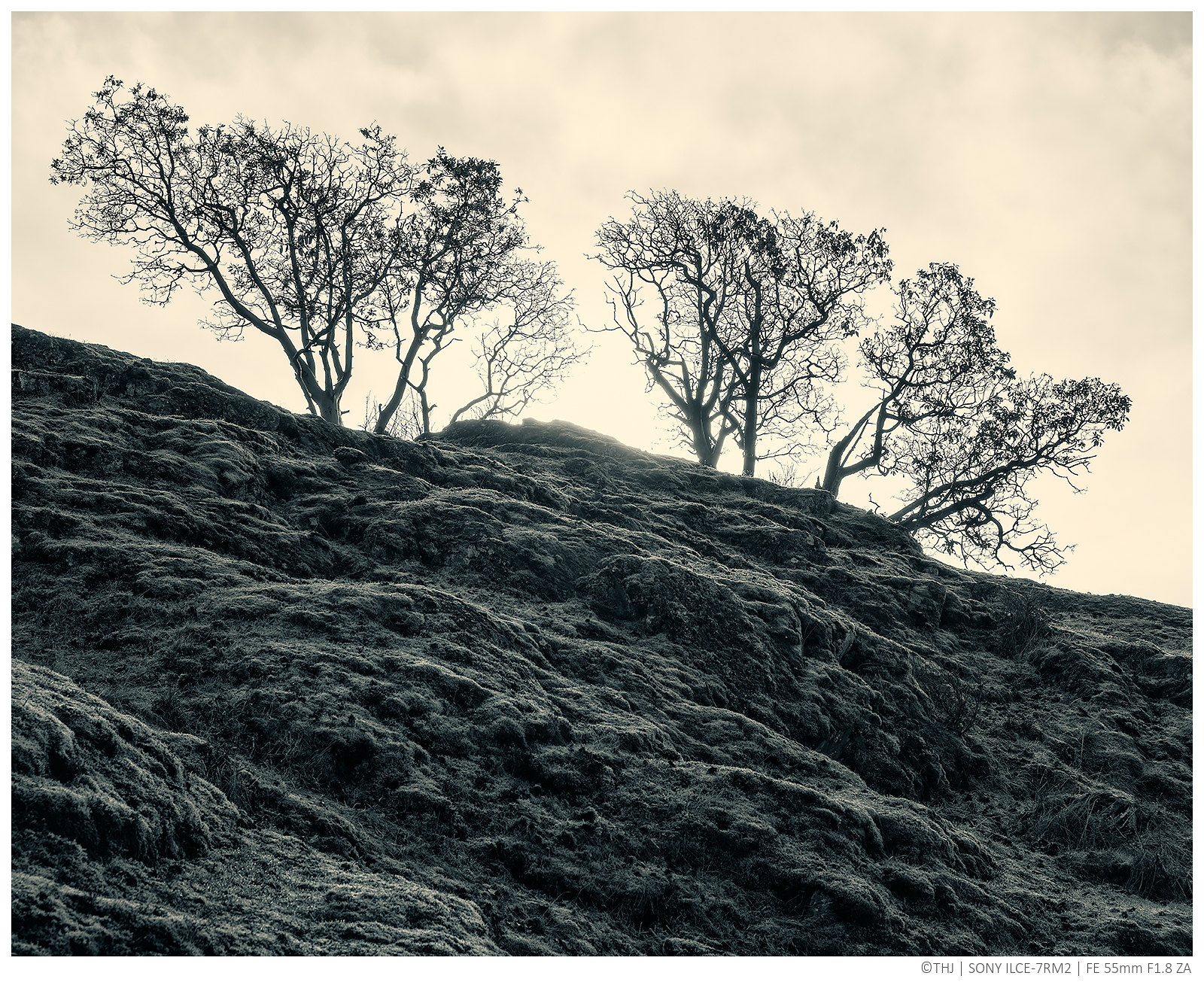


thompsonkirk
Member
Re: Fun with the Sony A7 Series Cameras( all of them)
Another anthropomorphic tree, dancing inside a hula hoop?
Kirk
View attachment 115716
A7rII, 35 Nokton f1.2
Another anthropomorphic tree, dancing inside a hula hoop?
Kirk
View attachment 115716
A7rII, 35 Nokton f1.2
Last edited:

Re: Fun with the Sony A7 Series Cameras( all of them)
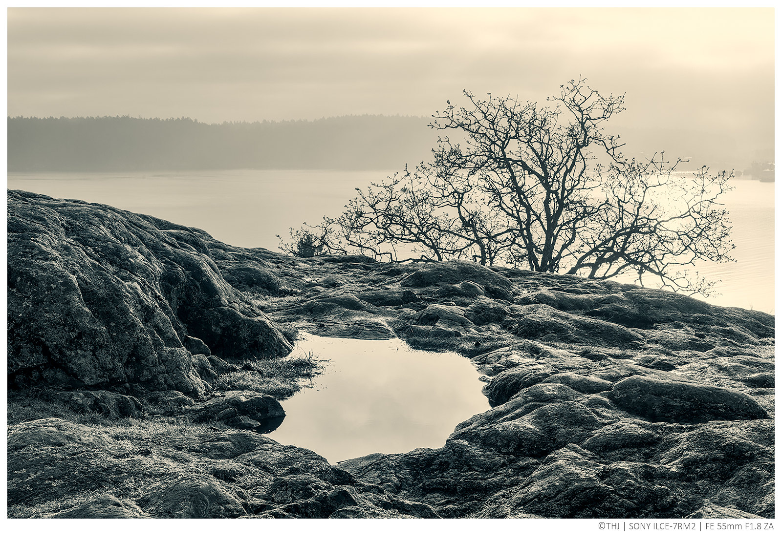
Some fantastic landscape pics here. Here's one with my A7R + ZM50 1.5. I can't seem to get this same look with the A7RII though.
Some fantastic landscape pics here. Here's one with my A7R + ZM50 1.5. I can't seem to get this same look with the A7RII though.
Attachments
-
 958.7 KB Views: 27


Re: Fun with the Sony A7 Series Cameras( all of them)
Thanks for looking
Dave in NJ

Here is another one taken at the same time looking in the other direction (north, roughly). This one at 1/40th sec, f14 at 22mm, also hand held (love that image stabilization).A7RII, 16~35mm Zeiss FE lens at 16mm, ISO 400, 1/50 sec at f8 hand held.
Dave in NJView attachment 115736
Thanks for looking
Dave in NJ
Barry Haines
Active member
Re: Fun with the Sony A7 Series Cameras( all of them)
All taken this afternoon.
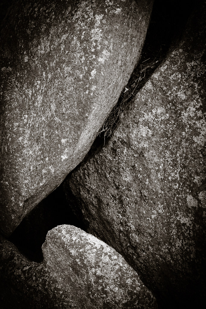
“BLACK ROCK” at Millendreath.
21mm Loxia. Dilute Cyanotype toned.
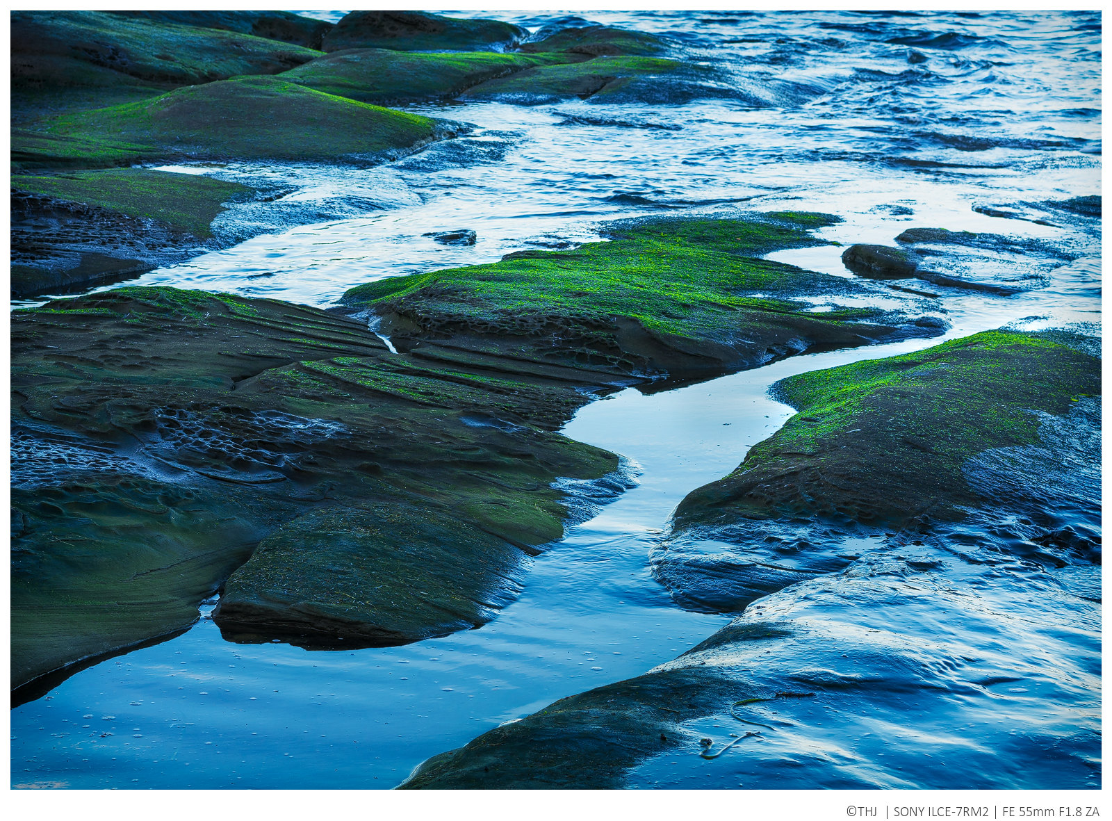
“ROCKS AT SEATON”
21mm Loxia. (BLENCOMO)
“YELLOW”
21mm Loxia
All taken this afternoon.
“BLACK ROCK” at Millendreath.
21mm Loxia. Dilute Cyanotype toned.

“ROCKS AT SEATON”
21mm Loxia. (BLENCOMO)

“YELLOW”
21mm Loxia

Last edited:

frozenbb
Member
Re: Fun with the Sony A7 Series Cameras( all of them)
^^^ All three are quite good, but I particularly like the atmosphere in the second. I love those moments of weak/diffuse sunlight.
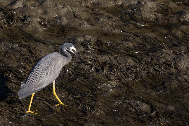
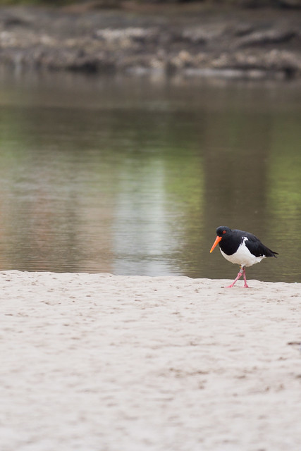
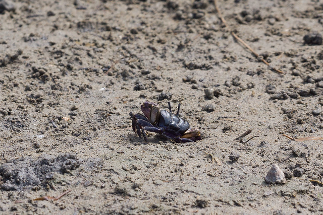
In keeping with the theme, here's one from yesterday as I ambled in the tide pools with my toddler.
'Transitions'
^^^ All three are quite good, but I particularly like the atmosphere in the second. I love those moments of weak/diffuse sunlight.
In keeping with the theme, here's one from yesterday as I ambled in the tide pools with my toddler.
'Transitions'
eleanorbrown
New member
Re: Fun with the Sony A7 Series Cameras( all of them)
REPAIR QUESTION PLEASE....Sorry but this request is a little off subject but don't know where else to ask. While having fun with my Sony A7R2 with Batis 85 lens, my dog ran right in front of me and tripped me up big time. My Sony got damaged on the concrete and needs Sony repair service (focus issues through EVF viewfinder). I also want the lens checked out to factory specs just for safety. I can't find where the best place us to send my Sony. If anyone has any suggestions about where I should send camera and lens for factory service here in the US I would appreciated it very very much. Many thanks, Eleanor
REPAIR QUESTION PLEASE....Sorry but this request is a little off subject but don't know where else to ask. While having fun with my Sony A7R2 with Batis 85 lens, my dog ran right in front of me and tripped me up big time. My Sony got damaged on the concrete and needs Sony repair service (focus issues through EVF viewfinder). I also want the lens checked out to factory specs just for safety. I can't find where the best place us to send my Sony. If anyone has any suggestions about where I should send camera and lens for factory service here in the US I would appreciated it very very much. Many thanks, Eleanor
- Status
- Not open for further replies.