Stormvogel
New member
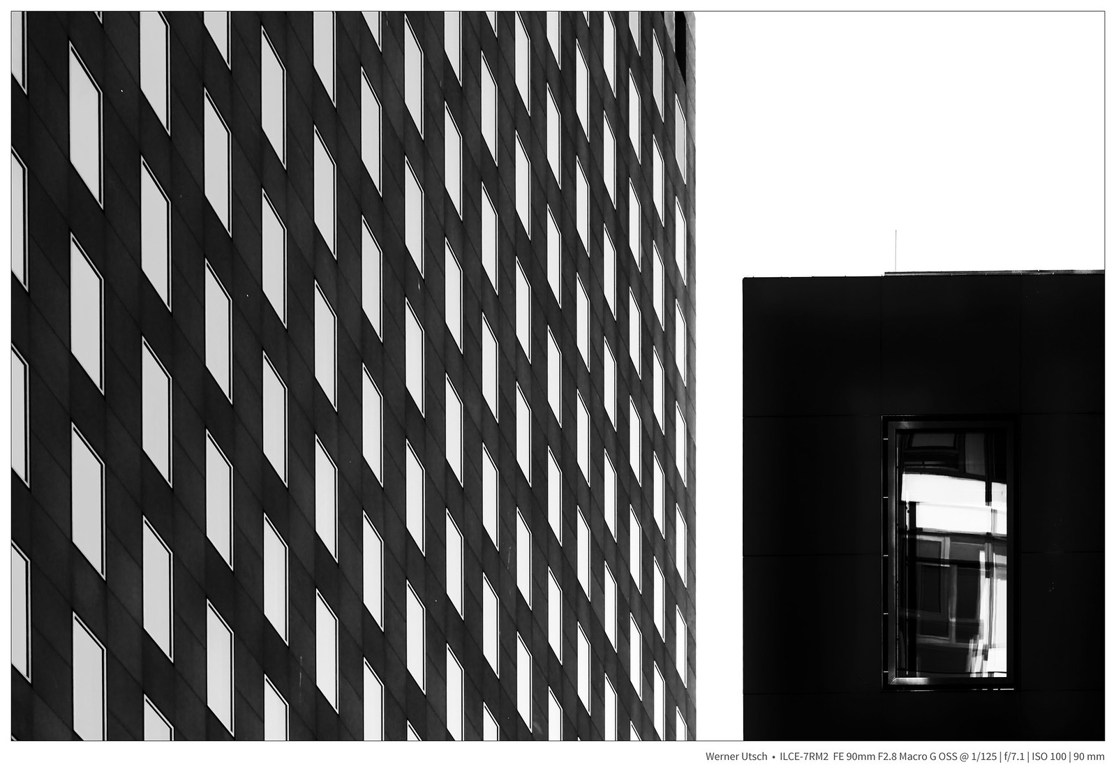
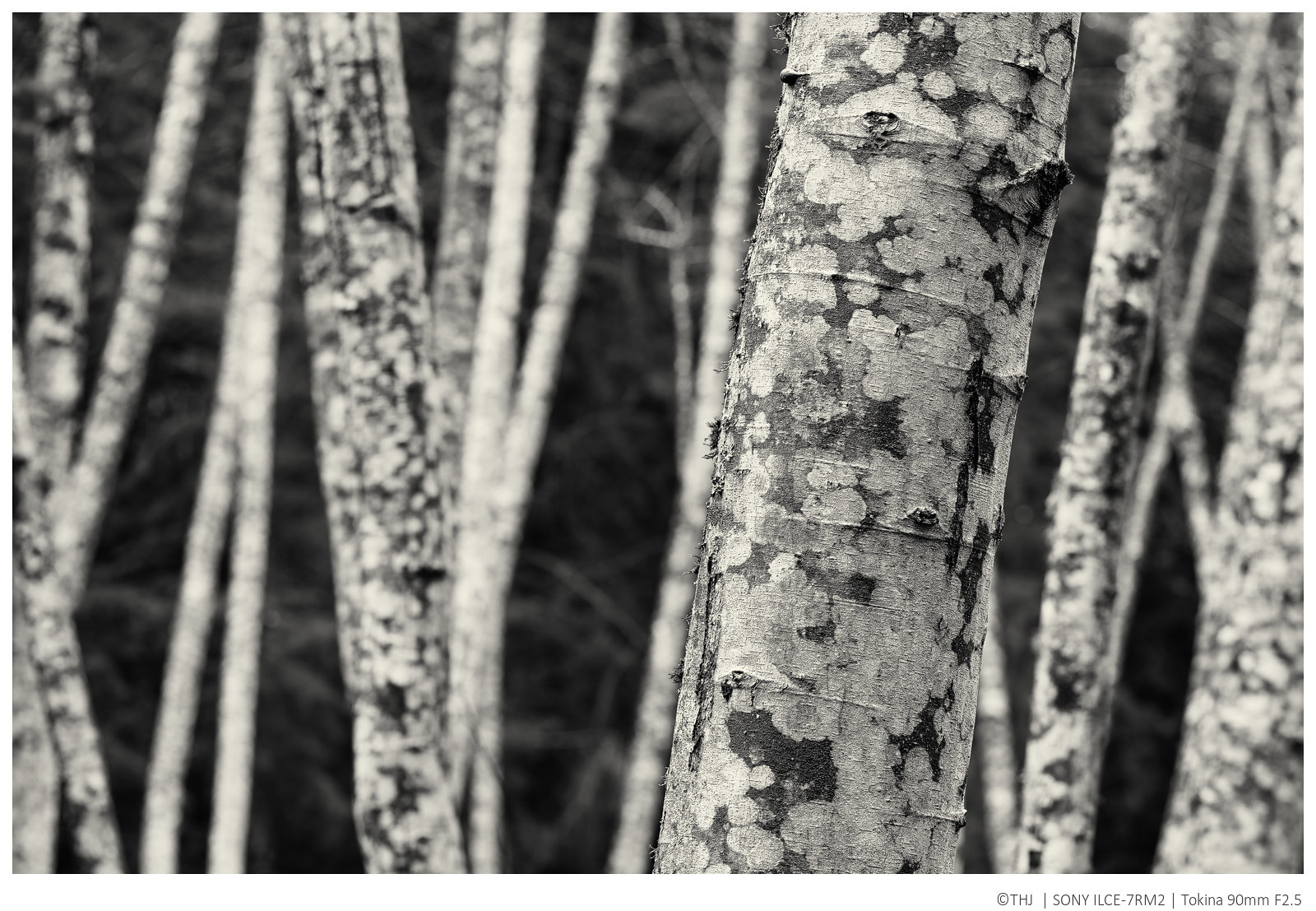
Re: Fun with the Sony A7 Series Cameras( all of them)
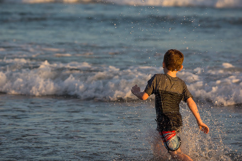
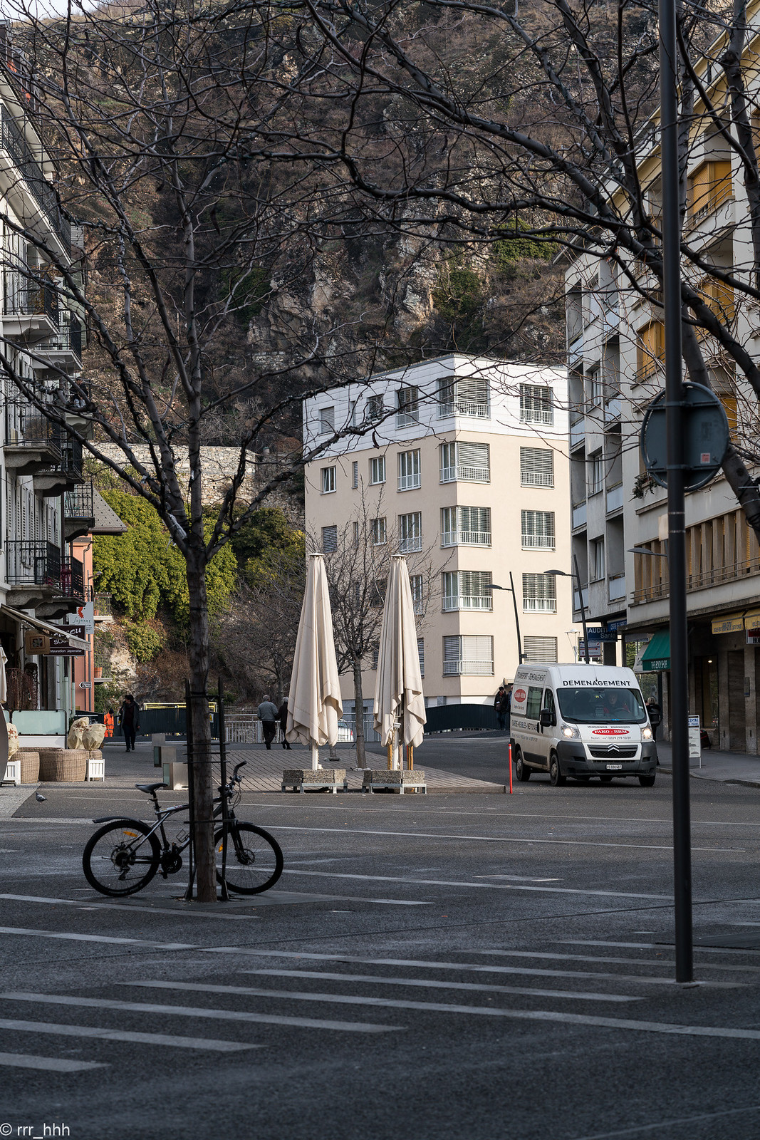
Sten Arnold at Antwerp.
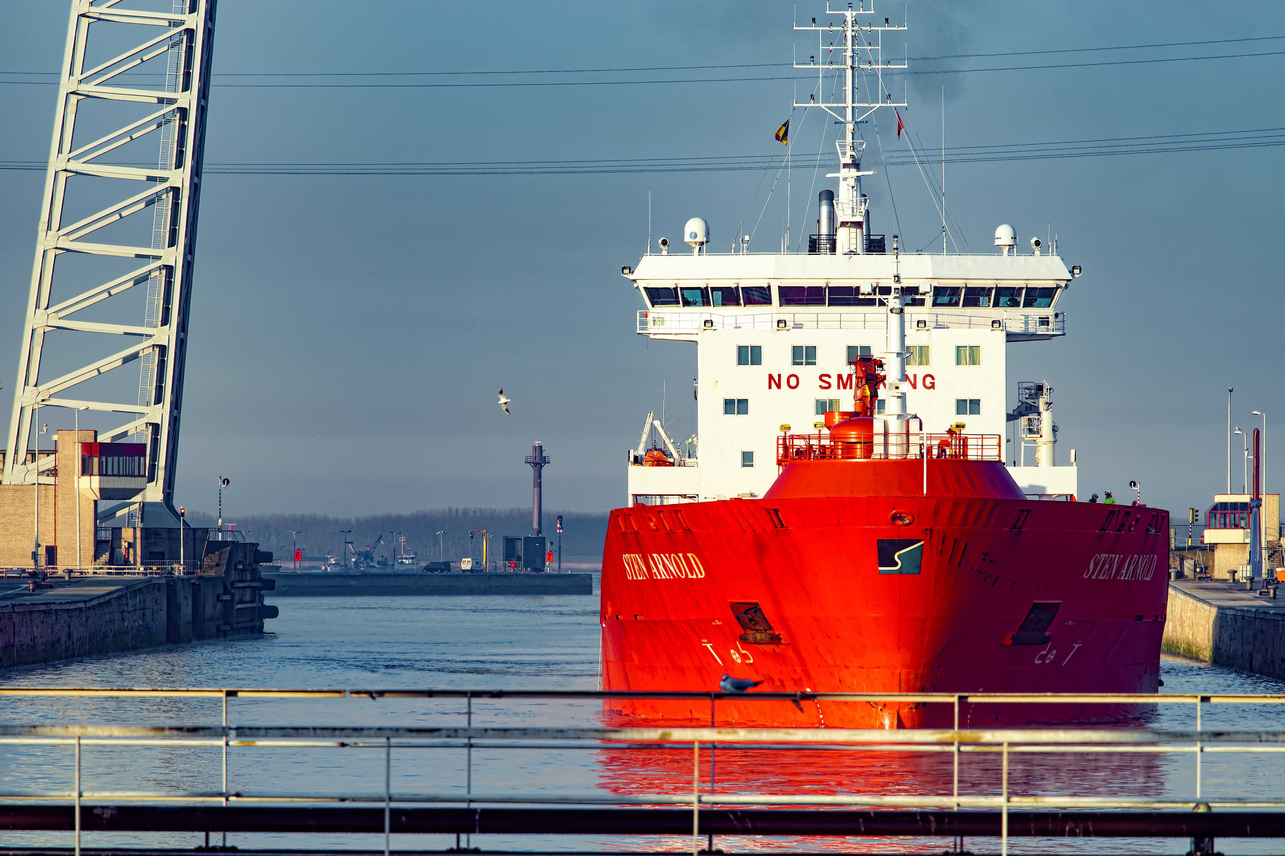
A7 II FE 70-200 1/250 F10 iso 200.
Kind regards Willem.
Sten Arnold at Antwerp.
A7 II FE 70-200 1/250 F10 iso 200.
Kind regards Willem.
Great to see you here. Join our insightful photographic forum today and start tapping into a huge wealth of photographic knowledge. Completing our simple registration process will allow you to gain access to exclusive content, add your own topics and posts, share your work and connect with other members through your own private inbox! And don’t forget to say hi!


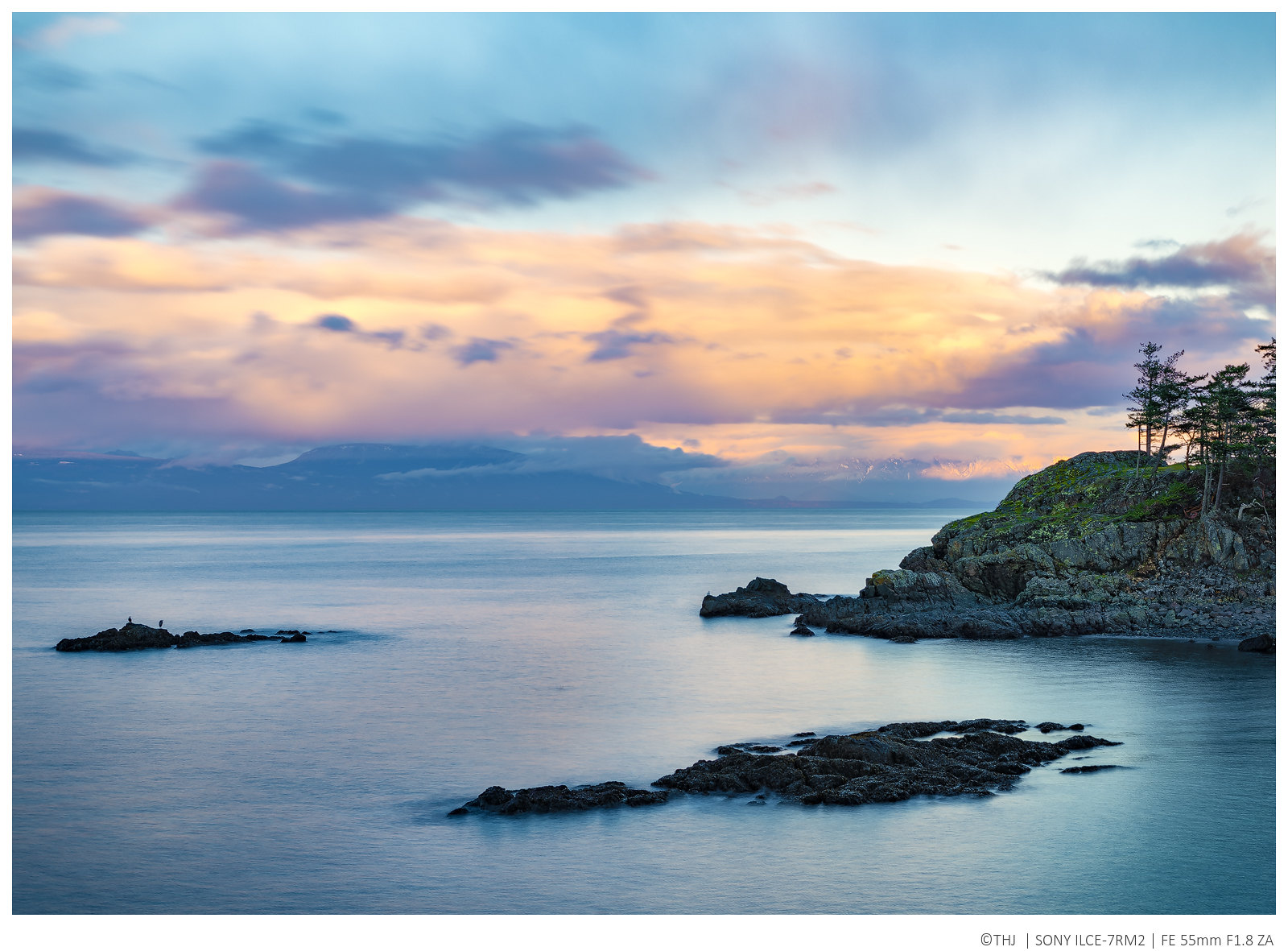
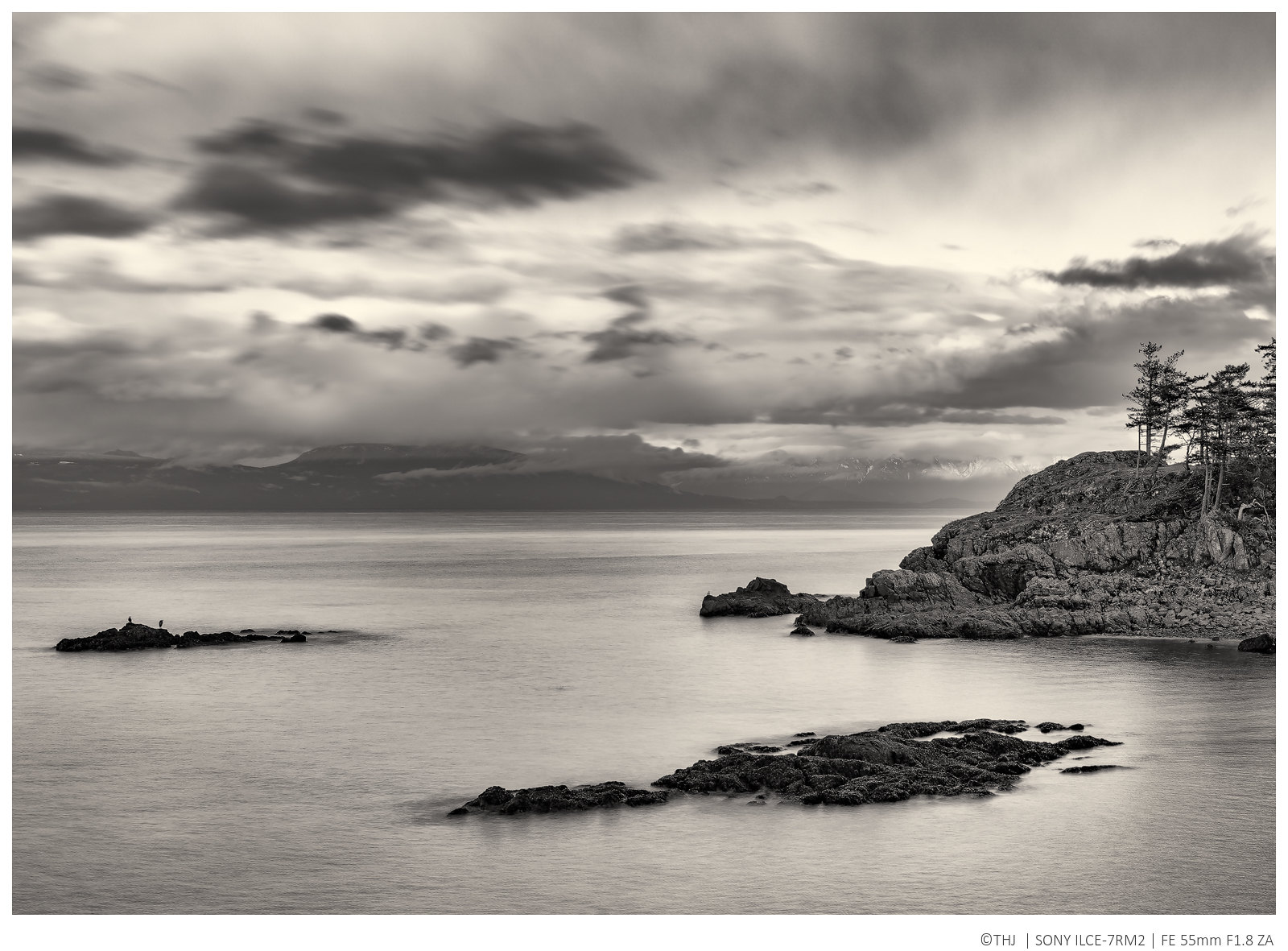
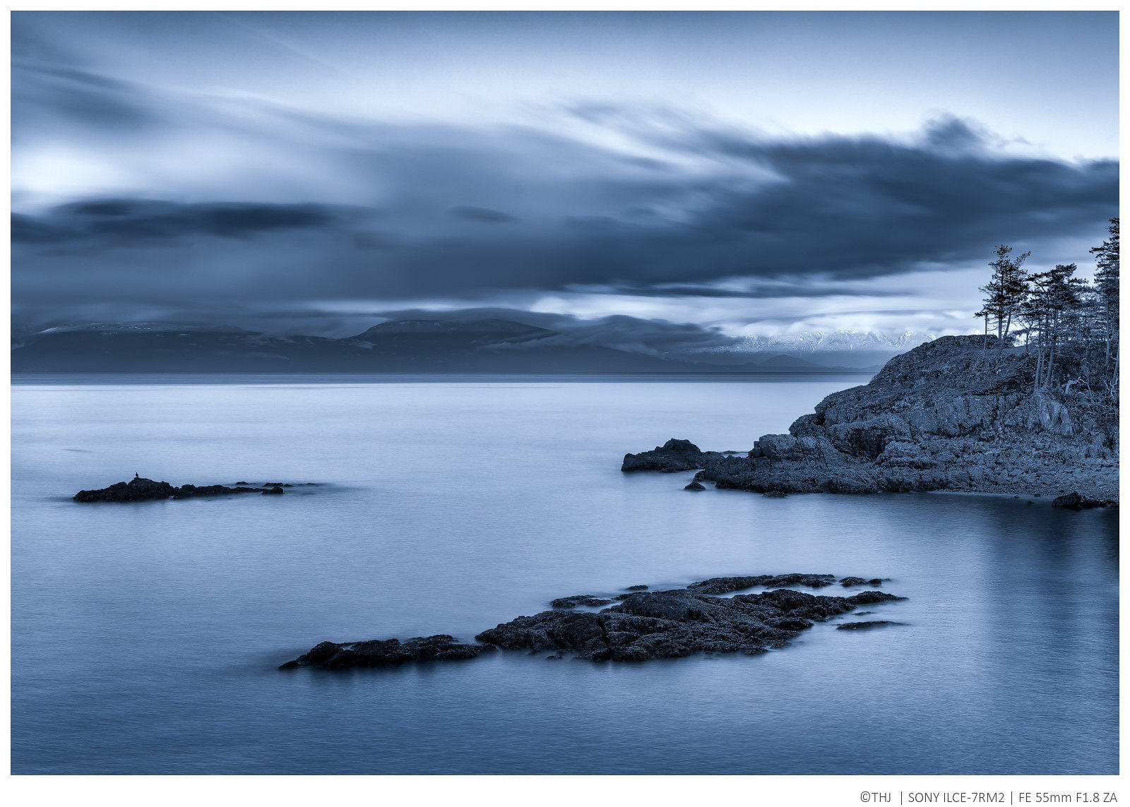
The first one for me ! Without the underlining of the horizontal orange/yellow colored cloud, the right side becomes a little too heavy. May be a mix of the third and first ones would work too, but the first has already very mute/soft colors, so it may not add much. As is, I find the third a little too dark/saturated.I couldn't decide, so I'm inflicting all three versions upon you! Taken earlier tonight.
The Straight of Georgia #10
Tom, I like #10.1 best. It reduces the image to shapes and tones, and the water and rocks mimic the sky. Although the subtle color in the first version (#10) is interesting, it may actually detract from the composition. The lines and tonal range of the second version are really attractive. Just my two cents.I couldn't decide, so I'm inflicting all three versions upon you! Taken earlier tonight.
:thumbs: :clap:
I'd guess 30'Lovely owl shots, Doug. Approximately at what distance were those taken?
Cheers.