The GetDPI Photography Forum
Great to see you here. Join our insightful photographic forum today and start tapping into a huge wealth of photographic knowledge. Completing our simple registration process will allow you to gain access to exclusive content, add your own topics and posts, share your work and connect with other members through your own private inbox! And don’t forget to say hi!
Fun With Sony Cameras
- Thread starter fotografz
- Start date
- Status
- Not open for further replies.
Annna T
Active member
Re: Fun with the Sony A7 Series Cameras( all of them)
That said, I like the color work of Thompson Kirk even more.
I'm sure it was intended so and since the lighter trunk standing just behind looks sharp, I like it so. It invites the viewer to look deeper into the forest. Could go with the injunction : "don't stop at the tree hiding the forest !"I very much like your sensibility/approach, but the back focus on this one disappoints. Focus bracketting?! :grin:
That said, I like the color work of Thompson Kirk even more.
Re: Fun with the Sony A7 Series Cameras( all of them)
UTE, as far as the Contax G 90 (and 45) I was a strong proponent of these two lenses all the way through from my Contax G2, the NEX 5, NEX 7 bodies. Fact is they were my primary lenses even though I had many other lenses to choose from. I figured they would remain my favorite glass with the a7rII but for me they bothe had a sort of magenta color cast when used with the a7rII that I had not seen before and it was present in LR, Aperture, C1, and DXO conversions. Not a big deal but annoying to the point I bought a 55 and 90 OEM lenses to replace them as finally I found glass that actually worked better than the CG 45 and 90 on a body.
I still use the 21, 28, 35, 45, and 90 on my CG2 camera with slide film and have the 45 and 90 with me when I take the NEX 7 out to play but IMO the Sony OEM glass in 55 and 90 just plays better on a A7RII than my CG glass due to color casting( which is fixed very easily in any pp software but it was the Zeiss look and colors were why I was so loyal to these lenses before but it's exceptionalizm disappeared when I used them on the a7RII) (also I Often use Singh Ray filters and color casting got far more obvious when a filter was used like a variND or warming polarizer)
I still got great images from these lenses on the a7rII but it just took a bit more work in post.. The OEM glass did not show this issue even with filters and gave me far more utility and less time to post process. Never thought any glass would ever beat my CG glass but IMO sadly it did.
mediumcool
Active member
Re: Fun with the Sony A7 Series Cameras( all of them)
I think we would agree that Kirk is an accomplished and thoughtful photographer, however!")
We’ll have to agree to disagree. In my experience (and consequently my opinion), foreground OOF areas need to be very blurry to work; my eyes keep returning to the leaf-covered trunk that is just a little soft, searching for texture that isn’t there.I'm sure it was intended so and since the lighter trunk standing just behind looks sharp, I like it so. It invites the viewer to look deeper into the forest. Could go with the injunction : "don't stop at the tree hiding the forest !"
I think we would agree that Kirk is an accomplished and thoughtful photographer, however!
pegelli
Well-known member
Re: Fun with the Sony A7 Series Cameras( all of them)
I think (Kirk pls correct me when I'm wrong) that putting the prime focus on the second trunk was a concious decision. I probably would not have made the same choice and put it on the first for the reason mediumcool is saying. So from that perspective it's a thought (and discussion) provoking picture to think about why he did that. Maybe because he didn't want the picture to be obvious or standard, maybe he liked the texture on the 2nd trunk more. In the end the artist has the last word, so I hope he is willing to share his thoughts on the choice. I think we can learn something interesting from thatWe’ll have to agree to disagree. In my experience (and consequently my opinion), foreground OOF areas need to be very blurry to work; my eyes keep returning to the leaf-covered trunk that is just a little soft, searching for texture that isn’t there.
I think we would agree that Kirk is an accomplished and thoughtful photographer, however!
The Ute
Well-known member
Re: Fun with the Sony A7 Series Cameras( all of them)
Much appreciated.
I would love to get the Sony 90.
I'll just have to save up a while longer is all.
Thanks so much Jim for taking the time to go into this much detail.UTE, as far as the Contax G 90 (and 45) I was a strong proponent of these two lenses all the way through from my Contax G2, the NEX 5, NEX 7 bodies. Fact is they were my primary lenses even though I had many other lenses to choose from. I figured they would remain my favorite glass with the a7rII but for me they bothe had a sort of magenta color cast when used with the a7rII that I had not seen before and it was present in LR, Aperture, C1, and DXO conversions. Not a big deal but annoying to the point I bought a 55 and 90 OEM lenses to replace them as finally I found glass that actually worked better than the CG 45 and 90 on a body.
I still use the 21, 28, 35, 45, and 90 on my CG2 camera with slide film and have the 45 and 90 with me when I take the NEX 7 out to play but IMO the Sony OEM glass in 55 and 90 just plays better on a A7RII than my CG glass due to color casting( which is fixed very easily in any pp software but it was the Zeiss look and colors were why I was so loyal to these lenses before but it's exceptionalizm disappeared when I used them on the a7RII) (also I Often use Singh Ray filters and color casting got far more obvious when a filter was used like a variND or warming polarizer)
I still got great images from these lenses on the a7rII but it just took a bit more work in post.. The OEM glass did not show this issue even with filters and gave me far more utility and less time to post process. Never thought any glass would ever beat my CG glass but IMO sadly it did.
Much appreciated.
I would love to get the Sony 90.
I'll just have to save up a while longer is all.
mediumcool
Active member
Re: Fun with the Sony A7 Series Cameras( all of them)
One further observation: I do a lot of focus-bracketing these days (64-years-old peepers)—I have a range of camera systems (three at the moment), and a range of lenses, both AF and manual-focusing. Memory is cheap!We’ll have to agree to disagree. In my experience (and consequently my opinion), foreground OOF areas need to be very blurry to work; my eyes keep returning to the leaf-covered trunk that is just a little soft, searching for texture that isn’t there.
I think we would agree that Kirk is an accomplished and thoughtful photographer, however!
Last edited:
thompsonkirk
Member
Re: Fun with the Sony A7 Series Cameras( all of them)
"... so I hope he is willing to share his thoughts on the choice. I think we can learn something interesting from that" – Pegelli
Thanks to everyone for suggestions! I'm clearly having a problem with focal point and DOF in my romantic or pictorialist experiments, and can use advice.
The background is that in March I finished a portfolio book of landscapes, executed in an 'f64' style, as sharp as possible from foreground to infinity. After printing that portfolio, I wanted to try something different and hit on the idea of regressing even further, into a kind of 'digital pictorialism,' with narrow plane of focus, beaucoup de bokeh, and a turn-of-the-previous-century look. Ideally I wanted the image to suggest that the photographer/viewer had been walking down a trail and has stopped to notice just one thing – usually an anomaly like a broken branch or fallen tree – and stood for moment to stare at it. This sort of thing, a fence that seemingly serves no purpose, would be an example:

I thought I could accomplish this with old lenses, wide open – 50mm LTM Nikkor, 1.5 Summarit, etc., but their flare was sometimes overwhelming; and I wanted one focal point to be quite sharp. So I hit on the Mitakon f0.95 (for Sony), which does pretty much what I want and even adds some swirl to the corners.
But sometimes its angle of view is too narrow, so I've been trying out the 35 Nokton f1.2. That's what's got me in trouble with these two images! I like the field of view of this lens, but I have trouble even at f1.2, isolating a plane of focus. There seems to be a lot more DOF behind the point of focus than in front, even going on the assumption that apparent sharpness will extend 1/3 in front of the point focused on, and 2/3 behind.
I suppose I might limit myself to the Mitakon and do more stitching. I received the friendly suggestion that I could use an even longer lens for shallower DOF, and stitch together even more images.
Anyhow from the comments I've received, it looks like the wider lens, with its greater DOF, doesn't serve my purpose very well even when wide open.
Thank you for making me think more about this – any further suggestions appreciated!
Kirk
"... so I hope he is willing to share his thoughts on the choice. I think we can learn something interesting from that" – Pegelli
Thanks to everyone for suggestions! I'm clearly having a problem with focal point and DOF in my romantic or pictorialist experiments, and can use advice.
The background is that in March I finished a portfolio book of landscapes, executed in an 'f64' style, as sharp as possible from foreground to infinity. After printing that portfolio, I wanted to try something different and hit on the idea of regressing even further, into a kind of 'digital pictorialism,' with narrow plane of focus, beaucoup de bokeh, and a turn-of-the-previous-century look. Ideally I wanted the image to suggest that the photographer/viewer had been walking down a trail and has stopped to notice just one thing – usually an anomaly like a broken branch or fallen tree – and stood for moment to stare at it. This sort of thing, a fence that seemingly serves no purpose, would be an example:
I thought I could accomplish this with old lenses, wide open – 50mm LTM Nikkor, 1.5 Summarit, etc., but their flare was sometimes overwhelming; and I wanted one focal point to be quite sharp. So I hit on the Mitakon f0.95 (for Sony), which does pretty much what I want and even adds some swirl to the corners.
But sometimes its angle of view is too narrow, so I've been trying out the 35 Nokton f1.2. That's what's got me in trouble with these two images! I like the field of view of this lens, but I have trouble even at f1.2, isolating a plane of focus. There seems to be a lot more DOF behind the point of focus than in front, even going on the assumption that apparent sharpness will extend 1/3 in front of the point focused on, and 2/3 behind.
I suppose I might limit myself to the Mitakon and do more stitching. I received the friendly suggestion that I could use an even longer lens for shallower DOF, and stitch together even more images.
Anyhow from the comments I've received, it looks like the wider lens, with its greater DOF, doesn't serve my purpose very well even when wide open.
Thank you for making me think more about this – any further suggestions appreciated!
Kirk
Last edited:
k-hawinkler
Well-known member
Re: Fun with the Sony A7 Series Cameras( all of them)
The Mitakon should work fine for this.
The Mitakon should work fine for this.
V
Vivek
Guest
Re: Fun with the Sony A7 Series Cameras( all of them)
Kirk, The level of fuzz between the focused and unfocused is pretty much the same with little distinction. As such, they don't do much for me. A sharper lens with stitching might work or a Petzval type lens or just a good old sheet film camera with a suitable lens- i don't know.
Kirk, The level of fuzz between the focused and unfocused is pretty much the same with little distinction. As such, they don't do much for me. A sharper lens with stitching might work or a Petzval type lens or just a good old sheet film camera with a suitable lens- i don't know.
thompsonkirk
Member
Re: Fun with the Sony A7 Series Cameras( all of them)
Anyhow, for better or worse, three more attempts at the same sort of thing:
Kirk


A7rII Kolari, Mitakon and 1.2 Nokton
Anyhow, for better or worse, three more attempts at the same sort of thing:
Kirk
A7rII Kolari, Mitakon and 1.2 Nokton
Barry Haines
Active member
Re: Fun with the Sony A7 Series Cameras( all of them)
+ I really love Doug’s B&W’s
IMHO I do believe the answer you may be looking for is in having a slightly sharper 35mm lens than the Nokton.
If the focused point looks sharper then the OOF rendering front and back will give the “impression” of looking a bit more blurred even if it isn’t
I owned the 35mm f/1.2 Nokton for many happy years but as soon as the Sony FE 35mm Distagon f/1.4 came along I knew instantly that was the happy balance of sharp WO with great bokeh that I personally was looking for myself...I feel it is just a tad sharper than the Nokton WO with a bit more contrast also...On the downside it is AF and not that cheap + large and heavy and probably not so good on the Kolari version A7RII, so it may not be for you
I hope you don’t mind but I have tried to emulate the style of one of your images as best as I can (poorly I admit, so my apologies upfront)...I realise it’s a lot closer than what you would normally take but it was the only image I could find suitable.
I normally use Web Sharpener for down sizing but it plays havoc with the bokeh of an image but it does make an image look crisper all over...I just used plain old CS bicubic sharper on this particular occasion (no other sharpening used)...A7RII + 35mm Sony FE Distagon at f/1.4
PS. I am still considering getting the 50mm Mitakon thanks to your images, so please keep them coming.
Out of interest does the 50mm Mitakon perform better on the Kolari A7RII TIA?...Cheers Barry
Hi Kirk, first of all I’m probably one of your biggest fans of your own particular style of B&W images"... so I hope he is willing to share his thoughts on the choice. I think we can learn something interesting from that" – Pegelli
Thanks to everyone for suggestions! I'm clearly having a problem with focal point and DOF in my romantic or pictorialist experiments, and can use advice.
The background is that in March I finished a portfolio book of landscapes, executed in an 'f64' style, as sharp as possible from foreground to infinity. After printing that portfolio, I wanted to try something different and hit on the idea of regressing even further, into a kind of 'digital pictorialism,' with narrow plane of focus, beaucoup de bokeh, and a turn-of-the-previous-century look. Ideally I wanted the image to suggest that the photographer/viewer had been walking down a trail and has stopped to notice just one thing – usually an anomaly like a broken branch or fallen tree – and stood for moment to stare at it. This sort of thing, a fence that seemingly serves no purpose, would be an example:
View attachment 119430
I thought I could accomplish this with old lenses, wide open – 50mm LTM Nikkor, 1.5 Summarit, etc., but their flare was sometimes overwhelming; and I wanted one focal point to be quite sharp. So I hit on the Mitakon f0.95 (for Sony), which does pretty much what I want and even adds some swirl to the corners.
But sometimes its angle of view is too narrow, so I've been trying out the 35 Nokton f1.2. That's what's got me in trouble with these two images! I like the field of view of this lens, but I have trouble even at f1.2, isolating a plane of focus. There seems to be a lot more DOF behind the point of focus than in front, even going on the assumption that apparent sharpness will extend 1/3 in front of the point focused on, and 2/3 behind.
I suppose I might limit myself to the Mitakon and do more stitching. I received the friendly suggestion that I could use an even longer lens for shallower DOF, and stitch together even more images.
Anyhow from the comments I've received, it looks like the wider lens, with its greater DOF, doesn't serve my purpose very well even when wide open.
Thank you for making me think more about this – any further suggestions appreciated!
Kirk
+ I really love Doug’s B&W’s IMHO I do believe the answer you may be looking for is in having a slightly sharper 35mm lens than the Nokton.
If the focused point looks sharper then the OOF rendering front and back will give the “impression” of looking a bit more blurred even if it isn’t
I owned the 35mm f/1.2 Nokton for many happy years but as soon as the Sony FE 35mm Distagon f/1.4 came along I knew instantly that was the happy balance of sharp WO with great bokeh that I personally was looking for myself...I feel it is just a tad sharper than the Nokton WO with a bit more contrast also...On the downside it is AF and not that cheap + large and heavy and probably not so good on the Kolari version A7RII, so it may not be for you
I hope you don’t mind but I have tried to emulate the style of one of your images as best as I can (poorly I admit, so my apologies upfront)...I realise it’s a lot closer than what you would normally take but it was the only image I could find suitable.
I normally use Web Sharpener for down sizing but it plays havoc with the bokeh of an image but it does make an image look crisper all over...I just used plain old CS bicubic sharper on this particular occasion (no other sharpening used)...A7RII + 35mm Sony FE Distagon at f/1.4

PS. I am still considering getting the 50mm Mitakon thanks to your images, so please keep them coming.
Out of interest does the 50mm Mitakon perform better on the Kolari A7RII TIA?...Cheers Barry
Barry Haines
Active member
Re: Fun with the Sony A7 Series Cameras( all of them)
Disused railway bridge
A7RII + 35mm FE Distagon @ f/1.4
Disused railway bridge
A7RII + 35mm FE Distagon @ f/1.4

Barry Haines
Active member
Re: Fun with the Sony A7 Series Cameras( all of them)
IR ivy clad church (BLENCOMO)
A7RII + 28mm Contax Distagon
IR ivy clad church (BLENCOMO)
A7RII + 28mm Contax Distagon

thompsonkirk
Member
Re: Fun with the Sony A7 Series Cameras( all of them)
Thank you, Barry, for important suggestions!
The 35 1.2 Nokton is already big and clumsy, so adding more weight with the f1.4 Zeiss might not be a problem. I'll visit my dealer to see if it's something I can handle. It's ironic that I acquired Sony for lightness and compactness, but am already carrying some rather heavy chunks of glass.
The images you posted are fine examples of the 'look' I've been thinking of, except as you noted: If I want the viewer to feel that he or she is standing where the photographer was standing and is fixating on a particular object within the field of view, then I have to step farther back, with deeper DOF.
About Mitakon and Kolari (which SpellCheck calls Mistaken and Solari): I've had the Mitakon only a few months, and a body with the Solari mod for only this month; so my experience doesn't go far beyond what I've been able to post here.
First, about Solari: I compared it with my regular Sony body and came to the same conclusion you can read on the web: significant improvement in the corners, especially in the 28-50mm range, and even 24mm. In general, one or even two wider f/stops are usable. It adds a green tint, so you have to make individual or batch corrections, or else make a personal camera profile. I'm very happy to have it for use with M lenses.
This even includes MATE and WATE, which I use for regular landscape shooting. I thought I'd see no improvement, because these are retrofocus lenses; but there's a slight advantage in corner sharpness at a pixel-peeping level. So I've started using the modified body with all lenses except Sony/Zeiss AF FE, for which I've kept the regular A7rII body.
Second, about the Kolari mod supporting the Mitakon in particular, I don't think it can offer any improvement that matters. Wide open, the Mitakon corners are already so enjoyably vignetted, fuzzy, and distorted as to be beyond repair. I haven't tried the Mitrakon stopped down, though I've heard the resolution acceptable. For more detailed work I've just changed lenses.
Third, about considering Mitakon: when WO it produces highlight flare, so that a brightly-lit leaf will look soft because of surrounding flare, while a shadowed one right next to it may look considerably sharper. This is a further limitation on center sharpness, and I don't know how to avoid it without acquiring a Noctilux.
Finally, when I re-read your post I came up with what turned out to be a half-baked idea: I noticed you'd used a 28mm Distagon in C/Y mount for your most recent post, and immediately thought 'So why not use an old C/Y 35mm f1.4 for landscapes instead of a new FE 35 1.4, because it's a manual-focus lens?' A good idea except that when I looked up the price, I saw that the C/Y 35 1.4 is like the 28mm Hollywood Distagon – it hasn't depreciated and sells for nearly as much as a brand new one.
Most people have probably given up reading by now, but I think at least the two of us are on the same wavelength, thinking of style/gear/technique/image quality as a complicated feedback loop, where you have to establish good relations among a whole family of factors. In this respect it seems to be as hard to make an 'old-fashioned' BW image with controlled soft focus areas as it is to make a sharp and appealing contemporary color image.
Kirk
PS, lovely bokeh in the railroad track image!
Last edited:
MikeEvangelist
Member
Re: Fun with the Sony A7 Series Cameras( all of them)
Beer Power
Power plant at the old Hamm's brewery in St Paul, MN
A7Rii with Voigtlander 10mm ƒ5.6 @ ƒ11
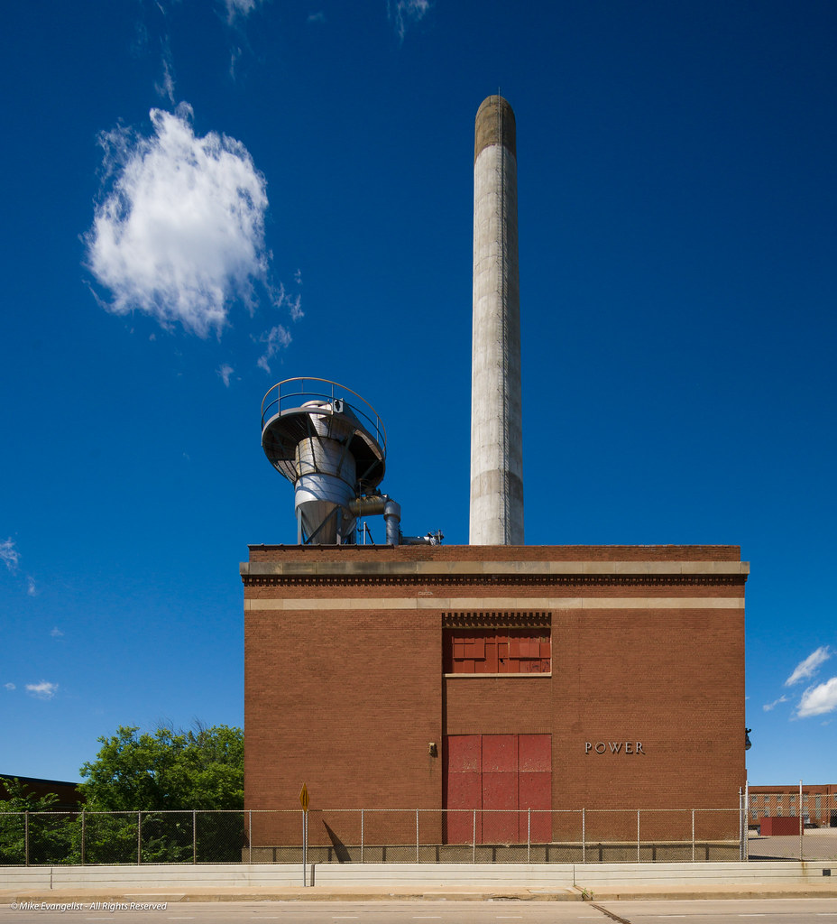
Larger version here - https://www.flickr.com/photos/mikeevangelist/27649506090/sizes/o/
Beer Power
Power plant at the old Hamm's brewery in St Paul, MN
A7Rii with Voigtlander 10mm ƒ5.6 @ ƒ11
Larger version here - https://www.flickr.com/photos/mikeevangelist/27649506090/sizes/o/
thompsonkirk
Member
Re: Fun with the Sony A7 Series Cameras( all of them)
Beer Power
Power plant at the old Hamm's brewery in St Paul, MN
A7Rii with Voigtlander 10mm ƒ5.6 @ ƒ11
Mike, it looks almost alive – and puffing off steam.
Kirk
mediumcool
Active member
Re: Fun with the Sony A7 Series Cameras( all of them)
And so he did!"... so I hope he is willing to share his thoughts on the choice. I think we can learn something interesting from that" – Pegelli
I like this one very much; acceptable subject sharpness begins at the gate—the ground in front is nicely soft, as are the trees behind; well-isolated IMO. I vignette just about every shot, which I think would help in the vintageization of this kind of photograph.Thanks to everyone for suggestions! I’m clearly having a problem with focal point and DOF in my romantic or pictorialist experiments, and can use advice.
The background is that in March I finished a portfolio book of landscapes, executed in an ‘f64’ style, as sharp as possible from foreground to infinity. After printing that portfolio, I wanted to try something different and hit on the idea of regressing even further, into a kind of ‘digital pictorialism’, with narrow plane of focus, beaucoup de bokeh, and a turn-of-the-previous-century look. Ideally I wanted the image to suggest that the photographer/viewer had been walking down a trail and has stopped to notice just one thing—usually an anomaly like a broken branch or fallen tree—and stood for moment to stare at it. This sort of thing, a fence that seemingly serves no purpose, would be an example:
View attachment 119430
I thought I could accomplish this with old lenses, wide open—50mm LTM Nikkor, 1.5 Summarit, etc., but their flare was sometimes overwhelming; and I wanted one focal point to be quite sharp. So I hit on the Mitakon f0.95 (for Sony), which does pretty much what I want and even adds some swirl to the corners.
That “rule” was always more of a guide—and made less of a rule with any amount of back-focus!But sometimes its angle of view is too narrow, so I’ve been trying out the 35 Nokton f1.2. That’s what’s got me in trouble with these two images! I like the field of view of this lens, but I have trouble even at f1.2, isolating a plane of focus. There seems to be a lot more DOF behind the point of focus than in front, even going on the assumption that apparent sharpness will extend 1/3 in front of the point focused on, and 2/3 behind.
Not only is Kirk a thoughtful photographer, he is gracious as well!Anyhow from the comments I’ve received, it looks like the wider lens, with its greater DOF, doesn't serve my purpose very well even when wide open.
Thank you for making me think more about this—any further suggestions appreciated!
Kirk

Barry Haines
Active member
Re: Fun with the Sony A7 Series Cameras( all of them)
I'm sure you already know most of what I have written below...
The FE 35mm Distagon 630g is notably larger and heavier than the Nokton 471g (+ adapters weight), just so you are aware but a bit less in weight than the Mitakon 720g.
I hear you about the weight and I'm in full agreement and find myself in the same position now with a heavier outfit than I ever originally intended I guess the only way to get the look of fast lenses and also reduce the weight of your gear at the same time is by going with the smaller format option...FF is the sweet spot position for me as I suspect it may well be for you also...I have no real desire at the moment to go smaller or larger in formats...Time will tell.
Muchas gracias Re: all the Solari and Mistaken info...That was very interesting and also very helpful info for me (I just learned several things from you which I didn't know already :thumbup: )... most appreciated.
I wouldn't necessarily expect the Noctilux F/0.95 to out shine the Mitakon (on A7R/II) in terms of IQ...Based on the few reviews that I have seen to date...But I have no personal experience of either.
A few links to reviews etc... (Noctilux vs Mitakon) for you in case you have'nt already seen them...
https://www.talkemount.com/threads/...-speedmaster-ii-dark-knight-50mm-f-0-95.9773/
https://www.talkemount.com/resource...kon-speedmaster-ii-dark-knight-50mm-f-0-95.2/
Zhongyi Mitakon 50mm 0.95 Preview ( Test VS Leica 50mm Noctilux 0.95) - Rico Space
https://bitchinlight.wordpress.com/...-crap-thats-fast-part-ii-of-the-fast-fifties/
My Contax 28mm Distagon was the F/2.8 slower version (Excellent sharp lens, when stopped down but to wide and slow for this kind of work that we are discussing) as opposed to the Contax 28mm F/2.0 Hollywood just so you know...
The pseudo IR together with pseudo halation gave the glow on the church cross.
My small experience of Contax lenses on A7R's to date show that the Contax lenses put out a cooler colour to the files as opposed to Sony/Zeiss FE lenses.
If I remember correctly Michiel and Chuck both have the C/Y Contax 35mm Distagons and like their lenses...as you say some of these old Contax C/Y lenses havent really dropped their prices in awhile.
I think one of the reasons that we are both on the same wave length together with a few others here is that we both have a love for vintage fine art prints by the old masters
I worked in London for over 3 decades (70's onwards) regularly visiting as many photographic galleries that I could in my lunch breaks, it gave me a much better appreciation of a vintage fine art print.
Thanks again for all...Cheers Barry
Many thanks Kirk, apologies for the tardy response + Also this style of quick response as I have a mountain of jobs to do today...please excuseThank you, Barry, for important suggestions!
The 35 1.2 Nokton is already big and clumsy, so adding more weight with the f1.4 Zeiss might not be a problem. I'll visit my dealer to see if it's something I can handle. It's ironic that I acquired Sony for lightness and compactness, but am already carrying some rather heavy chunks of glass.
The images you posted are fine examples of the 'look' I've been thinking of, except as you noted: If I want the viewer to feel that he or she is standing where the photographer was standing and is fixating on a particular object within the field of view, then I have to step farther back, with deeper DOF.
About Mitakon and Kolari (which SpellCheck calls Mistaken and Solari): I've had the Mitakon only a few months, and a body with the Solari mod for only this month; so my experience doesn't go far beyond what I've been able to post here.
First, about Solari: I compared it with my regular Sony body and came to the same conclusion you can read on the web: significant improvement in the corners, especially in the 28-50mm range, and even 24mm. In general, one or even two wider f/stops are usable. It adds a green tint, so you have to make individual or batch corrections, or else make a personal camera profile. I'm very happy to have it for use with M lenses.
This even includes MATE and WATE, which I use for regular landscape shooting. I thought I'd see no improvement, because these are retrofocus lenses; but there's a slight advantage in corner sharpness at a pixel-peeping level. So I've started using the modified body with all lenses except Sony/Zeiss AF FE, for which I've kept the regular A7rII body.
Second, about the Kolari mod supporting the Mitakon in particular, I don't think it can offer any improvement that matters. Wide open, the Mitakon corners are already so enjoyably vignetted, fuzzy, and distorted as to be beyond repair. I haven't tried the Mitrakon stopped down, though I've heard the resolution acceptable. For more detailed work I've just changed lenses.
Third, about considering Mitakon: when WO it produces highlight flare, so that a brightly-lit leaf will look soft because of surrounding flare, while a shadowed one right next to it may look considerably sharper. This is a further limitation on center sharpness, and I don't know how to avoid it without acquiring a Noctilux.
Finally, when I re-read your post I came up with what turned out to be a half-baked idea: I noticed you'd used a 28mm Distagon in C/Y mount for your most recent post, and immediately thought 'So why not use an old C/Y 35mm f1.4 for landscapes instead of a new FE 35 1.4, because it's a manual-focus lens?' A good idea except that when I looked up the price, I saw that the C/Y 35 1.4 is like the 28mm Hollywood Distagon – it hasn't depreciated and sells for nearly as much as a brand new one.
Most people have probably given up reading by now, but I think at least the two of us are on the same wavelength, thinking of style/gear/technique/image quality as a complicated feedback loop, where you have to establish good relations among a whole family of factors. In this respect it seems to be as hard to make an 'old-fashioned' BW image with controlled soft focus areas as it is to make a sharp and appealing contemporary color image.
Kirk
PS, lovely bokeh in the railroad track image!
I'm sure you already know most of what I have written below...
The FE 35mm Distagon 630g is notably larger and heavier than the Nokton 471g (+ adapters weight), just so you are aware but a bit less in weight than the Mitakon 720g.
I hear you about the weight and I'm in full agreement and find myself in the same position now with a heavier outfit than I ever originally intended
I guess the only way to get the look of fast lenses and also reduce the weight of your gear at the same time is by going with the smaller format option...FF is the sweet spot position for me as I suspect it may well be for you also...I have no real desire at the moment to go smaller or larger in formats...Time will tell.Muchas gracias Re: all the Solari and Mistaken info...That was very interesting and also very helpful info for me (I just learned several things from you which I didn't know already :thumbup: )... most appreciated.
I wouldn't necessarily expect the Noctilux F/0.95 to out shine the Mitakon (on A7R/II) in terms of IQ...Based on the few reviews that I have seen to date...But I have no personal experience of either.
A few links to reviews etc... (Noctilux vs Mitakon) for you in case you have'nt already seen them...
https://www.talkemount.com/threads/...-speedmaster-ii-dark-knight-50mm-f-0-95.9773/
https://www.talkemount.com/resource...kon-speedmaster-ii-dark-knight-50mm-f-0-95.2/
Zhongyi Mitakon 50mm 0.95 Preview ( Test VS Leica 50mm Noctilux 0.95) - Rico Space
https://bitchinlight.wordpress.com/...-crap-thats-fast-part-ii-of-the-fast-fifties/
My Contax 28mm Distagon was the F/2.8 slower version (Excellent sharp lens, when stopped down but to wide and slow for this kind of work that we are discussing) as opposed to the Contax 28mm F/2.0 Hollywood just so you know...
The pseudo IR together with pseudo halation gave the glow on the church cross.
My small experience of Contax lenses on A7R's to date show that the Contax lenses put out a cooler colour to the files as opposed to Sony/Zeiss FE lenses.
If I remember correctly Michiel and Chuck both have the C/Y Contax 35mm Distagons and like their lenses...as you say some of these old Contax C/Y lenses havent really dropped their prices in awhile.
I think one of the reasons that we are both on the same wave length together with a few others here is that we both have a love for vintage fine art prints by the old masters
I worked in London for over 3 decades (70's onwards) regularly visiting as many photographic galleries that I could in my lunch breaks, it gave me a much better appreciation of a vintage fine art print.
Thanks again for all...Cheers Barry
Last edited:
- Status
- Not open for further replies.