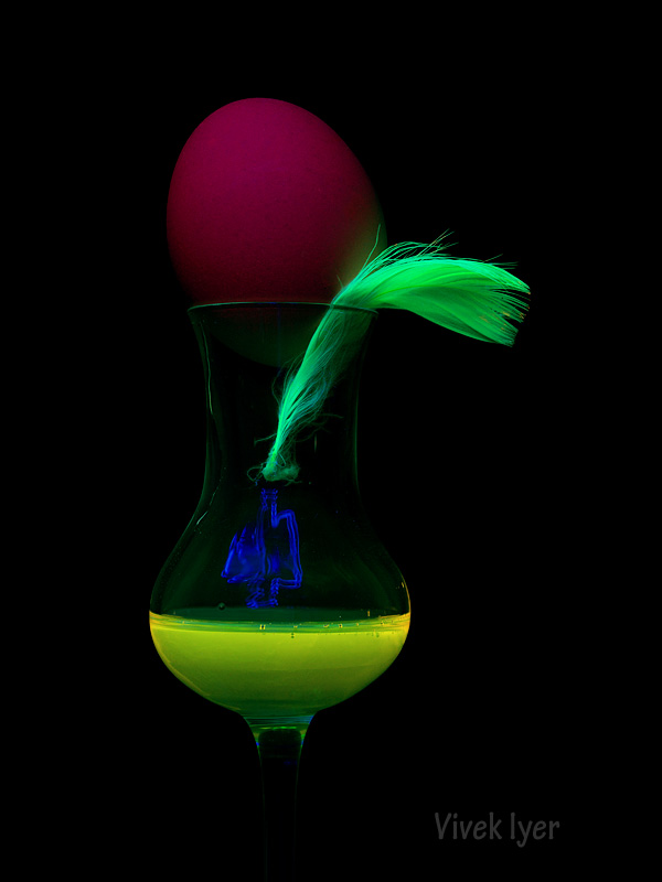
I like to look at photographs, and do look at a lot of them online. A trend I find (very) disturbing is an almost unabashed use of tone-mapping followed by the invariable weird halos and then dirty, gritty "grunge" colors contained in same. The other trend, often (but not always) combined with the over tone-mapped look, is the enhanced saturation adjustments bordering on grotesque that often create a plethora of near-fluorescent colors in a conventional image. When the two trends are combined, the result makes my head hurt so much I find myself wanting to rip out gobs of my hair or stick needles in my eyes to make it stop. (Okay, that was an exaggeration.) I have to admit, viewing a nicely composed monochrome or normally-colorfull image has become a rare pleasure for me. (And thank heavens I still a lot of these being shared on THIS site!)
What do you think?
What do you think?
")