The GetDPI Photography Forum

Great to see you here. Join our insightful photographic forum today and start tapping into a huge wealth of photographic knowledge. Completing our simple registration process will allow you to gain access to exclusive content, add your own topics and posts, share your work and connect with other members through your own private inbox! And don’t forget to say hi!

IQ180 - Remote Shutter Release not working anymore

jng

Well-known member
I've also been watching this thread quietly as I don't have much if anything to offer. However it occurred to me to ask how old is your color checker card? My understanding is that the colors go off with time, and I remember an old thread where Steve Hendrix had a client with a similar color balance problem that was solved when he replaced his old color checker card with a new one. Admittedly a long shot but sometimes the answer to a tough question is the simplest.

John
 

KEVINS

Member
A lot of Great Info, thanks everyone!

Thanks Gents for coming aboard!
I just bought the color checker last fall and the date on the back is 2021. I'm familiar with Pantone colors and how items like this need to be stored so it says in the sleeve in a cabinet in a dark room.

As far as my statement I’m glad someone noticed:

"If the card is placed on the painting and the exposure is adjusted to get a good exposure of the painting then it's possible the card will be underexposed or overexposed depending on how bright the overall color of the painting is.. Yellow painting vs Brown painting. Correct? If this is true then I can see where the ICC won't work."

If I stand back and take a picture of the painting with the card hanging on it then walk up to the card and fill the card in the image the exposure requires different settings. On this particular painting it needed a shorter exposure time for just the card. I didn’t expect this but I can sorta see where the overall color of the painting may affect the exposure settings on the camera… or maybe not…I dunno.

I read the comment that I should be exposing for the card only, not the painting. If the card is exposed properly then the painting colors will fall into place when a correct ICC is used which makes perfect sense. I will see how this works and what I need to do...

Desperately thinking that the items/colors behind the easel may affect exposure settings I bought a black cloth and additional stands to place behind the easel then took new pics and created a new ICC which turned my new black cloth green in the new image.

As I mentioned I often talk with Eddy Wouters from the IBEX Collection who photographs their paintings and he gave me info on how he does the setup and he photographs the paintings with the card on them. This was how I learned to do it but Ashley from Xrite said the card should be at a minimum 1/3 of the image. This becomes impossible for large paintings and Eddy doesn’t seem to worry about this even on paintings that are 6ft/8ft. He uses the GFX100S and uses pixel shift on every image so the resolution of the color card should be real sharp which IMO is the important part. I will learn more about his process later.

Lighting:
I know for a fact that White LED lighting affects colors on my paintings. I created several paintings while working under white LED lighting and when I got done and took it outside the colors were ALL off! The colors looked really dull and dark. The white LED’s tend to saturate/glow the colors (almost like a fluorescent light) so when the lights are removed the saturation disappears. I’ve learned to deal with this effect but I know this happens. So I have brought up the LED lights as a potential issue but nobody thinks LED lights have been an issue with photographs…but maybe there is something to this… I don’t have any other lighting setup to try with a full painting. I used to do them outside but the paintings reflected too much. I know exactly what I need to do it but it will be difficult to setup and control with what I have to work with now.

White Balance:
When I was doing the WB correction I read that I should use cell G5 on the SG card. I also have a ColorChecker Passport and used that on a few images with the same orange result…

Interesting: I get the same orange results doing the WB in Capture1 and Photoshop but as I type this I don’t recall if the orange tint was ONLY on the Phase1 images or also the Canon... To be cont’d..

I will take a pic of just the card outside as Ray suggested…. Maybe we are onto something with the LED lights..To be cont’d.


Jut to eliminate a firmware issue with the IQ180 I reset it to factory settings and will test it. I don’t think this will fix anything, just eliminate the possibility of it..

If I forgot to answer anything please let me know. Having all your suggestions is giving me some encouragement so keep them coming!

Kevin
 

anwarp

Well-known member
Kevin

I suspect your LED lights may have an unexpected amount of ultra violet, which would explain your experience with the images looking darker in sunlight. It would also explain the red shift when you apply just a white balance.

White LEDs are really fluorescent lamps. The chip actually produces a far blue or even UV light. A coating of phosphors over it emit the mixture of red, green and blue to simulate the white.

Do you have access to flash to test?

Anwar
 

KEVINS

Member
Kevin

I suspect your LED lights may have an unexpected amount of ultra violet, which would explain your experience with the images looking darker in sunlight. It would also explain the red shift when you apply just a white balance.

White LEDs are really fluorescent lamps. The chip actually produces a far blue or even UV light. A coating of phosphors over it emit the mixture of red, green and blue to simulate the white.

Do you have access to flash to test?

Anwar
Thanks Anwar!
I think we may be onto something, then..

I do have Godox strobes for the Canon but I wasn't sure if the Phase One would operate the trigger for them and didn't want to hurt the PhaseOne if something shorted but I'll give it try....

If it doesn't work the only way I may be able to light a painting without reflections is in my garage that uses T5 florescent garage lighting in the ceiling.

Kevin
 

KEVINS

Member
I reinstalled the latest firmware for the DB so no tests were done with factory firmware.
I set up the flash strobes in the room.
I adjusted camera settings/flashes until the LAB values of the 4 white corner squares on the SG card read close 96-97 based on the desired LAB value.

Screenshot of before ICC adjustments:
default with strobe.JPG

Screenshot after ICC adjustments:
after.JPG


WB issue did not change - it still turns orange.


Creating an ICC with the Xrite did not produce the desired LAB values and when I printed it the photo came out dark with a bluish tint.

I did send Ray the RAW file just in case he wanted to see it.

If I have time I will try and move things outside this afternoon to use natural light...

If anyone wants to play with this image let me know.

Kevin
 

Ray Harrison

Well-known member
I reinstalled the latest firmware for the DB so no tests were done with factory firmware.
I set up the flash strobes in the room.
I adjusted camera settings/flashes until the LAB values of the 4 white corner squares on the SG card read close 96-97 based on the desired LAB value.

Screenshot of before ICC adjustments:
View attachment 201247

Screenshot after ICC adjustments:
View attachment 201248


WB issue did not change - it still turns orange.

Creating an ICC with the Xrite did not produce the desired LAB values and when I printed it the photo came out dark with a bluish tint.

I did send Ray the RAW file just in case he wanted to see it.

If I have time I will try and move things outside this afternoon to use natural light...

If anyone wants to play with this image let me know.

Kevin
Thank you Kevin, it's still pretty blue and so forth, which shifts the white balance yellow/orange. If you get the chance, take just the color checker outside, neutral background, evenly lit, set the camera in manual mode, choose whatever aperture and adjust the shutter speed until the camera indicates a correct exposure in its info window. and fire the shot. Shoot that on over and I'll take a look. Also, get rid of AWB in favor of Daylight - and maybe keep it there for now, even inside.

With the above, I would have assumed that the shutter speed would have been the camera's flash sync speed of (whatever it is - I forget on the DF/DF+), though you noted you weren't sure the camera could fire the flash. How did you fire the flash?
 

KEVINS

Member
Thank you Kevin, it's still pretty blue and so forth, which shifts the white balance yellow/orange. If you get the chance, take just the color checker outside, neutral background, evenly lit, set the camera in manual mode, choose whatever aperture and adjust the shutter speed until the camera indicates a correct exposure in its info window. and fire the shot. Shoot that on over and I'll take a look. Also, get rid of AWB in favor of Daylight - and maybe keep it there for now, even inside.

With the above, I would have assumed that the shutter speed would have been the camera's flash sync speed of (whatever it is - I forget on the DF/DF+), though you noted you weren't sure the camera could fire the flash. How did you fire the flash?
Just sent it to you.
Outside Image
WB set to Daylight
Centered metering Exposure

Surprisingly the camera did fire the Godox flashes........and nothing melted! =)

Since I have never used the flash with the P1 I wasn't sure how to set it up quickly so I just manually adjusted everything until the exposure on the cards were "correct".

Since I had at one time reset the DB and firmware to factory settings the DB doesn't power on with the body even with the latest firmware reinstalled...aarrg..

ks
 

Ray Harrison

Well-known member
Just sent it to you.
Outside Image
WB set to Daylight
Centered metering Exposure

Surprisingly the camera did fire the Godox flashes........and nothing melted! =)

Since I have never used the flash with the P1 I wasn't sure how to set it up quickly so I just manually adjusted everything until the exposure on the cards were "correct".

Since I had at one time reset the DB and firmware to factory settings the DB doesn't power on with the body even with the latest firmware reinstalled...aarrg..

ks
Thanks Kevin. I did a quick-n-dirty profile on the card image. It did reasonably well given the circumstances - it's about a deltaE of 3 at 90%. While that wouldn't be acceptable for real work, it shows that the camera should be OK (in my mind anyway). Obviously, the profile is only valid with that camera, that lens and in that exact situation so not useful for anything else. Profile=Effect->No color correction, Curve Linear Scientific, tweaked the levels to get the white patches close.

Screenshot 2023-02-26 at 4.25.10 PM.jpg
 

KEVINS

Member
Thanks Kevin. I did a quick-n-dirty profile on the card image. It did reasonably well given the circumstances - it's about a deltaE of 3 at 90%. While that wouldn't be acceptable for real work, it shows that the camera should be OK (in my mind anyway). Obviously, the profile is only valid with that camera, that lens and in that exact situation so not useful for anything else. Profile=Effect->No color correction, Curve Linear Scientific, tweaked the levels to get the white patches close.

View attachment 201268
That is SUPER encouraging and the image colors on row 8 look fantastic too!!!

WHEW!!! I agree that we can eliminate the camera as having issues and pretty much points one nasty finger at the lighting.
I haven't tried making a new ICC in the Xrite software yet but will post results. I've never tried correcting colors in an image before so that will be a learning experience. Hopefully the default ICC will be close enough.

Back to lighting... I'm surprised and disappointed that the flash lights created a blue tint. I can see this happening with the LED lights but I hoped the flashes would have had better color.

LED Light Settings:
I have them adjusted up to 5600k at 100% power. I figured, maybe incorrectly, that this would produce a pure white light thus less false color. Changing the setting down to 5200 at 100% makes a more yellow light. So is there a way to offset the blue tint with the light settings if so how would I be able to tell if the light settings are getting close to a more neutral setting? I would still be a bit worried that the LED's are adjusted to work for a few color patches but mess up others...


ks
 

dchew

Well-known member
Well, I tried Lumariver. Definitely does not have the same orange issue. I have a choice of what curve to use, and I chose linear, which gives a bit flatter image than other options. If you think this is promising I can try another with a curve applied. I did still have to boost the exposure 1/2 stop. That may be because I chose linear.

In the past, I've found Lumariver to produce less-dramatic colors than other profiles. I think that is by design, as Torger errs on accuracy vs "looks cool." But regardless, I can try again with a curve if this looks at all promising. It was my first try, and Lumariver is a bit confusing (especially after a few years!). Kevin, I will send you the profile for you to experiment with.

Dave


KEVINS

Member
Well, I tried Lumariver. Definitely does not have the same orange issue. I have a choice of what curve to use, and I chose linear, which gives a bit flatter image than other options. If you think this is promising I can try another with a curve applied. I did still have to boost the exposure 1/2 stop. That may be because I chose linear.

In the past, I've found Lumariver to produce less-dramatic colors than other profiles. I think that is by design, as Torger errs on accuracy vs "looks cool." But regardless, I can try again with a curve if this looks at all promising. It was my first try, and Lumariver is a bit confusing (especially after a few years!). Kevin, I will send you the profile for you to experiment with.

Dave
Thanks Dave!
Give me a day or so to get things caught up around here then I will try and do more tests and review files. I can definitely say that her forehead now shows great transition color so this is also encouraging...

Ray,
Those quick color adjustments you made was that in C1 or basiccolor? I made a quick ICC with that outdoor photo of the SG card I sent you but the ICC still didn't produce "accurate" LAB colors. Doing a WB on G5 didn't seem to turn it orange but the colors were still off.

ks
 

dchew

Well-known member
Here is a Lumariver Profile with the curve loaded from std IQ180 profile curves instead of linear. I think it is better, and I didn't have to boost exposure as far; 0.39 instead of 0.52.

Dave


Ray Harrison

Well-known member
Thanks Dave!
Give me a day or so to get things caught up around here then I will try and do more tests and review files. I can definitely say that her forehead now shows great transition color so this is also encouraging...

Ray,
Those quick color adjustments you made was that in C1 or basiccolor? I made a quick ICC with that outdoor photo of the SG card I sent you but the ICC still didn't produce "accurate" LAB colors. Doing a WB on G5 didn't seem to turn it orange but the colors were still off.

ks
I produced the tiff as input for the profile using Effects->No color correction in C1 for the ICC Profile, Curve->Linear Scientific. I then tweaked the levels to get the white patches in a reasonable range, exported the tiff and then ran it through basiccolor. Then I used that profile in C1, curve back to linear scientific and made small tweaks I believe again to the levels.
 
Last edited:

dchew

Well-known member
After spending some time with the file and working on the profile(s), I finally understand what you mean by a well-exposed painting vs a well-exposed card. Theoretically there should be no difference.

On the left is a variant adjusted to get the card reading reasonably good lab values vs the SG specs, at least for luminance. I did this by adjusting the exposure / HDR settings. Exposure is actually -1.05! The painting is of course oh so dark. On the right is just my perception of what the painting brightness should be, more or less. That is +0.4, or almost 1.5 stops difference.

I wonder if a lot of this has to do with how the paint reflects the light source vs the card. I also am curious about how much brighter the center of the picture frame is (where it shines back) compared to the top and bottom. Again, I'm off in the weeds.

Dave

kevindiffexposure.jpg
 
Last edited:

KEVINS

Member
After spending some time with the file and working on the profile(s), I finally understand what you mean by a well-exposed painting vs a well-exposed card. Theoretically there should be no difference.

On the left is a variant adjusted to get the card reading reasonably good lab values vs the SG specs, at least for luminance. I did this by adjusting the exposure / HDR settings. Exposure is actually -1.05! The painting is of course oh so dark. On the right is just my perception of what the painting brightness should be, more or less. That is +0.4, or almost 1.5 stops difference.

I wonder if a lot of this has to do with how the paint reflects the light source vs the card. I also am curious about how much brighter the center of the frame is compared to the top and bottom. Again, I'm off in the weeds.

Dave

View attachment 201289
Exactly... And I'm so new at trying to achieve proper colors I'm not sure the best way to approach it. As you surmised the image on the right is better.

Since we all know the artificial lights are causing the issue I need to either figure out a way to adjust for them in PP or come up with a way to photograph them outside. Outside creates it own headaches but anything can be done.
From experience the area behind me/camera HAS to be pure Black. If there is ANY amount of light then the canvas reflects it. I have learned to wear black clothing b/c light color clothing is reflected in the painting.
At one time I pulled my truck up to the garage door then opened the garage door. Leaned the painting against the front bumper so the painting faced inside the garage where it was dark. This somewhat worked but the garage wasn't dark enough so the painting reflected everything in the garage and looked too light plus the painting sits in shadow which may hurt..

With Rays image of the outdoor card looking real good I'm curious if you would have the same difficulty you have been fighting if you weren't fighting the tint from the lights.. ie if you were processing an image that was taken outside..

For the last hour I have been looking around outside to see how I could take a picture with the card. The only thing I can think of is the same setup with the painting facing inside the garage.

I keep wondering that there has to be a lighting setup that works, tho. Maybe toning down the LED lights from 5600K to 5200k or ???

The room I photograph in is grey but I can't see the walls/ceiling casting the blue tint considering how bright the flashes are..

ks
 

KEVINS

Member
WEIRD result on one of my images tonight!!!
I set up the lights etc and took a practice capture. I dumped it into C1 and it looked pretty good. I did a WB like usual and it looked great! It didn't turn orange at all!! I clicked on a few other patches on the SG card then back on the grey square (G5) and it looked real good so I decided to make a custom ICC. When I implemented it it turned the image BLUE!..crap..

I reset the image then did another WB and it turned the usual Orange.. I reset it again and even reloaded the RAW file from the camera back into C1 and it still turned orange..aaarrgg.

ks
 

dchew

Well-known member
Dumb question: is there a style or some other auto adjustment being added to the image you don’t know about?

Dave
 

KEVINS

Member
Dumb question: is there a style or some other auto adjustment being added to the image you don’t know about?

Dave
I have no idea. I was hoping that others that use C1 wouldn't have these issues and if they didn't then there must be a setting in my C1 that is causing it. So far it appears that everyone is having the same issue with my images.
I had version 22 with the default settings then uninstalled it and installed ver21 using the default settings now I'm back on ver22 with default settings..
When this image looked good I hadn't even used C1 and never made changes. After the WB looked good I noticed that the ICC was still the default IQ180 Flash and the curve was still Auto. Other than that I have no idea what settings were being used. Thinking it was a fluke I saved a copy of the raw file to my desktop but when I loaded it back into C1 it acted stupid like all other images..

ks
 

Ray Harrison

Well-known member
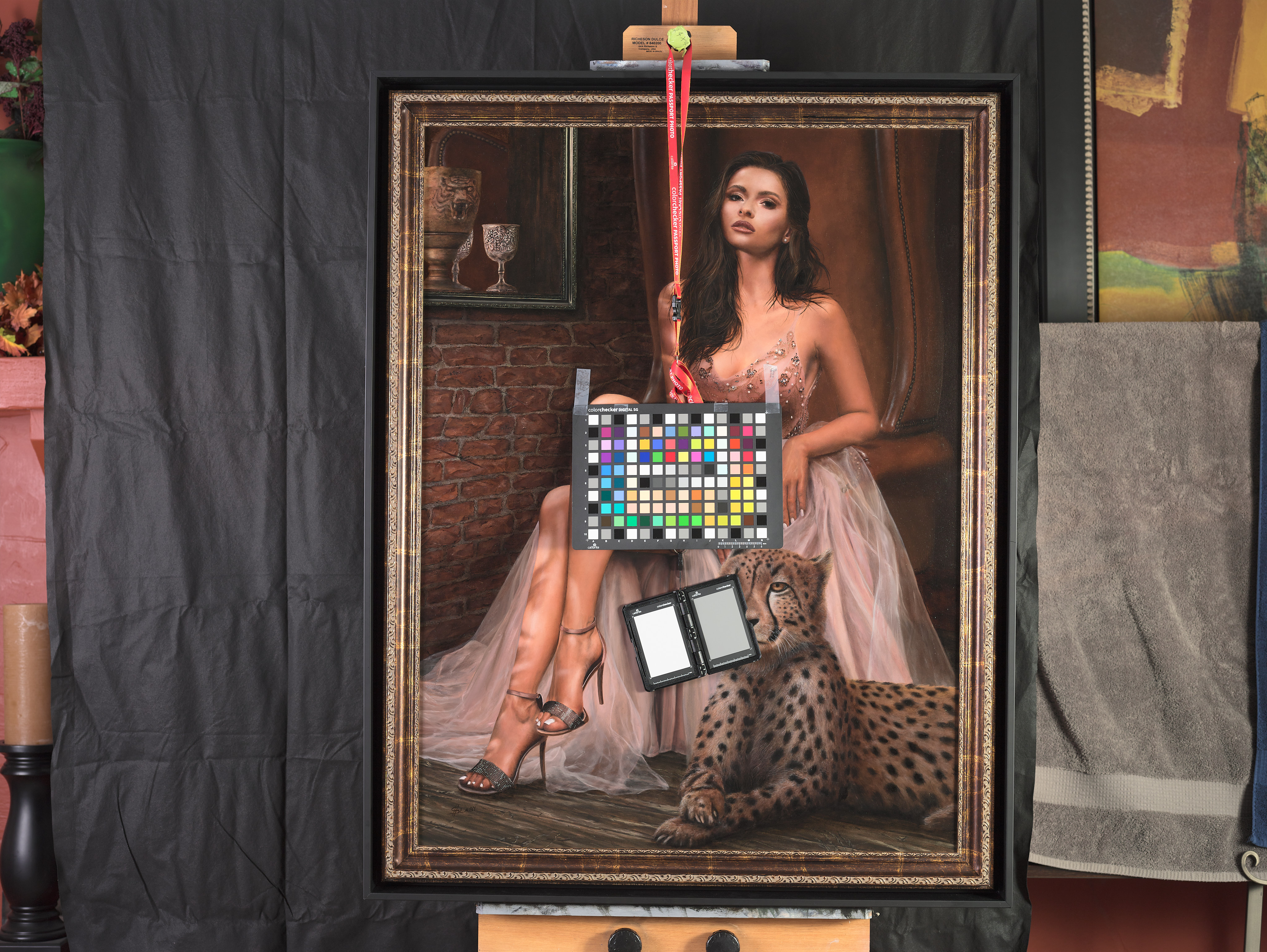
@KEVINS Maybe consider the situations where an in-situ ICC profile is going to be useful in your workflow of photographing your art work. To really get accurate color is a fair amount of work and there are all of these requirements: The lighting (including angle to the scene), camera, lens (including aperture), exposure settings, luminosity uniformity and white balance that must be correct to even have a hope of getting that color accuracy. Things that affect white balance can include ambient and reflected light, quality of lighting (really make sure those LEDs have "clean light") and making sure that the room or space where the artwork is being photographed is neutral in color. You've had other strong colors in images I've seen (reds and so forth). That last piece goes back to the ambient and reflected light - those strong colors will affect your ability to make a color representative profile.

I can actually recommend a PDF from the cultural heritage folks at Digital Transitions. It'll cost you a fiver but it has a lot of really good basic information. https://heritage-digitaltransitions.com/product/digitization-workflows-reflective-pdf-download/

One small correction I'd make on the PDF is that they say that C1 Pro doesn't do L*a*b* readouts, but that's now an available feature, clearly :D .

If, on the other hand, it's less important to have truly accurate color and more important to have it look both good and close, there are easier options. You still should nail the exposure and white balance but there are profiles in Capture One for other digital backs that handle tonal transitions really well, even though they aren't specifically built for your IQ180. IQ3-100 pro standard, etc are good examples that to my eye look a bit better. Even though these are built for the frequency response of a different sensor and sensor type (CCD (IQ180) vs CMOS (IQ3100, your Canon, etc), play around with them to see if they're something you want to incorporate.

That said, nailing the exposure and white balance may make the need to do that go away, at the end of the day (and I expect this to be the case).

I'd also recommend investing some time in really learning Capture One. It has a lot of capabilities that are worth learning. I'd recommend their YouTube channel for overviews of the ecosystem if you haven't done this. https://www.youtube.com/@CaptureOne/streams - I find that really knowing my tools puts me at a distinct advantage. It obviously takes an investment of time, of course.

Were you saying you were local to Capture Integration in Atlanta? If so, maybe speak with them about your specific needs and have them take you through the features of the camera and digital back that may help with the workflow. Phase One digital backs are a very powerful and capable platform and really getting that hands on for your specific needs may open up other possibilities to improve. They aren't obviously like using a standard DSLR and maybe picking up additional insight from Brad and team at Capture Integration would help. He's an exceptional commercial photographer who has a wealth of insight.

All just thoughts of course :).
 
Top