The GetDPI Photography Forum

Great to see you here. Join our insightful photographic forum today and start tapping into a huge wealth of photographic knowledge. Completing our simple registration process will allow you to gain access to exclusive content, add your own topics and posts, share your work and connect with other members through your own private inbox! And don’t forget to say hi!

Print not like screen

spassig

Member
Hello
I print this picture, see screenshot.
There are big difference between paper and screen.
The sky of print is without blue color and darker.
The sky is more grey. I don't see the bright and airy sky and background in the print.
The background with snow and bushes and forests are without proper tracing.
I use PhotoRag Metallic 340 g/qm from Hahnemühle and Colormanagement with the ICC profile from Hahnemühle for this paper on Epson Sure Color P800.
I use a calibrated screen from Eizo.
Does anyone have any idea what could be the cause of my problem and what I would still have to check?

Jochen

IMG_0107.jpeg
 
Last edited:

dchew

Well-known member
Hi Jochen,
  1. How do you print? PS, LR, Epson software, something else?
  2. Have you tried soft proofing? If so, how does that look on screen?
  3. Have you tried relative colorimetric vs perceptual? If so, what difference do you see between the two?
I suspect this is because that image appears darker on that paper than it does on the monitor, but answering the above questions will help.
Dave
 

MGrayson

Subscriber and Workshop Member
I don't understand why, but I've always gotten terrible results from Metallic papers. No dynamic range, muted colors. Just awful. I do all the things I do with any new paper, but ... zilch. (Hahnemuhle, Canon Pro1000, ¯\_(ツ)_/¯)
 

dchew

Well-known member
I don't understand why, but I've always gotten terrible results from Metallic papers. No dynamic range, muted colors. Just awful. I do all the things I do with any new paper, but ... zilch. (Hahnemuhle, Canon Pro1000, ¯\_(ツ)_/¯)
Me too. I've tried it a few times, and it works with some specific scenes. In general, I'm not satisfied with the results. That's why I'm curious if Jochen had tried softproofing. It should show on screen during the softproof.
 

spassig

Member
Hi Jochen,
  1. How do you print? PS, LR, Epson software, something else?
  2. Have you tried soft proofing? If so, how does that look on screen?
  3. Have you tried relative colorimetric vs perceptual? If so, what difference do you see between the two?
I suspect this is because that image appears darker on that paper than it does on the monitor, but answering the above questions will help.
Dave
@dchew
Thanks for feedback
1) I use CaptureOne current version. I use current version of Epson driver for SureColor P800.

2) I used the soft proof and mean this looks better as print. I do it in the past.

3) I mean I used perceptual (perceptive). I will check it in future the difference.

I have the following questions on base the attached screenshot

Is it the case that the marked three color areas on the monitor cannot be printed or are they moved to the printable area by the software or printer?

A newly created ICC profile for the paper and printer does not bring any improvement?

Jochen

Bildschirmfoto 2024-03-04 um 10.34.45.png
 
Last edited:

spassig

Member
I don't understand why, but I've always gotten terrible results from Metallic papers. No dynamic range, muted colors. Just awful. I do all the things I do with any new paper, but ... zilch. (Hahnemuhle, Canon Pro1000, ¯\_(ツ)_/¯)
Hey. I‘m beginner in printing.
I‘m testing different paper. Do You think that’s wrong?
What mean \_(ツ)_/¯ in your answer? I know the code ;-)

Jochen
 
Last edited:

MGrayson

Subscriber and Workshop Member
Hey. I‘m beginner in printing.
I‘m testing different paper. Do You think that’s wrong?

Jochen
I'd be surprised if you couldn't get good results with Epson Premium Luster. I'd work with that for a while. It was my goto before I got sucked into the Hahnemühle Baryta world.
 

dchew

Well-known member
Is it the case that the marked three color areas on the monitor cannot be printed or are they moved to the printable area by the software or printer?

A newly created ICC profile for the paper and printer does not bring any improvement?

Jochen

View attachment 211256
Yes. The three marked points on your charts would be mapped to within the printer/paper gamut. How it gets moved depends on your selection of "perceptual" or "relative colorimetric." Perceptual will compress all the mapped colors into the space, kind of like shrinking the entire gamut to fit. Relative Colorimetric will retain everything that is within gamut, and just clip whatever is outside the gamut and remap it to the gamut's edge. That may not be a technically correct description, but it is how I think of the difference.

Dave
 

spassig

Member
Yes. The three marked points on your charts would be mapped to within the printer/paper gamut. How it gets moved depends on your selection of "perceptual" or "relative colorimetric." Perceptual will compress all the mapped colors into the space, kind of like shrinking the entire gamut to fit. Relative Colorimetric will retain everything that is within gamut, and just clip whatever is outside the gamut and remap it to the gamut's edge. That may not be a technically correct description, but it is how I think of the difference.

Dave
Thanks. I will print on other paper with different settings.

Jochen
 

anwarp

Well-known member
What do you select as the paper type on the printer?

e.g my Epson P600 only lists Epson papers. If I use 3rd party papers with their profile, I have use the Epson profile they have recommended to allow the 3rd party supplied ICC profile to work correctly.
 

spassig

Member
What do you select as the paper type on the printer?

e.g my Epson P600 only lists Epson papers. If I use 3rd party papers with their profile, I have use the Epson profile they have recommended to allow the 3rd party supplied ICC profile to work correctly.
I used Epson Premium Luster for the print above as recommended by Hahnemühle.

Jochen
 

spassig

Member
Like Dave and Matt suggested, it would probably be best to test using a wide gamut paper, may be one of the Epson papers itself. That should help eliminate most of the uncertainties.

You’re probably already aware, but if your screen is too bright, the print may look too dark.

This is a good source if you want to understand a bit more about printing. https://www.northlight-images.co.uk...-and-reviews/printing-paper-reviews-articles/
Is there references in technical date of papers
By the way a separate profile is currently being created by a service provider for my paper/printer.
My screen data see in sreenshot.
Thanks for the link, I probably need a lot of time to study and hopefully understand everything ;-)

Jochen


Bildschirmfoto 2024-03-05 um 14.48.34.png to wide gamut?
 

MGrayson

Subscriber and Workshop Member
It should not be this difficult to get pretty close. Canned profiles and standard papers should look good, unless the monitor is way too bright or badly miscalibrated. Getting special profiles and reading technical documents is not the first (or fourth) step I would take. There's also the possibility of a clogged nozzle - usually, but not always, visible as stripes on the print.

Matt
 

dchew

Well-known member
I agree with Matt. I've found the difference between profiles to be subtle. Like, "Does that yellow have more or less orange in it?" Usually, the difference between profiles can be seen if pointed out in a direct comparison, but not something that screams "this is wrong" by itself. In situations like that described by Jochen, I suspect:
  1. Monitor brightness: at 100 cd/m2 I doubt it. That's less than mine (120) and I have a similar monitor.
  2. The paper just isn't right for the specific image: I suspect that is the case here.
  3. The print head has some issue: Doesn't fit the description.
  4. The printing path broke with some OS update: Possible, but no specific evidence.
  5. Other color management issues: Again possible, but no evidence
Given that this is specifically about the light areas being too dark, I am still very suspicious this is the metallic paper.

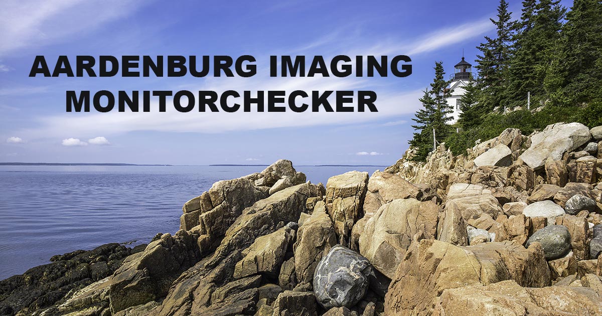
BTW, Mark McCormick-Goodhart has a great monitor checker file here:

Dave

1709659477620.png
 

tenmangu81

Well-known member
Is there references in technical date of papers
By the way a separate profile is currently being created by a service provider for my paper/printer.
My screen data see in sreenshot.
Thanks for the link, I probably need a lot of time to study and hopefully understand everything ;-)

Jochen


View attachment 211295 to wide gamut?
Hi Jochen,

1) You should select the brightness target of your monitor as a function of your working environment. My monitor is in a rather dark corner of my flat, and I have chosen 80 cd/m2 in these conditions. In brighter environments, it would be better to select a higher brightness (100 or 120 cd/m2).
2) The white point is, in my opinion, a little bit too high, but this should not have drastic consequences on the result. I have mine at D50, but a 5500 K temperature would be good as well.
3) Be aware that the difference between what you see at your screen and what you see at your print strongly depends upon the light under which you are looking at your print. There are standard 5000 K lights, and ISO specs have been published for that, but it becomes complicated to comply with.
4) And finally, most important : I have noticed on many occasions that printing from Capture One didn't give me good results. Most of the time, it worked, but on specific images, it didn't. So, I decided to print from Lightroom or Photoshop : their soft proof is far more reliable.
 

spassig

Member
@Robert.
Thank for feedback and your recommendations.
Next what I do is printing this picture on other paper. Also use different rendering settings.

Jochen
 

spassig

Member
I print on Hahnemühle G_FineArt Baryta 325 g/qm with different Rendering Intent.
The screenshot show the above picture monitor Normal and Proof.
Did someone see the different here?

Jochen

Bildschirmfoto 2024-03-06 um 18.34.24.png
 

MGrayson

Subscriber and Workshop Member
I print on Hahnemühle G_FineArt Baryta 325 g/qm with different Rendering Intent.
The screenshot show the above picture monitor Normal and Proof.
Did someone see the different here?

Jochen

View attachment 211307
Yes, they are different. The question is - how different is the proof image from the print? The proof is supposed to be the final check before printing. If anything seems off there, you correct it, maybe saving a version for that particular printer/paper.
 
Last edited:

tenmangu81

Well-known member
Yes, clearly different. And the colour of the bench is very different. If you remember how it is (or was), this could be a good hint.
 
Top